 This is Part II of my Artist Series interviews with Andy Skurman of Skurman Architect. If you missed Part I, no worries, click here. Andy is an extraordinary architect, that is why I gave him a call. I wanted to learn more about him and from him. He delivered.
In the first segment, I promised pictures of Andy and Francoise's home. At the top is a picture of the living room. That is the coffee table I became "transfixed" on while speaking to Andy. I used that word because it is a strong word that Andy used in in another interview he did for Period Homes, "I accompanied him (grandfather) on a sales call to Philip Johnson’s office in the Seagram Building and was transfixed.” According to that article, Andy realized then (or shortly there after) he was to be an architect. Lucky for us! The pictures of Andy and Francoise's home are compliments of an article California Style magazine published in the October 2007 edition.
Let's continue with the interview.....
Paula: Where did you grow up?
Andy: I grew up in New York.
Paula: In Manhattan or -?
Andy: No, on Long Island. I’m kind of answering your questions but not in order if that’s okay with you.
Paula: That’s fine.
Andy: I had a very early interest in art and in sixth grade I was the best artist in the class, and I remember the teacher took a great interest in me and thought I should be an artist. I really felt this way in sixth grade, that I felt it was really too risky financially and I needed to do something that I could make a living at. I didn’t want to be a starving artist. I had architects in the family. There are two architects in my family. My grandfather’s brother was an architect and my mother’s cousin was an architect, so it wasn’t unfamiliar to me. I knew that it existed. It’s so important to know that careers exist. Who becomes an economist? How do they now that exists? We see so much of that in the news today with all the analysis of the economy.
It seems so interesting, but when I was a kid I didn’t even know it was a choice, but I knew about architecture. I also was passionate about industrial design and I went to the Museum of Modern Art in my teens and I fell in love with the Goodwin collection of industrial design there, which had propellers and transistor radios and Italian furniture and all the classic modern chairs and fabulous designed by great architects. I also fell in love with all the art. As I discovered the Museum of Modern Art on my own I would teach myself who did which painting. I would learn the names of the artists, and I have a really good knowledge of art that started back then, and that helped me select the art for the apartment. I know what looks important, and it doesn’t necessarily have to be expensive.
Paula: Right. I completely agree.
Andy: So I got a piece from – I went to Cooper Union and one of my professors was Robert Slutsky who was a great artist and he was never really discovered in a big way. We bought a piece from his widow from Philadelphia. When I contacted her she insisted that we come and pick one out, so we flew to Philadelphia to buy the piece of art and we love it. It’s probably about five feet square and it’s an important, fabulous kind of Bastille meets Joseph Alvarez type of piece. The art we have, there’s some abstract expressionism, the geometric as I’m describing it, and we have a Bay Area figurative piece by a man who’s in his late 80’s and still painting called Raimonds Staprans, and he’s from the school of Thiebaud, and it looks – it’s a great piece, a terrific piece. Then we have a piece that’s from an emerging artist that we paid next to nothing for. It’s an uptick and it’s huge. I like big art.
Paula: Apparently.
Andy: We have some small pieces too, but I like large pieces, and this was very reasonable and was from an artist’s first show in L.A., so we have everything from a deceased artist to a beginner artist, and we have the gamut of modern art stylistically.
Paula: Do you note – this is sort of a difficult question because obviously they’re different people and different training, different inspirations, but do you see a difference in the maturation of the older artists as compared to the younger artists?
Andy: No I don’t. I would never be able to guess an artist’s age.
Paula: Really?
Andy: Yeah.
Paula: I can’t wait to see – and this is all in the article that you said?
Andy: Yeah. It’s all in this article, which I can scan and send to you today.
Paula: Okay. Great. That’d be great. I might do part two.
Andy: Maybe I should try to send it to you while we’re talking.
Paula: Oh. Can you do that?
Andy: Yeah I can. Can you hang on a minute?
Paula: Sure.
Andy: Thanks. What else can I answer for you?
Paula: So do you and your wife make these decisions together regarding the purchasing of the art?
Andy: Yes we do. It’s not easy. I show her probably maybe a few dozen pieces before she says she likes that one. [Laughs] I want a lot of things.
Paula: That’s funny that you’re expansive and she just sort of reins you in and says no, this is the one she likes, but that’s actually nice that you guys coordinate that because I’ve worked with some couples that don’t do that and it usually doesn’t work out very well.
Andy: Oh, it’s one of the most difficult things, but I wanna tell you more about the apartment in regards to how we work together. We made a decision on the apartment. My wife’s mother passed away and we inherited 18th century French furniture in the Louis XV style and what Francois did with it, which is extremely unusual, is she had it gilded in silver and had it upholstered in white.
Paula: Wow.
Andy: And the modern pieces we discussed, ‘cause of course I love so many things, but we decided, and really Francois was the one who thought that this was important, that none of the furniture would be recognizable in terms of an architect label, no Mies, no Eames, no Corbu, things that were fresher that people didn’t know if is what we decided to collect in terms of the modern furniture. The modern furniture is fairly cutting edge to have a great contrast with the 18th century furniture, so that’s how we came to select the furniture, and we had some pieces made as well.
Paula: I can’t wait to see that. Why is that?
Andy: That we decided to do non-recognizable pieces?
Paula: Yes, exactly.
Andy: Well you know when I started to look for furniture of course I found the Mies furniture in the polished stainless with white leather and thought that would be perfect but then I found much more interesting things. Our dining table we commissioned Tom Dixon in London to make it for us and he accepted and he did it. He’s one of the great modern furniture designers and we liked his chairs by Cappallini called the Pylon chairs, and we asked him to make a table that looked like that in a certain size and he did it. I just called him and he agreed. Most of his pieces of course are production pieces and we have another table by him that’s a production piece, but we love our commission piece. Some of the other furniture was commissioned by an artist in France called Astuguevieille.
 Tom Dixon's Pylon Chair
Paula: Okay, and did he – I mean you almost sounded excited and surprised that when you called him he did it for you.
Andy: Yes I was.
Paula: Why? I mean I asked why a million times, but -
Andy: It’s okay. Well I’ve seen pieces by Cappallini in Italy and different manufacturers and I just didn’t expect that he would do a one-off or a small series, but that’s what he does and you buy it or you don’t.
Paula: But you are who you are, so do you think that – oh, beautiful. I’m looking at your apartment. I see the 18th century furniture.
Andy: Good, and you see some of the artwork?
Paula: I do. There you are. I mean it strikes me that you’re surprised because you are an important person in our industry, so when you’re surprised -
Andy: That might’ve helped.
Paula: Yes. That might’ve helped is basically what I’m saying.
Andy: I’ve never spoken to him. I only spoke to his assistants. Do you see the table there, the dining table?
Paula: Yes. Here I am. Oh, it’s beautiful.
Andy: It’s really something.
Paula: That is wonderful.
Andy: To commission that and have it work so well was really exciting.
Paula: Yeah, I see the artwork that is in the dining room, the turquoise.
Andy: That’s the Twombly.
Paula: Okay. That’s a grand piece of art.
Andy: Isn’t it?
Paula: It’s beautiful and it’s grand and it’s perfect against all the white. The white looks like a gallery ready to receive the art and then every piece in it whether it’s a furnishing or a piece of art on the wall just looks – everything looks like a piece of art as opposed to just a furnishing. It looks like it’s a collection.
 Their dining room with the Dixon table and the Twombly painting. One of Francoise's plaster figures, 'Dona Mariana', sits atop the custom buffet.
Andy: Yeah. That coffee table was a great find. It’s Cappallini in Italy.
Paula: That’s what I got transfixed on. You said, “Did you see the dining room?” and I well, “Um, no, because I’m looking at the coffee table.” [Laughs] Now I know about being transfixed. I understand kind of what that feels like ‘cause I’m rarely transfixed.
Andy: It’s pretty great.
Paula: Where is the coffee table from?
Andy: Italy, and it’s no longer made. It was a limited edition.
Paula: Oh phooey.
Andy: They make different sizes of it, but not that one. They make round ones and tall ones and different sizes but not that particular one any longer.
Paula: Okay. Now I’m jealous.
Andy: You know it’s not a big apartment. It’s only a one-bedroom, but it’s a very spacious one-bedroom. It’s kind of like a loft.
Paula: Yep. What are the walls again?
Andy: They’re lacquered.
Paula: And the floor is glass.
Andy: It’s white glass from Japan.
Paula: Oh. I love glass. I use a lot of glass myself in my designs, so to see a glass floor -
Andy: It’s just really shiny and it picks up the light. It’s not meant for floors, but I convinced my former client to use it.
Paula: Have you had any problems with it?
Andy: Well you know tiles do break and I have an attic stock of it in storage. As soon as I bought the apartment I bought every bit I could find.
Paula: That was a brilliant move right there.
Andy: Yeah, and they do break and you have to replace them sometimes at impact, not from walking on it but maybe dropping something heavy.
Paula: Like a piece of art.
Andy: Well yeah, or a glass.
Paula: I’m teasing you because of the size of your grand art. I also really like the fireplace and the simplicity, just the simple design and using mirror because it’s -
Andy: It’s polished stainless steel.
Paula: Oh is it? Because it just recaptures everything in the room as if it was a mirror.
Andy: No. We have a wall of polished stainless steel also. It’s extremely high end because my client wanted it that way 18 years ago, but they never bought any art. It was for a lady and she never bought art. She never could decide, so that’s why they had trouble selling it, and there were no drapes either.
Paula: So it was a white box.
Andy: It was a white box with no drapes and no art and beautiful white furniture, which we didn’t purchase from them, but I knew what I could be.
Paula: No, absolutely. As you can tell I’m clicking through it again and again. I’ll try to stop.
Andy: Okay.
Paula: It’s lovely.
Andy: Thanks.
 Beautiful Louis XV chairs Francoise had gilded in silver.

 Their living room (last picture worth repeating!).
 Francoise's sculpture, 'Venus Refuses the Apple' above. Text from the article follows.
 Above is the 1976 Spiral Painting by Robert Slutzky.
 Their bedroom.
I enjoyed speaking with Andy about his home with Francoise. Their home is quite the contrast from Andy's current work. But there is a consistency. A consistency in attention to detail, in beauty, and it being impeccable.
The next two posts from the interview, this Thursday and next Tuesday, we'll cover Andy's business philosophy, how he made the change from contemporary to classical, his thoughts about education, his affinity for working with designers, and the all important hotel recommendations. Of course, there will be plenty more pictures of Andy's striking structures.
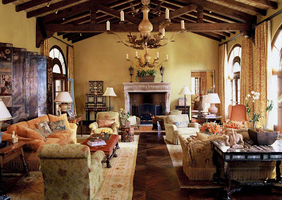
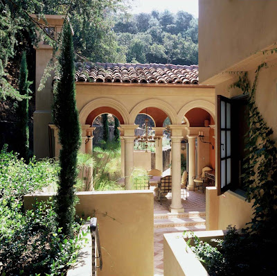
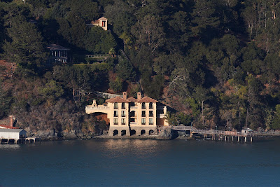
I'll leave you with more of Andy's French style, a mansion done in the Normandy style, and some examples of Mediterranean style. Enjoy!
CITY MANSION IN THE FRENCH STYLE


 INTERIOR DESIGN: Tucker and Marks, Inc.
LANDSCAPE DESIGN: Suzman and Cole Design Associates
CONTRACTOR: Forde Mazzola Associates Inc.
PHOTOGRAPHY: Matthew Millman
NORMANDY STYLE CARRIAGE HOUSE


 PHOTOGRAPY: Steven Brooke
HILLSIDE RESIDENCE IN MEDITERRANIAN STYLE


 INTERIOR Design: Tucker and Marks, Inc.
LANDSCAPE DESIGN: Suzman and Cole Design Associates
CONTRACTOR: Ryan Associates
PHOTOGRAPHY: Ken Gutmaker and David Duncan Livingston
LAKESIDE VILLA IN MEDITERRANIAN STYLE
 PHOTOGRAPHY: Chris Flach


Modern Furniture India, designer bedroom furniture, home furnishing & also contemporary Furniture India at our online store theurbandecor.com in Banagalore,India.
ReplyDeleteI actually came across a really nice website Spacify.com that has a huge variety of Italian Furniture with really good prices.
ReplyDelete