A couple of weeks ago, my family had the pleasure of seeing
Riverdance at Wolftrap Performing Arts Center. I have posted about Wolftrap before ~ a beautiful outdoor venue perfect to breath fresh air and fill the senses. Once again, my daughter enjoyed the show. She tried her hand, or should I say feet, at the traditional Irish tap dancing. It was precious. There she was dancing away as proud as can be with a glowing smile ~ never mind that she was just skipping around and trying very hard to keep her arms straight at her sides.
"It's harder than it looks, mom, but I'm good at it," she said
. I, of course, mirrored her and said,
"Yes you are my love," with a glowing proud smile on my face.

Riverdance was stunning. My favorite part was the dual between the traditional Irish dancers and the jazz tappers that graced the stage. They were wonderful. They danced by themselves and then against and ultimately with the Irishmen. They even mimicked each other ~ that was hysterical!
'What a wonderful juxtaposition this is,' I thought. The show's director and/or choreographer, of course, knew this.

Naturally my mind wandered a bit to design. The term juxtaposition is used in interior design but really, what does that mean? Let's consider Taoism's Yin Yang for a moment ~ a classic juxtaposition. A portion of
About.com's definition for Yin Yang is:
"What's great about the Yin-Yang symbol is that the smaller circles nested within each half of the symbol serve as a constant reminder of the interdependent nature of the black/white "opposites." It reminds the Taoist practitioner that all of relative existence is in constant flux and change. And while the creation of pairs-of-opposites would seem to be an aspect of our human software, we can maintain a relaxed attitude around this, knowing that each side always contains the other, as night contains day, or as a mother “contains" the infant that she will, in time, give birth to." Lovely.Dictionary.com defines juxtaposition as
"an act or instance of placing close together or side by side, esp. for comparison or contrast." So true in quality design. But how does this translate into interior design? Let's look at some photos....
 This is a Jesse Carrier and Mara Miller design published in Traditional Home. I see the juxtaposition here as the traditional window treatments partnered with the more rustic table and chairs with the table illuminated by an antique metal swing arm floor table. So we have three 'opposites' coming together to form one beautiful vignette. The window treatments nicely 'hold' or frame the furnishings. The mixture of materials adds wonderful interest. Here is what the designers say about their work, "Our work is very much influenced by the harmonious mix of old and new that we experience everyday in New York. We like to soften crisp, new architecture by introducing the patina of a few, unexpected antique pieces, or vice versa, interject some contemporary art into more traditional homes. It makes a space timeless as opposed to a time capsule. " Well said and implemented.
 This room is by Julio Quinones. I like this example because of the unusual tables he paired with the chairs. For harmonious interest, he adds color, shape, and form with a contemporary flair and yet does not go overboard. He keeps the pairing symmetrical to aid the organized feel of the room.
 This design belongs to Vasi Ypsilanti and Margreet Cevasco. A wonderful example of green design and juxtaposition. Note the architecture, the incredible use of traditional arches and molding, next to contemporary bamboo and glass cabinets, next to traditional columns and glazing of the sink area that uses modern fixtures, next to the antique table base topped with clean, smooth, modern steel.... wow! The remarkable contrast is soothed by the earthy hues that compliment each other in nature every day. This room is an abundance of harmonious interest to me. I keep saying that, harmonious interest... but I believe the principle of harmony (unity and diversity) is paramount in good design. Another room....
 This is room that I found on delight by design, a blog I follow. The writer of design by delight loved the farm table she found at a showhouse. She had the smarts to take pictures and I am very happy she did as this is another excellent example. Note the streamlined upholstered chairs contrasting with the table. Beautiful. Again, the soothing use of a neutral hue for the upholstery keeps the contrast in check and pleases the eye. Last photo, my own design....
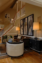
 In this transitional design, I used a traditional federal style sofa. The arms of the sofa mirrored by a traditional roll armed daybed. I paired them with mirrored and chrome contemporary tables and wood and chrome lamps. The latter selection served to lighten and brighten the deep hues and heavier furnishing.
So there you have it ~ juxtaposition 101.
Tell me about your juxtaposition designs; send pictures too! I'd love to see your interpretations!



 You've heard time and time again... Its all in the details. I agree. We've been looking at some before and during pictures of a project and then some of the details. Today's detail is about shape and rhythm ~ two elements I pay very close attention to when I design.


 Posts
Posts