


Home | About | Portfolio | Paula Grace Furnishings | Working with You | Attaché Design | Press | PGD Blog | Contact Us
©2006-20011 - Paula Grace Designs, Inc
| Privacy Policy
Website designed by Digital
Doorway Designs


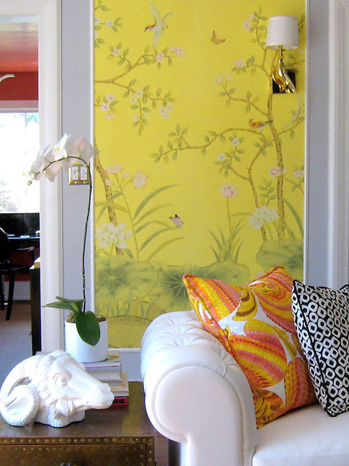
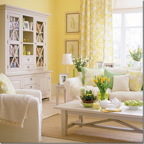
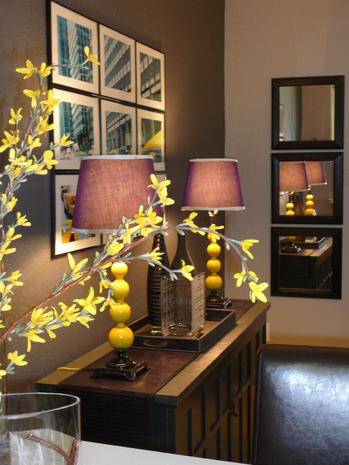
I always feel like yellow is a hard color to get right, but it is wonderful when it works. Blues are so much easier, and mixed they are great!
ReplyDeleteJanell
I love yellow accents in a room. Yellow is such a cheerful color.
ReplyDelete