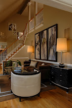
Remember I said in my last post that two of the blue/green silk panels were in my office? Well there they are. Jeff is installing photos of my work. Wow, my office is a mess! I did straighten it though. The bookcase I bought is too small. I'm going to move it to the basement. I'm in search of the perfect piece for my office now... always something!
Showing posts with label art. Show all posts
Showing posts with label art. Show all posts
Sunday, January 22, 2012
A Peak in the Office
Remember I said in my last post that two of the blue/green silk panels were in my office? Well there they are. Jeff is installing photos of my work. Wow, my office is a mess! I did straighten it though. The bookcase I bought is too small. I'm going to move it to the basement. I'm in search of the perfect piece for my office now... always something!

Thursday, December 8, 2011
Beautiful Details
 On Monday I showed you a wide angle shot of this project. Here is a detail shot. You may already know this about me but I love using glass... art glass, glass tile..... I am always mesmerized but the play between light and glass. This leads me to state for the record ~ lighting is critical for great design. You can see I used glass tile that captures the palette. These are illuminated by under cabinet lighting. In this design, I also have lit top cabinets along the entire perimeter of this kitchen. Of course, the shelves in these cabinets are a bit too high for daily functional use but functional use is not why they are there. I designed these cabinets to hold a two art glass series that I love from Cyan Design. They are not terribly expensive ~ GREAT! They are, however, very impactful.

When these glass pieces are illuminated, they are spectacular. The entire perimeter of the kitchen glows with champagne and soft green. Hmmm.... maybe I should take a picture of them in the evening (duh!). Next time :)
More details to come!
Sunday, October 30, 2011
Byron Jorjorian Michigan Trip


 Aren't these lovely? One of my favorite nature photographers, Byron Jorjorian, just came back from a trip to Michigan. The colors are spectacular and the scenes peaceful. I can almost smell the fresh air. I interviewed Byron for my blog a while ago and have featured him before because I have always loved his work. His photographs adorn some of my most enjoyable projects. Thanks for the view Byron!
Sunday, October 31, 2010
Evelyn Avery
 The other day I was invited to the apartment showroom of Evelyn Avery. Evelyn is a fine art dealer among a few other things.
 While perusing her magnificent inventory, if one can even call it inventory given how fantastic they are, I realized her amazing eye for art AND creating the perfect setting for it. What do you mean??!! Evelyn also specializes in custom framing ~ both new material and restoration of antique finds. She has a special gift of marrying art to their frame. I adored the contemporary works in their traditional style frames ~ so unique.
 Meeting Evelyn was a great pleasure. She is relatively new to the DC area. She moved here from Atlanta. The South is in Evelyn's blood. She is full of charm, elegance, and grace. Her long list of clients include the incomparable Barry Dixon. In fact when I entered her apartment showroom, I thought I was in a Barry Dixon designed home as I recognized some of the furnishings as his. When I commented on my observation, Evelyn smiled and fondly spoke of her affiliation with Barry and his designs. They have worked together for many years. And yes, many of the furnishings are from Barry's lines. Evelyn's apartment is the perfect place to view her creations. The main area is full with natural light. The view from her 10th story flat was a lovely addition to the beautiful elements within her walls.

 There are several creations to Evelyn's master eye ~ not only art and frames but mirrors, headboards, furniture, and media screens.


 I was captivated by the media screen idea. I have seen and used mirror, art, and cabinets to conceal televisions but none as sophisticated as her screens. Imagine hiding the black blob with chic art framed with precision and purpose. Take a look...
 I can see specifying Evelyn's screens ~ hand selecting the art, finish, and style. I have a project in mind for this as I type. Lovely, just lovely.
Of course while I was there, I fell in love with a particular piece of art.
 I am partial to art depicting the human form. I purchased this piece not knowing where I would place it. However, I think I found its home. I'll keep you posted on that one.
Here are two more that I really love...

 Hmmm... where can these two live in my home??!!
Everywhere one looks in Evelyn's flat is beauty...


 I could spend days in there just soaking it all in.
I am looking forward to the Tea she is hosting in her Alexandria, Virginia studio. Seeing how her masterpieces are created will be great fun and a valuable learning experience.
FYI ~ Evelyn works with clients directly and with designers. And she offers wonderful service ~ she'll come to you to help select and place art. Her impeccable taste married with your desired look can be yours. All one needs to do is ask. How lovely is that?
Thursday, August 5, 2010
Conversation with Lauren
 I have posted conversations with Lauren that leave me in awe before. This time is no different. You know I love art ~ can't live without it really. This is a painting I have in my home by Victor Klauss (represented by Art & Frame Source). I love it. When I look at at it, I see a women sitting, bent over perhaps out of exhaustion. Lauren said to me the other day, "Mommy, I don't see a women. I see a lion." She preceded to point the lion out to me. As soon as she literally pointed it out, I saw it too. Amazing! I love abstract art because people can see different things so each person's experience of it is their own. Lauren is a very confident, vocal little girl. It doesn't surprise me that she saw a lion. What does that say about me then when I see an exhausted women?? Hmmm??.....
What do you see?
Monday, June 28, 2010
Timeless Tuesday Number Twenty One
 Welcome to Timeless Tuesday #21! Wow, Timeless Tuesday can legally drink alcohol ~ sounds like a martini night for me!!
Seriously ~ you may have noticed the lack of posts lately. So sorry! I have been very busy with work AND the Gala. What Gala you ask?? Take a look at yesterday's post. It is very rewarding and very time consuming.
Today I am posting about the ever classic art. What type of art? It really doesn't matter. Art is in the eye of the beholder just like beauty. For me designs can be inspired by a piece of art or they can complete the design with their presence. I posted about my bedroom that was inspired by a wonderful Victor Klauss piece.

That is a passionate design.
Even in my my tweens' rooms, art plays an important role. The art I selected reflected each girl's personalities and likes.

 I know I only represent wall art in this post but art is vast and in many forms. For me ~ a room in not complete without the art. It will always be a timeless need for me ~ always.
Now it is your turn to share your posts about classics or trends you hope become timeless...
1) Add your permalink below ~ not your blog's address in general but the specific post you want people to visit. To obtain the actual post link, click on the title of your post once you have published it and copy and paste the URL into Mister Linky.
2) Leave your name and say a couple of words to describe your post (e.g. "Coco Chanel suits" or "Classic interior design for children" or "Delicious meals in a snap."
3) Copy and paste the Timeless Tuesday logo button (on my right sidebar) to your Timeless Tuesday posts. This is a sure way for your readers to know you have joined in the party.
4) Link back to the host blog, that's me ~ Paula Grace Designs Blogspot Timeless Tuesday ~ so all the bloggers that joined the party will receive many interested visitors.
Sunday, April 25, 2010
Monday's Method
 Welcome to Monday's Method! This is the day of the week I answer interior design questions. Today we have two for the price of one :) Sweet Sheila (wonderfully sweet ~ she's the type I'd hug upon meeting!) of the lovely blog, Note Songs, writes in with this question...
Hi Paula,
Well, I got to thinking about us asking you questions, so I will. My living room is still a work in progress. I love my Ralph Lauren sofa. It was a discontinued line and we got a fabulous deal. Anyway, I have two winged back chairs covered in a tapestry fabric that I was going to have recovered. I've changed my mind and am going to keep my beloved wings and put them in another room. I'm going to be on the lookout for new chairs for the living room. Well, to make my long story short, I would love an accent color for some pillows on the sofa and am having a hard time deciding. The walls are painted a soft mossy green, I made my drapes in here and like them. I have a center entry with the living room on one side and dining room on the other and this color of green is on both walls. The drapes are the same also just a different beaded trim. I'm not finished with the wall behind the sofa either. I'm thinking of hanging a couple of small prints on either side of the big picture or maybe hanging some little wall shelves I have.Any advice you can give me would be great.
Be a sweetie,
Shelia ;)
The photo at the top if of the beloved Ralph Lauren sofa. Here are a few more photos to give you a sense of Sweet Sheila's style...


 Sheila, you have a lovely traditional style. The color palette of reds and greens is classic. Beautiful! I see how an an accent color may be a bit tricky. If you accent in a darker green, it may look a bit Christmasy all year round.
My choice for an accent color would be blue. Fabrics that incorporate a hue already in the room and blue would be an excellent choice. Here are a few samples from Robert Allen / Beacon Hill to illustrate...


The two are a rich, highly saturated blue. The left is a Beacon Hill fabric ~ Arno in the colorway Berry Blue. This fabric has the red and the cream of the sofa. The right one is from Robert Allen ~ Aigrette in Navy ~ but also incorporates a nice green hue. Note that the patterns are an organized geometric yet traditional. This would be a nice contrast to the curvy motif on the sofa fabric.

These two are a medium tone blue. The left is from Robert Allen ~ Barnyard in Twilight. It incorporates the green and the cream plus the toile-like motif would marry well with your style. The right is Betty in Navy. This is a lovely, sweet fabric incorporating all three color in the room (red, green, and cream) plus adds the blue.
With the addition of a blue, the accessories that you spoke about adding may incorporate blues. This will enhance the harmony in the room. You already have fabulous unity with style and color. Adding blue would bring in a pinch of diversity for added interest. How wonderful!
This is a French Country design I did for a lovely family. The color palette is yellow, red, blue, gold, ivory, and a hint of green. The pillows incorporate most of the colors. The green comes in the form of topiaries and lamps. What do you think? Do you like the way the pillows marry all the colors and then there is a different hue ~ green ~ in the lamps? That just gives the room a bit more interest. By the way, the lumbar and chair pillows are reversible. See how the chair pillow has an ivory background and the lumbar ones on the sofa has a gold background? Each has the other fabric on their flip side. This is an easy way to get more bang for your buck. You may change out the room based on season or your mood by simply flipping the pillow over.

I hope this helps Sheila! I'd love to see what you do!!
Jane also writes in...
Hello, Paula --
How kind of you to offer decorating help! I have a family room sofa that sits off center on the wall. I have a small group of large canvases I would like to hang on that wall ... do I center them on the wall or specifically over the sofa?
Thank you for giving some thought to my design dilemma.
Jane
This is a very good question. One that many struggle with. The art needs to be in relation to the sofa ~ meaning that canvases need to be centered over the sofa. Also, they should not sit to far above the sofa either. Take a look again at the French Country design above. See how the art follows the line of the sofa back? The art is in relation to the sofa. Here are some other examples from my portfolio... Note the art centered over the sofa and practically sits right on the chair rail as these pieces are quite tall...
 Again, not too far off the back and centered on the long side of the L shaped sectional...

This vignette has the art as the focal point. Literally all other pieces surround the art.
Centering it over the sofa may then leave the room feeling off balance. You may need to augment by adding a tall furnishing(s) to the side of the sofa that has more exposed wall to provide balance. This would be an asymmetrical balance done by the eye. In the last vignette ~ the floor lamp was placed first. There was a wall expanse to the left of the art so I added the large scale vase. The lamp backed by the ivory silk drapes is nicely balance by the large scale textured ivory floor vase.
There you go Jane! I hope that helps. Let me know how it turns out.
If you have interior design questions, don't hesitate to leave it in a comment. If you have questions about a specific room or space, email me a couple of pictures to paula@paulagracedesigns.com. Please note 'Monday Method Question' in the subject line.
I am linking with these fabulous blogs. Each deserves a nice, long visit...
Monday ~
Between Naps on the Porch Metamorphosis Monday
Little Red House Mosaic Monday
Tuesday ~
A Soft Place to Land DIY Tuesday
Thursday ~
The Shabby Chic Cottage Transformation Thursday
Saturday ~
Funky Junk Interiors Saturday Nite Special  See you tomorrow for the Timeless Tuesday link party!
Wednesday, January 20, 2010
A Map in Time
 Gorgeous! Isn't it?! This is a map of London 1827. I find these reproductions extraordinary.
 Florence 1910
 Naples
 Paris
Paris Stockholm
 Venice 1910
The originals are from a collection owned by the well known antique dealer, Rudy van Thiel, Jr. His private collection. In 2009, he decided to share his beauties with the world. Exquisite reproductions are now being made. Here is how Mr. Van Thiel describes the process...
"I started collecting old coins and maps when I was twelve years young. Browsing flea markets, yard sales and local auctions was pretty normal in our family. By 2007 my bounty of maps had grown to several hundreds and we decided to add some of them to our collections.
We put a team together and started experimenting with how to create a replica that would reflect the authenticity and warmth of my originals. I also started hunting for maps that would fill in the gaps and cover almost all countries in the world as well as many provinces and states.
After more than a year of hard work, in the spring of 2009 we introduced The Map Collection.
Each of our hand made map reproductions is placed on canvas, a technique used in the old days to create a folding travel map. Each map comes in several sizes. Most frames are hand finished by our great team of antique restorers. After an order for one is placed, we start custom making that unique map."
I have shown just a small sample. His collection spans many continents, countries, and cities.
I love placing these in studies, dens, and family rooms. Placing a country of my clients' heritage or a special city has proven to be a wonderful personal touch.
Do you have a special place?
Subscribe to:
Posts (Atom)


 Posts
Posts