About Interiors FurnishingsWorking with You Attache Design Press PGD Blog Contact Us
Showing posts with label design theory. Show all posts

Tuesday, July 17, 2012

Read My Article on the Psychology of Design


Have you ever felt dissatisfied with the way your home looks or feels, without quite knowing why? Read my article, The Psychology of Interior Design, published in the Washington DC Women's Weekly and find out why.  This is a topic near and dear to my heart.  It is how I approach interior design.  A very personal experience for each one of my clients.  Let me know your thoughts.

Thursday, May 31, 2012

Will Clarity Help You Design Your Home?

If you read my blog at all, you know I write a lot about the principles and elements of quality design.  But is that really where a design starts?  Nope.  The principles and elements are lenses.  I will write more about that soon but right now, let's really start at the beginning.


Jump right into buying!  Um.... NO!  Stop, take a breath and read on...

There are some things that need to be defined and understood first.  This is a critical phase of any project and often overlooked.

First we need to understand the space we are going to be doing.  What does that mean? 

1)    It means we need to know if the space is a public portion of your home such as your family room or a private part such the master bedroom.  This is important because if it is a public portion of your home it will be important for all the public spaces to have a rhythm, a flow, so ones senses are pleased when leaving one space and entering another vs. having your senses jarred because the room you just left has no connection to the room you just entered.  This is particularly important in open concept floor plans.  Private space will have internal rhythm but doesn’t necessarily need to connect with the surrounding rooms. 


2)    It also means we need to know what people will be using the room, how many of them and what will they be doing there.  For example, how many people will need to comfortably sit in the room on a daily basis?  What about when you entertain?  Are there any special needs like an elderly person or small children? What are the tasks and activities that will occur in the room (e.g. watching television, playing Wii, reading, napping…)? A critical room for this to be examined is the kitchen.  How do you move though the kitchen, what are your motions while you are cooking?  Define, define, define in order to create a room that is functionally perfect first.  The saying 'form follows function' is absolutely true.  Once you know who will be in the space and what they will be doing there – function – then the form will flow from there.


3)    Measure, measure, measure then measure again.  Do a drawing with detailed measurements on it.  If you don’t have software to help you with this, good old fashion graph paper is just fine.  Draw the room once and make several copies of that drawing so you can try several space and furniture plans – or layouts - to accomplish the functional aspect you already identified.


4)    Define the feeling of the space.  How do you want to feel in this room?  How do you want others to feel in this room?  What do you want the room to portray or reveal about you?  You may want a different feel in different rooms.  A family room may be comfortable, warm, and cozy to spend time with your loved ones.  I living room elegant and sophisticated that portrays your success.  What feel and portrayal of you in the space in a very important aspect and needs to be considered every step of the way.  The feel helps keep you focused.  There is so much product out there, so much stimuli it can be overwhelming.  You may have defined the feel of the room as warm, cozy, kid friendly but go over to your friend’s house and see this sleek, leather sofa and think to your self “I love it, I want that!”  Whoa nelly.  If you put that sleek sofa in your warm and cozy room, is it going to be warm and cozy?  Is it going to seat you and your kids comfortably to snuggle up on? 


In summary – define, define, define. Define who and what, define the measurements, define the feel.  Form follows function.  The style will be born from in particular, the feel and what you want the space to say about you.  And, after function, aren't those two things the most important elements ever?

Wednesday, May 16, 2012

Does Balancing What's in Your Home Help Your Life?


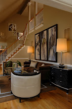
Balance matters in your home.
Balance is an important design principle. I was thinking about this the other day because of a project I am working on. This project has odd windows placement making window treatments difficult to implement. I will be suggesting the windows be changed as it would bring a much better sense of balance to the room and the homeowner can get the panels framing the windows he so desires.

 Why is balance so important? 
We all crave it in our lives. Work time, family time, play time... we would like to achieve some sense of balance in our lives. It is no different when designing your home. What is balance when it comes to interior design? Balance is equilibrium both visually and psychologically. Balance pleases our senses and soothes our souls. The example above is balance though symmetry ~ mirror images from a center point. This is considered the most formal type of balance. It is lovely and very pleasing.


What if 'perfect' balance doesn't suit your eye and heart?
But what if mirror images simply cannot be done or it feels too formal for the desired outcome. Above is an example of asymmetry ~ optically varying items from a central point to achieve balance. The central point above is the art work. Note the floor vase with a great amount of mass. On the right hand side, the lamp is very similar in height to the vase but clearly doesn't have the mass to balance the vase. The chair adds the needed mass to gain a sense of balance. I used a grouping to balance the vase. The vignette is very pleasing and draws one into the center (the focal point) using asymmetrical balance.

Maybe a little of both will be the secret to happiness.
The picture at the top and the one just above are in a master suite.  These two forms of balance adds to the harmony, another design principle, in the room. The two types of balance, symmetrical and asymmetrical, adds interest to the room. Clearly the palette unifies; the type of balance adds the variety.


Can we talk?
What about this Jay Jeffers' design? This is radial balance ~ equilibrium based on the circle. Stadiums are often based on radial balance as the focal point is at the center.  Everyone can see the football game because they are sitting all around it.  A round dining table offers radial balance as everyone sitting at the table can see everyone else at the table.  This is a type of balance near and dear to my heart.  You may know I was a psychotherapist in my past career with a specialty in group psychotherapy.  I would arrange the circle perfectly so each member could see the other.  This fosters good communication.  The focal point really is each other.  It is easy to see the radial balance of a stadium and a round dining table but what about real life furniture arranging.  Jay did a nice job here.  The sectional forms half the circle; the single chairs the other half.  There is a fireplace and art as a secondary focal point but I see each other being the primary one in this vignette.

So what type of balance is right for you and your room?  
It all depends on what you're trying to accomplish and the space you have to work with.  Symmetrical can feel more formal; asymmetrical more artistic; and radial more communicative.  I have all three represented in my home.  That variety is simply pleasing to me. What about you?  Do you lean more towards one or the other?

Sunday, March 11, 2012

Skip Sroka

This is the work of my friend Skip Sroka, interior designer extraordinaire. This project is featured on the Home & Design website right now so you can read all about it. When I came across these pictures though, I thought they were exceptional examples of the principles and elements of good design. Case in point, the room above is a perfect example of how symmetry done well makes for calm and pleasing outcome. The palette also lends itself to the classic as these neutrals will never tire. Note the ceiling in this first picture, the subtle architectural detail, and how it is carried throughout for wonderful interest and flow. This gradation is also seen on the fireplace surround. Lovely rhythm.

The softness of the palette is remarkable showing perfect restraint. I love the floor detail. It is not overpowering; it is simple, elegant, and classic.

The ethereal beauty of the palette and furnishings is so calming.

The banquette is so inviting in this room it just draws me in. I literally want to spend time here.

Soft, spa-like.

Note the repeat motif from the hard wood floor in the dining room on the carpeting. What a wonderful connection from the public to private space.

This home will be as in style in 10 years as it is right now. Why? Because of the attention to detail and excellent editing. The most complex pattern seen is still organized and repeated in at least two places. This makes the senses happy ~ they note the familiar pattern and feel comforted at the same time a bit exhilarated from the punctuation. Simply magnificent. But that's Skip. Kudos!

Friday, February 10, 2012

Accessorize this Room...

Salon with Custom Plaster Ceiling traditional living room


A couple of days ago, I posted this room by dSPACE compliments of Houzz and asked if you like the ceiling. Between here and Facebook, folks in general, liked the ceiling. A point made was the room could become busy when fully accessorized. I agree so I did a brief search of accessories given my thoughts on what would be lovely in the space.

Here's my thinking ~ keep the room simple. Add white, textured, architectural groupings to the shelving similar to these...


The white color and form of each piece would pop off the gray. For a splash of color on the cocktail table...


a deep red charger. And for the side table...


the same color as the charger. The accessories compliments of Global Views.

I didn't venture into pillows and art. I just pulled the ones above out of thin air really based on form, texture, and color. It would be wonderful if the homeowner had a collection of something simple to display. But for a design exercise, I love the simplicity of the accessories above.

How would you accessorize in this room?

Wednesday, December 14, 2011

Shape and Rhythm Details

You've heard time and time again... Its all in the details. I agree. We've been looking at some before and during pictures of a project and then some of the details. Today's detail is about shape and rhythm ~ two elements I pay very close attention to when I design.

In the detail picture above are the table, chairs, and chandelier I selected for the kitchen. First, the chandelier and table base have contemporary lines and finished in chrome ~ a nice connection. To warm it up and mix materials and periods, I used reproduction 19th century Parisian brasserie wooden chairs. To connect the great divide in material and periods, I echoed a shape. Note the soft V-like shape of the chandelier arms and the back of the chair. The eye is drawn to the shape connection adding a lovely vertical rhythm. I love that.

Do you see it?

Wednesday, May 26, 2010

Thursday's Room

dominomag- eclectic pastel living room eclectic living room

This is different type of room from what I am normally drawn to ~ at least palette wise. But this room captivates me and draws me in. I am completely smitten with it. Why? Let me tell you... You know I am a fan of Houzz where I found this lovely photo. I continually go back to Houzz to check my idea folder (I only have one) to see if I am still attracted to what I have placed in there. Some I still love, some I wonder why I even put them in. But this one still makes me smile every time. Why?! It is a happy room with a wonderfully sweet color palette and just enough pop to satisfy me. It also has lovely variety. At first, all I saw was the soft blue. I love blue ~ a big fan. Usually, it is not the powder blue types but I don't see this as powder blue. The wall has a smidge of red in it leaning it toward the lavender and the chair fabric has a touch of gray making it easy on the eye and giving it staying power. Then I noticed the wonderful pinks, green, and orange ~ some not so soft and a great contrast to the blues. A bold motif on the back of the chair serves almost like a wink inferring 'I'm not always a kitten'. The painted panels on the doors give my eye a great rest and interest to absorb. They also add a rhythm dancing across the room. After the colors, panels, and motif, I noticed that all the chairs are different offering unique seating ~ something for everyone. How considerate! All furniture has exposed legs ~ I love nice legs (on almost anything). Soft and sweet, sexy and sassy all at the same time. Hmmm... maybe that's why I can relate so well to this room ;)

Sunday, April 25, 2010

Monday's Method

Welcome to Monday's Method! This is the day of the week I answer interior design questions. Today we have two for the price of one :) Sweet Sheila (wonderfully sweet ~ she's the type I'd hug upon meeting!) of the lovely blog, Note Songs, writes in with this question...

Hi Paula,

Well, I got to thinking about us asking you questions, so I will. My living room is still a work in progress. I love my Ralph Lauren sofa. It was a discontinued line and we got a fabulous deal. Anyway, I have two winged back chairs covered in a tapestry fabric that I was going to have recovered. I've changed my mind and am going to keep my beloved wings and put them in another room. I'm going to be on the lookout for new chairs for the living room. Well, to make my long story short, I would love an accent color for some pillows on the sofa and am having a hard time deciding. The walls are painted a soft mossy green, I made my drapes in here and like them. I have a center entry with the living room on one side and dining room on the other and this color of green is on both walls. The drapes are the same also just a different beaded trim. I'm not finished with the wall behind the sofa either. I'm thinking of hanging a couple of small prints on either side of the big picture or maybe hanging some little wall shelves I have.Any advice you can give me would be great.

Be a sweetie,

Shelia ;)

The photo at the top if of the beloved Ralph Lauren sofa. Here are a few more photos to give you a sense of Sweet Sheila's style...

Sheila, you have a lovely traditional style. The color palette of reds and greens is classic. Beautiful! I see how an an accent color may be a bit tricky. If you accent in a darker green, it may look a bit Christmasy all year round.

My choice for an accent color would be blue. Fabrics that incorporate a hue already in the room and blue would be an excellent choice. Here are a few samples from Robert Allen / Beacon Hill to illustrate...


The two are a rich, highly saturated blue. The left is a Beacon Hill fabric ~ Arno in the colorway Berry Blue. This fabric has the red and the cream of the sofa. The right one is from Robert Allen ~ Aigrette in Navy ~ but also incorporates a nice green hue. Note that the patterns are an organized geometric yet traditional. This would be a nice contrast to the curvy motif on the sofa fabric.


These two are a medium tone blue. The left is from Robert Allen ~ Barnyard in Twilight. It incorporates the green and the cream plus the toile-like motif would marry well with your style. The right is Betty in Navy. This is a lovely, sweet fabric incorporating all three color in the room (red, green, and cream) plus adds the blue.

With the addition of a blue, the accessories that you spoke about adding may incorporate blues. This will enhance the harmony in the room. You already have fabulous unity with style and color. Adding blue would bring in a pinch of diversity for added interest. How wonderful!

This is a French Country design I did for a lovely family. The color palette is yellow, red, blue, gold, ivory, and a hint of green. The pillows incorporate most of the colors. The green comes in the form of topiaries and lamps. What do you think? Do you like the way the pillows marry all the colors and then there is a different hue ~ green ~ in the lamps? That just gives the room a bit more interest. By the way, the lumbar and chair pillows are reversible. See how the chair pillow has an ivory background and the lumbar ones on the sofa has a gold background? Each has the other fabric on their flip side. This is an easy way to get more bang for your buck. You may change out the room based on season or your mood by simply flipping the pillow over.


I hope this helps Sheila! I'd love to see what you do!!

Jane also writes in...

Hello, Paula --

How kind of you to offer decorating help! I have a family room sofa that sits off center on the wall. I have a small group of large canvases I would like to hang on that wall ... do I center them on the wall or specifically over the sofa?

Thank you for giving some thought to my design dilemma.

Jane


This is a very good question. One that many struggle with. The art needs to be in relation to the sofa ~ meaning that canvases need to be centered over the sofa. Also, they should not sit to far above the sofa either. Take a look again at the French Country design above. See how the art follows the line of the sofa back? The art is in relation to the sofa. Here are some other examples from my portfolio...

Note the art centered over the sofa and practically sits right on the chair rail as these pieces are quite tall...

Again, not too far off the back and centered on the long side of the L shaped sectional...


This vignette has the art as the focal point. Literally all other pieces surround the art.

Centering it over the sofa may then leave the room feeling off balance. You may need to augment by adding a tall furnishing(s) to the side of the sofa that has more exposed wall to provide balance. This would be an asymmetrical balance done by the eye. In the last vignette ~ the floor lamp was placed first. There was a wall expanse to the left of the art so I added the large scale vase. The lamp backed by the ivory silk drapes is nicely balance by the large scale textured ivory floor vase.

There you go Jane! I hope that helps. Let me know how it turns out.

If you have interior design questions, don't hesitate to leave it in a comment. If you have questions about a specific room or space, email me a couple of pictures to paula@paulagracedesigns.com. Please note 'Monday Method Question' in the subject line.

I am linking with these fabulous blogs. Each deserves a nice, long visit...

Monday ~
Between Naps on the Porch Metamorphosis Monday
Little Red House Mosaic Monday

Tuesday ~
A Soft Place to Land DIY Tuesday

Thursday ~
The Shabby Chic Cottage Transformation Thursday

Saturday ~
Funky Junk Interiors Saturday Nite Special

See you tomorrow for the Timeless Tuesday link party!

Wednesday, March 17, 2010

Thursday's Room

Carlyle Penthouse eclectic living room


This room is the work of Riehl Designs, Inc. Photo compliments of Houzz. I love the soft blend of pattern, texture, and shape (including the interesting ceiling fixtures). The white rhythm from ceiling to floor and down the center catches my eye. It's contrast with the deep hues really makes them pop. I have been fascinated lately by the drapeless window. Here, I really see why. Not only is the white a lovely pop and rhythm, it looks so lush and billowy that it adds the softness that would come from fabric framing the windows. I love red-orange and for me, this is just the right amount to use. The zig zag beat to the red-orange and ultimately being grounded by it is the jazz next to the white symphony ~ love it. All of this music is enveloped safely in neutrals. This is how a room does not get out of control. You should hear the music but not dance right off the stage. Nicely done ~

Wednesday, February 24, 2010

Thursday's Room

I seem to be looking at a lot of dining rooms lately. I think it is because I am itching to have a dinner party. This one by Charles Allem, principal designer for CAD International, published in Architectural Digest caught my eye. It doesn't have the round table that I am drawn to but this octagon table is quite chic. I like the way the angles are used to place a dinner guest at the table.

The first thing I notice is the scale and proportion of the room, table, and that magnificent light fixture. The direct linear relationship appeals to me and the horizontal balance is comforting. I have always been attracted to long and lean objects. Perhaps it mirrors my own image being 5'8" and lean. The shape of the table and shape and form of the chandelier pair well. Unusual enough for maximum interest.

This particular chandelier not only illuminates but add textures, depth, and dimension to the fifth wall in the room and highlights the simple architectural detail. I see it as the focal point with the table as a close second. The remaining furnishings are in supporting roles ~ simple and elegant.

I also enjoy the neutral palette. If you read my blog, you know I love neutrals. They allow you to pop with color or a detail such as this chandelier. If the palette had more color or the drapes and chairs pattern, it would detract from the focal point(s).

The room as a whole is elegant yet comfortable, chic yet cozy. I think that can be a hard combination to achieve. Apparently not for Mr. Allem. Bravo!

Sunday, February 21, 2010

Monday's Method

Welcome to Monday's Method. I received an email from Sari with a dilemma ~

Paula,

I found your website through your guest blog entry on
Brooklyn Limestome about advice arranging furniture. My fiancƩ and I are interesting in purchasing a house but how to arrange furniture in the living room, a very important room, is quite puzzling to us.
This is the living room-


You can see if you make a right (I think you mean left) at the front door, it leads to the living room with the fireplace. Behind the single black chair is a doorway leading to the basement. To the right of the TV is another doorway that leads to the kitchen area. We don't want to block anything off. How can we possibly arrange the furniture to access the television in the best way? We feel like any way would be awkward/leave empty space or have a far view from the television. We like L shaped sectionals where the most people can view the TV at an optimal angle. The dimensions are 23’ x 11’. We want the fireplace to be a focal point, perhaps hang a flat screen over it, but we don’t want to block things off.

Can I please ask you for your expert advice???? What do you think??
-Sari

Sure, you can ask for my advice!

First let me say that this is wonderful space. So open and clean. It appears very spacious but I see your dilemma. When I look at this, I immediately see that the windows are not symmetrical, which may have posed some problems for the current home owner's furniture plan. I am thinking that the portion of the ceiling that is lower is functional in some way or why would it be there. I am assuming it needs to stay. The second thing I notice is that the fireplace seems disproportionate to the room as a whole and the style is fairly traditional with contemporary architecture. I know, I know... you asked about furniture arranging but it is all related for me.

When I have a long narrow room like this, I think of zones but a bit of construction would need to be done to make that work given the fireplace and television is your aim as the focal point. Let me just say upfront, I think a bit of construction is needed for either of my suggestions but please don't hyperventilate. A home is worth a bit of elbow grease especially a beautiful home such as this.

Here is one option (a caveat ~ I was not sure where the door was next to the existing television so I drew it two ways ~ it was too late to email as I worked on this late at night)...


In this option, I have removed the fireplace from the long wall altogether and repositioned it along the wall opposing the large window. The striped area indicates a build out to accommodate a fireplace consistent with the architecture and your flat screen television. In this option, you have your L shaped sectional and another seating area with swivel chairs for extra guests. The chairs may be moved closer to the TV for the big game or movie night but should return to their original placement afterwards. If this is how the door is positioned (above), I would extend the build out the width between the door and the wall for a clean line.


If the door to the kitchen is positioned like this, I would do a build out as such an add sconces. This option accommodates a 42" television. Note, the windows remain the same. You could make them symmetrical if you are going through the construction to move the fireplace. It seems the right window must stay put given the jut from the ceiling so the left could be moved further left, equal distance from the outer wall as the right one. This would give you a lovely wall expanse for art. I have moved the window in the next option....


If you would prefer this orientation, that's fine too. This has less seating available but it also is an interesting look. This is a long sofa finishing with a chaise. I did move the window to be symmetrical providing us with a great wall expanse for a linear fireplace. The custom cocktail table would be 18" high; the fireplace would be placed at 19" ~ just above the table; next, the television would be placed just above the fireplace. This will keep the TV at eye level when seated. Here is why you may choose this option ~ it accommodates a 52" television. Aaahhhh!! "I see" says your fiance, "more screen for me." Hmmmm??!! Gives you something to think about. This option would also require a build out but I'm not sure how much. I drew the largest build out it could need and the design still works well.

In either option, you can see the door swing in the drawing and FYI, there is a three feet traffic path when the basement door is closed. An ample walkway.

No, I didn't do this drawing out of thin air, I specify furnishings of course.

The sofa/sectional in either option is the Garland by Zagaorli. I love, LOVE this sectional. It is beautiful, transitional style and very comfortable.


In option one, there is a corner sofa and a love seat. In option two, there is a sofa, armless love seat, and a chaise.

Option one also boasts the Joseanne Swivel chair from Hickory Chair; and case goods from Worlds Away.


The second option has the Lorenzo Cabinet from Hickory Chair opposing the large window and the round straight lined side table above.
But what about the focal point Paula Grace??!! What about the fireplace?? Yeah, that is the best part!

For option one ~ The Crystallo (with or without decorative surround)...


For option two ~ Linear...


These fireplaces are from Napoleon. They do not require outside venting. All they need is gas and electricity. The beauty is that they may be placed at any height such that if you place a television above it, the television can be a eye level when seated. No neck ache, no tilt down mechanism required. I also think they are more in line with the architecture of the house you are considering. The furnishings in the fireplace pictures is quite contemporary. The sectional I choose is less so, a bit softer but still clean lined.

So there you have it Sari! I hope this helps you with your decision process. Let me know how it goes.

If you have a question about this or another topic, leave me a comment. If you would like advice about something specific to your space, send me a couple of pictures at paula@paulagracedesigns.com.

I'm linking with these lovely ladies ~ all fabulous parties worth a long leisurely visit.

Monday ~
Between Naps on the Porch Metamorphosis Monday
Little Red House Mosaic Monday
Cottage Instincts Make it for Monday

Tuesday ~
A Soft Place to Land DIY Tuesday

Thursday ~
The Shabby Chic Cottage Transformation Thursday

Saturday ~
Funky Junk Interiors Saturday Nite Special

See you tomorrow for Timeless Tuesday!

Blog Widget by LinkWithin