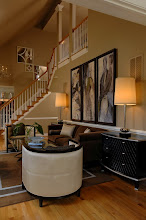
We all have our usual haute showrooms when going to Markets. I wanted to show you a few of mine and then another trend I was seeing. One of my usuals wasn't at Market this time. These things concern me because the economy has put such a strain on the industry that I wonder if all will come out the other side. I hope so. There are some smaller companies out there that make
exceptional furnishings that are struggling. Even some large ones too but they can restructure, sell off or drop components so their large corporation may gain capital. Not so for the smaller ones. That's what concerns me; makes me sad really. But on with some usuals that seem ok ~ for now.
Up first, Palecek. You saw the top photo yesterday (worth repeating). Here's a fact about Palecek ~ their a green company ~
and always have been.
 This is a beaded leaf motif
.
 Etched wood.

 They introduced a glass series that is gorgeous at a very nice price point!
 Love this new introduction chair ~ front and back.
  I also adore the table next to it. Simple and beautiful.
Next, Global Views. You saw a lot of them yesterday with the gray and orange color trend. Here's a few more interesting pieces.....

 Here is a new take on wall decor ~ a open rose. Its extension is about 10" so it can't be placed in a narrow hallway but wow, these were awesome. They have small buds and open roses. A grouping of these on a tall wall would be quite interesting and lovely.
 Wonderful crystal ball sconce.
 They have a collection of bronze ~ brown pieces that I adore. That's my favorite neutral.
 Accent table ~ quite sculptural.
 Gorgeous new dining table.
Worlds Away. They are known for their metal and mirror but are also gaining popularity with these accent pieces. What I really like about these ~ they all offer storage and can be used in many applications......
 A demilune wow factor.
 Organized glamour.
 Asymmetric glamour ~ these come in mirror images so they can be symmetrical with one on either side of a sofa. I particularly like these ~ they add interest. You can see me taking the picture... mirror.... what are you gonna do??! The star burst are also a reflection ~ not part of the piece :-)
Hickory Chair. I only took a few pictures ~ you saw some yesterday. For in depth coverage, check out
Habitually Chic ~ Heather covered them very well. I'll be going to Hickory Chair University in November. I'm looking forward to that.
 I love this soft pink bed. Very feminine.
 An Alexa Hampton chair ~ wonderful, front and back.
You may wonder why I keep showing and saying front(s) and back(s) of chairs. Each are equally important for aesthetics. Chairs often float thus seeing 360 degrees of the chair. Look at Alexa's chair. It is a tub chair but note the wood embellishment and nail head, the extension of the 'arms' out as if stretch out to catch or embrace you. It is quite inviting by its shape and form. I kept coming back to this chair (or maybe I was just going in circles ~ it is easy to in their showroom :-) I doubt it though. This was my favorite piece in Hickory Chair. Double click on it to see the detail.
Now for a trend I saw. Yesterday, I covered the color palettes. Today ~ pendants. They were everywhere. I saw
many, many pendants made of natural materials. All were simple shaped. The ones I liked the best were at Jamie Young....

 They are soft and elegant. I can see using these is many rooms ~ sun rooms, powder rooms, flanking a bed.....
 These glass pendants were introduced at last Market but I did not see them. They are beautiful glass enchanted with silver and banded at the bottom. Quite retro too! Again ~ many places these beauties can go.
These little numbers below are from Arteriors Home.....


The thing I like about smallish pendants is they may be hung as a solo piece or in a grouping at varying heights for interest, in a straight line for organization ~ but all add interest and a bit of
sparkle even if being used for general or task lighting. I'd like to mix the glass pendants from Jaime Young with the first Arteriors' pendants in a grouping. I think those forms together would be harmonious ~ united by the silver and light ~ divergent by material, concentration of silver, and shape.
Yum!Lastly, we have Luna Bella. I wish the picture wasn't so dark ~
sorry! These are glass beads hanging in acrylic spheres with gold and pewter distressed castings. I know, I know, your thinking Halloween but they aren't as dark as they appear. I love them. They have funky powder room written all over them!
There you have it, Part II of Fall High Point Highlights. Tomorrow I will drop names and report on green resources ~ I figure I'll still go to heaven if I behave in a sinful and moral fashion in the same post ~ right??!
If you have not voted on the E~Design Giveaway ~ click here and cast your critical vote!



 This is the Milo Made to Measure (Milo M2M) Console by Hickory Chair. That is exactly what it is ~ made to measure. Plus Hickory Chair has so many finish selections, one is bound to work well.
 These are the Skinny Consoles from Worlds Away. I have placed these so many times. They are truly thin ~ 10" max. These are wonderful when space is at a premium. They come in hammered gold and silver and gold and silver leaf so literally they can accommodate any decor. The shelves make them easy to personalize.


 Posts
Posts