About Interiors FurnishingsWorking with You Attache Design Press PGD Blog Contact Us
Showing posts with label House Beautiful. Show all posts

Friday, July 30, 2010

I couldn't agree more!

You all know how much I love to read the Washington Post on Thursday at lunch time. Yesterday was no exception.

Newell Turner's first House Beautiful is out! This is not the cover but what a fantastic cover this is!

Terry Sapienza did a great interview with Mr. Turner. His words of wisdom are fabulous. He knows who he is. We see eye to eye on the space thing and how to really sample paint colors. I have given that advise to clients hundreds of times. I think I even blogged about it. I love House Beautiful and I feel it is in good hands. Give the interview a read. It's short and sweet.

I thought I was a guest writer today on Finding Fabulous ~ um ~ no. It was yesterday that I was to guest write. I didn't get my post to her until last night ~ I had my wires crossed. Silly me! Jane, being very gracious, is running it next Tuesday. Stay tuned.

Enjoy your weekend!

Sunday, May 23, 2010

Monday's Method ~ Blue

No one asked for advice for today and I am tired of showing you new product in the market. So I finally decided to read some of the articles I have saved that intrigued me. If you have seen pictures of my home, you know I am a fan of blue. I love steel blue in particular, which is what I have in my living and sun rooms.

My living room is at the top and here is my sun room. The steel blue is paired with neutrals. I have always loved blue so when I finally got around to perusing House Beautiful's story of blue since the 1930s, I found myself smiling a lot and enjoying almost every picture. Let me show you a few of my favorites...


February 1938; April 1940

Amazing ~ the 1938 design could be done today and still considered fresh. The blue with the chocolate brown ~ love it.


February 1950; June 1953

Isn't that the color in 1950 that is En Vogue this year? The 1953 design is priceless and if implemented today, I would still be drawn to it. I love the touch of red. Remember that touch.


January 1959; November 1965

The palette in 1959 is similar to my home now. There's that color again in 1965 ~ similar to 1953. I love those chairs. There is that touch of red again.


January 1969; September 1982

That is one lovely outdoor space. There it is again in 1982 - shades of turquoise.


December 1984; November 1993

The 1984 one is my favorite. That is a timeless room. In the 1993 room, the wood tones with the blue is striking.


August 2009.

Now we have more than a touch of red with the blue. We have a pairing. Note the back of the chairs. I love this color combination and apparently others have too over the decades.

It is interesting to me how colors, blue in this case, and color pairings come back. I think if a room is done well, it can be down right timeless and always seem 'just completed.' That means it didn't come back ~ it never went away. And that, my friends, is design done well.

If you have a design question, please leave me a comment. That is what Monday's Method is all about. If you have a particular concern with your space, send me a couple of pictures to paula@paulagracedesigns.com. Place Monday's Method in the subject line.

I'll see you tomorrow for Timeless Tuesday. I have a bit of a twist for tomorow's timeless classic.

Monday, March 15, 2010

Timeless Tuesday ~ Seven

Welcome to Timeless Tuesday! Today I am writing about a Design Day at the Washington Design Center. It was a lovely day full of great people, interesting learning, and fantastic new products ~ this list is always timeless for me ~ people, learning, quality products. I was able to meet the gorgeous Celerie Kemble. She and Jamie Drake moderated by House Beautiful editor, Stephen Drucker, spoke about trends in respect to clients and furnishings.

It was a wonderful discussion. You may read it pretty much read it in full at Jennifer's great blog ~ DC by Design.

I also spoke with Barry Dixon and congratulated on his new fabric line with Vervain. I gave his line a good peruse. I must say, he has some wonderful ones. I loved a few of them so much I ordered memos for a current project. Let me show you what I mean...


Lush!

Simple and elegant.


Spectacular!

I love this tone on tone. Wonderful texture, sumptuous hand, and fresh pattern.


Same as above ~ wonderful, sumptuous, fresh ~ gorgeous!

Versatile and lush.

Love this contemporary one!

There are some that I actually drooled over ~ don't worry, none got on the fabrics. The one above is just one example.

Wonderful take on paisley!

Drool! The hand on this is magnificent.

Drool! This is sure to be a timeless classic.
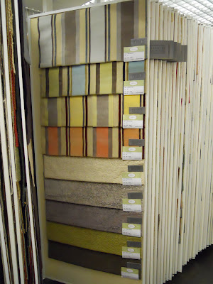

Drool, drool, drool! I love this one. The texture, pattern, hand, sheen, colorways.... LOVE!

Barry's line had a wonderful composition of contemporary and traditional fabric. Very well rounded, exceptional quality, and very fresh. I can see using this line for a very, very long time. Now that is timeless design at its finest.

Now it is your turn to share your classics or trends you hope become timeless...

1) Add your permalink below ~ not your blog's address in general but the specific post you want people to visit. To obtain the actual post link, click on the title of your post once you have published it and copy and paste the URL into Mister Linky.

2) Leave your name and say a couple of words to describe your post (e.g. "Coco Chanel suits" or "Classic interior design for children" or "Delicious meals in a snap."

3) Copy and paste the Timeless Tuesday logo button (on my right sidebar) to your Timeless Tuesday posts. This is a sure way for your readers to know you have joined in the party.

4) Link back to the host blog, that's me ~ Paula Grace Designs Blogspot Timeless Tuesday ~ so all the bloggers that joined the party will receive many interested visitors.

Sunday, January 3, 2010

The Family Room

Since we just came from spending time with family and friends, I am compelled to post about family rooms. House Beautiful did a nice spread on designer family rooms. I picked out a few of my favorites.

Designed by Robert Stilin. Featured in February 2009.

Designer Fern Santini. Featured in December 2007.

Designer Jacqueline Derrey Segura. Featured in July 2007.

Designer Chantal Dussouchaud. Featured in January 2006.

When I look at these rooms, I imagine comfort and gatherings. I enjoy the soothing neutral palettes. Many of the family room in the HB story seemed very formal or uncomfortable. A couple had beautiful but trendy palettes that I know I would tire of.

The greatest compliment I received this holiday season was from my brother, John. He said to me and my husband at different times, "Your home is so comfortable." My brother was here with his lovely wife, Laura, and their three boys Steven (age 20), Matthew (age 17), and Daniel (age 15). My mom was also here. John's comment I'm sure came from the fact that all could sit comfortably with their feet up and a drink shelf behind them in either of our family rooms (main and lower levels). If the girls wanted to watch something on TV, the boys retreated to the lower level to watch their show or play on the Wii. I took great joy in seeing my family all lined up on the sectional eating themselves silly. That's what a family room is all about to me. My family room??!! I only have a picture of the main level one....

Mrs. Limestone wanted to see pictures of my home in 2010 ~ click here to leave a comment of you would like to see on my blog in 2010. Well, here's your first installment, Mrs. L! The sectional is family friendly with easy to clean Ultrasuede on the cushions and leather on the frame. Here is a post I did a while ago using my family room design to illustrate the principles and elements of interior design (it was actually my very first blog post).

Of course, I am linking with Between Naps on the Porch Metamorphosis Monday as my first blog post chronicles the development of my family room. Join in the fun!

Happy 2010 beginning!

Wednesday, November 25, 2009

Holiday Drinks

House Beautiful shared drink recipes for the holidays. The Jade Cloud sounds particularly yummy:

Jade Cloud
1/2 oz. Rose’s unsweetened lime juice
1 oz. crème de prunelle
1 oz. vodka or gin
Shake well with cracked ice and serve in a whiskey sour or small frappe glass.

I would use vodka!


I usually serve a red and a green martini for the holidays. Here are a couple of recipes ~

Berry Fusion Martini recipe
1 oz Absolut® Kurant vodka
1/2 oz Hpnotiq® liquor
1/2 oz creme de cassis
2 oz cranberry juice

Chocolate Mint Martini
1 1/2 ounce vodka
1/2 ounce creme de cacao
1/2 ounce green creme de menthe
1 Splash club soda
Garnish - chocolate covered candy cane

What's your favorite holiday drink recipe (alcohol or non-alcohol)? Will you share your recipe??!!

On Monday November 30th, I have a wonderful holiday ornament giveaway! Don't forget to come visit to register. You will be glad you did!

Wednesday, October 21, 2009

Thom Filicia

In getting ready for High Point Market ~ in tandem with my gal, Kristin ~ I was thinking about her post with the picture of Thom Filicia.
There's Kristin with Thom ~ I took the picture. He was the nicest man. Full of hugs and kisses ~ happy to be there, grateful to be there, humble. Never underestimate the power of humility.

Thom is featured in House Beautiful:

"Designer and Style Network host Thom Filicia creates a show house apartment, inspired by the movie The Big Chill, as part of this year's Designer Visions: Cinema Style"

I perused his work. Humble and talented. Take a look and see for yourself....
He has a special touch with contrast, shape, and form. The lines and color of this chair are wonderful against the textured neutral wall covering.
Again, love the color of the leather against the dark cabinets.
Orange and hot pink! Lauren look at this!
Self explanatory with shape and form ~ superb.
Details, details.... its all about the details.....
Clean, crisp ~ a touch of the old with the chair. Lovely juxtaposition.
Sumptuous symmetry.
Love the lines and the contrast of the wood tone of the dresser with the walls. Adds a touch of warmth.
How cool is this??!
I would love to spend a warm, sunny day here. Why is it that as I continue, I start to fantasize? It just brings me there.
Symmetry done with a casual hand. Wonderful!

I hope he's at Market again. This time, Kristin will take the picture!

(P.S. I wrote this post before I left for Market. When it posts, I'll be there getting ready to return home with wonderful pictures from show rooms and people to share with you!)

Blog Widget by LinkWithin