About Interiors FurnishingsWorking with You Attache Design Press PGD Blog Contact Us

Thursday, March 18, 2010

Fun Friday ~ Andrew Sovjani

This past Timeless Tuesday, the writer of the blog Black Kat's Design joined the party. Kat showed us how to make this lovely paper wreath. Unfortunately, I am not much of a crafter. It did, however, remind me of a photographer that I have loved for years. I have three of his pieces in my dining room...

This is an old Christmas photo. That is his work ~ the two calla lilies and the tulip. His work post flowers has been very interesting to me. One of his creative projects was focused on light and folded paper. The results are quite remarkable. Take a look...


I think this series of his is quite fantastic. I love the geometric forms and angles of some and the curves and fluidity of others. The way he captured light is wonderful. All this from paper and light ~ amazing. Who is he?? Andrew Sovjani. As you may know, I love art. Photography is one of the mediums I enjoy a lot... A LOT! Check out Andrew's work ~ you won't be disappointed.

Enjoy your weekend! I sure will ~ I have had a llllllooooonnnggggg week.

Wednesday, March 17, 2010

Thursday's Room

Carlyle Penthouse eclectic living room


This room is the work of Riehl Designs, Inc. Photo compliments of Houzz. I love the soft blend of pattern, texture, and shape (including the interesting ceiling fixtures). The white rhythm from ceiling to floor and down the center catches my eye. It's contrast with the deep hues really makes them pop. I have been fascinated lately by the drapeless window. Here, I really see why. Not only is the white a lovely pop and rhythm, it looks so lush and billowy that it adds the softness that would come from fabric framing the windows. I love red-orange and for me, this is just the right amount to use. The zig zag beat to the red-orange and ultimately being grounded by it is the jazz next to the white symphony ~ love it. All of this music is enveloped safely in neutrals. This is how a room does not get out of control. You should hear the music but not dance right off the stage. Nicely done ~

Monday, March 15, 2010

Timeless Tuesday ~ Seven

Welcome to Timeless Tuesday! Today I am writing about a Design Day at the Washington Design Center. It was a lovely day full of great people, interesting learning, and fantastic new products ~ this list is always timeless for me ~ people, learning, quality products. I was able to meet the gorgeous Celerie Kemble. She and Jamie Drake moderated by House Beautiful editor, Stephen Drucker, spoke about trends in respect to clients and furnishings.

It was a wonderful discussion. You may read it pretty much read it in full at Jennifer's great blog ~ DC by Design.

I also spoke with Barry Dixon and congratulated on his new fabric line with Vervain. I gave his line a good peruse. I must say, he has some wonderful ones. I loved a few of them so much I ordered memos for a current project. Let me show you what I mean...


Lush!

Simple and elegant.


Spectacular!

I love this tone on tone. Wonderful texture, sumptuous hand, and fresh pattern.


Same as above ~ wonderful, sumptuous, fresh ~ gorgeous!

Versatile and lush.

Love this contemporary one!

There are some that I actually drooled over ~ don't worry, none got on the fabrics. The one above is just one example.

Wonderful take on paisley!

Drool! The hand on this is magnificent.

Drool! This is sure to be a timeless classic.
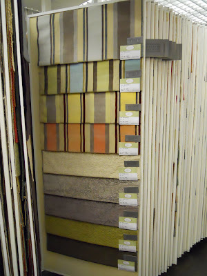

Drool, drool, drool! I love this one. The texture, pattern, hand, sheen, colorways.... LOVE!

Barry's line had a wonderful composition of contemporary and traditional fabric. Very well rounded, exceptional quality, and very fresh. I can see using this line for a very, very long time. Now that is timeless design at its finest.

Now it is your turn to share your classics or trends you hope become timeless...

1) Add your permalink below ~ not your blog's address in general but the specific post you want people to visit. To obtain the actual post link, click on the title of your post once you have published it and copy and paste the URL into Mister Linky.

2) Leave your name and say a couple of words to describe your post (e.g. "Coco Chanel suits" or "Classic interior design for children" or "Delicious meals in a snap."

3) Copy and paste the Timeless Tuesday logo button (on my right sidebar) to your Timeless Tuesday posts. This is a sure way for your readers to know you have joined in the party.

4) Link back to the host blog, that's me ~ Paula Grace Designs Blogspot Timeless Tuesday ~ so all the bloggers that joined the party will receive many interested visitors.

Sunday, March 14, 2010

Monday's Method


Today Nichole writes in with the following concerns:

Paula,

I'm stuck for a paint color in this room. The cabinetry is in good condition but needs a new coat of white, as does the rest of the trim in the room. The basic white tile on the floor and in the shower is in good condition, so it must be kept. I have already changed the knobs to polished chrome egg shaped ones and they look better when nieces haven't been playing with them. :) I need a new countertop and sink. I've been looking at some quartz options online like Silestone. Maybe white with gray veining? Built in sink or undermount? I obviously need new sink and bath taps. And what do I do about the horrendous mirror frame around the mirror? My frame shop has just started custom framing mirrors. Maybe they can build one over it? I've already purchased lights and towel bars from the Chatham Hardware Collection at Restorations Hardware. They are in a closet waiting for me to be inspired. The accessories on the counter are also from that collection. The paint in the bedroom is Apple 4 or 5 from Laura Ashley Valspar. Is there a blue/grey I can paint the bathroom that will look okay next to that strong green? I also considered a very faint blush pink, but the husband balked. Also, I don't have pink anywhere else in the house. Paint colors in the rest of the house: creams, yellows and blues and the color currently in this room, a tan with a strong undertone of gray. A lot of my rooms have at least a touch of red. The window: shutters or casual roman shades? This window and the bay window in the bedroom currently have white wood blinds. I'm definitely leaning towards the roman shades for the bedroom. What do you think of these taps? If you can give me guidance on any of these questions, especially the paint color, I would really appreciate it. Thanks.

Nichole


Here are some pictures of Nichole's home to start with...


Lovely traditional home...

Guest room the bath forms a suite with (photo taken during the day)...


Guest bath entrance (photo taken at night ~ note the appearance of the paint color at night vs. the day)...

Shower curtain Nichole would like to keep...

Vanity and mirror in question (above and below)....

Here are some things Nichole has selected to complete her guest bath...

Contemporary faucet, which I like...

Lighting awaiting inspiration (I'm pretty sure you purchased an over mirror light but I am going to recommend you exchange it for two of the above, which I really like ~ I like everything in this collection)...

Cards Nichole intends to frame and use in the space ~ I love these.....

A rug / runner. I must be honest, I do not like this piece. Nichole you mentioned you can return it. I would as I think it is too large and the wrong color.

Here is what I recommend...
First, I agree that the vanity is in good shape and that a fresh coat of white paint is just the ticket. I do like the faucet you selected but it is on the contemporary side with a more traditional vanity. You can marry the two by using plain white Silestone ~ White Zeus.
I like this better than the white with gray veining for two reasons ~ it is a more contemporary look and it will be easier to change out accessories and paint as you continue to live in your home. I would add an undermount sink ~ all in one ~ with the same material for consistency.

The lighting and mirror I show above it the best way to illuminate one's face. Sconces should be placed with the light at eye level. This decreases shadows on the face, which can alter the way you appear (e.g. casts a shadow mimicking dark circles when none are there). I like the mirror in the same Restoration Hardware Collection (I used the 24 x 36 in my drawing)...


I would also recommend a couple from Global Views as I do not like things to be matchy, matchy...

Ada's large square mirror...

The large Wavy Mirror.

Window treatments ~ if you have a stellar fabricator for fabric woven shades or are purchasing from a reputable manufacturer then I like the idea. If not, woven woods would be better. Why? Ease of use and they are current. I have seen fabric Roman shades that are difficult to use ~ not so with woven wood. In the bathroom, select a Sunbrella fabric or another outdoor brand if doing fabric shades as it will hold up better with the steam typically in a bathroom.

Paint color ~ ahhhh ~ that is a good question. Since this bath is part of a guest suite, the bath should relate well with the guest bedroom. You make note of this when you say the shower curtain coordinates with the comforter. I actually like the idea of a pale pink blush as it would compliment the strong green and textiles you already have. I understand why your husband my veto it though. Here is what I believe is the green in your room...


It is Valspar Apple XXXX4. It is a lovely color in the green~yellow range. The cards you have purchased to place in the space seem to include a close match to this. You may select a light blue from the cards to coordinate the two hues. My concern with that is that the cards are small and may not be enough to tie the two rooms together without purchasing or creating additional furnishings. I actually do not think a blue~gray will work well. I placed several next to the green you have it it just didn't look right. It may be that you are trying to add a color that you like but doesn't relate to what you have. I understand this but it is best left to bring it in accessories versus paint. I like to use a lighter tint of the bedroom color in the attached bath. I would simply add 25% white to the color above for the bath or select a neutral right from the shower curtain. Then add color with accessories.

I hope this helps Nichole! Let me know how it goes.

If you have a question about this or another topic, leave me a comment. If you would like advice about something specific to your space, send me a couple of pictures at paula@paulagracedesigns.com.

I'm linking with these lovely ladies ~ all fabulous parties worth a long leisurely visit.

Monday ~
Between Naps on the Porch Metamorphosis Monday
Little Red House Mosaic Monday
Cottage Instincts Make it for Monday

Tuesday ~
A Soft Place to Land DIY Tuesday

Thursday ~
The Shabby Chic Cottage Transformation Thursday

Saturday ~
Funky Junk Interiors Saturday Nite Special

See you tomorrow for Timeless Tuesday!

Blog Widget by LinkWithin