About Interiors FurnishingsWorking with You Attache Design Press PGD Blog Contact Us

Monday, February 15, 2010

Timeless Tuesday ~ Three

Welcome to Timeless Tuesday ~ Three. Today I'm paying tribute to the mirror. I love using mirrors in my designs. In the tweens rooms I am doing now, I designed one wall of each to be in mirror. All tweens need plenty of full length mirrors to see themselves in. With that being true, there are a few other reasons I placed mirrors in their rooms (and other rooms) ~ to enlarge the space ~ that is a well known trick ~ to add light ~ another easy thing for mirrors to do ~ and lastly, to reflect the design back to them so it may be enjoyed from any where in the room. Mirrors have been used in just about all styles...

Traditional ~

Diane Burn published in Architectural Digest

Contemporary ~

John Lyle published in Metropolitan Home

And many styles in between.

I like placing mirrors by the main door used to enter and exit the home. This way folks can give themselves one last check before walking out the door. This has saved me from leaving my home with lipstick on my teeth ~ YIKES! Here is one I placed in a foyer of a Bethesda, MD client ~

This vignette is completed with a stool to comfortably sit and take shoes on and off ~ a must for the winter we've been having!

One of the most important factors to be cognizant of is what the mirror is reflecting. This can even be a main factor in the design.....

In this design of mine, I placed a mirror over the mantel ~ a classic position for a mirror. This one reflects the art on the opposing wall. If you look in the mirror above, you'll see the wall below.

I must admit ~ reflecting art in my favorite. Below is my 'His and Hers' design.

His masculine lounge complete with a large scale floor mirror...

her feminine dining room full of sparkle and gorgeous art.

The sparkle and beautiful art of the dancer enjoyed in both.

With the next design, I used the large wall on the stairs to bring light to the upper level hall. When one is is the balcony area, it appears bigger and brighter with these mirrors that double as architectural beauties.


Mirrors have been well used by all design styles to add expanse, depth, light, and to see oneself. These functional pieces of glass will always be timeless.

Now it's your turn! I can't wait to see what timeless pleasures you have in store.

To join Timeless Tuesday:

1) Add your permalink below ~ not your blog's address in general but the specific post you want people to visit. To obtain the actual post link, click on the title of your post once you have published it and copy and paste the URL into Mister Linky.

2) Leave your name and say a couple of words to describe your post (e.g. "Coco Chanel suits" or "Classic interior design for children" or "Delicious meals in a snap."

3) Copy and paste the Timeless Tuesday logo button (on my right sidebar) to your blog's sidebar and your Timeless Tuesday posts. This is a sure way for your readers to know you have joined in the party.

4) Link back to the host blog, that's me ~ Paula Grace Designs Blogspot Timeless Tuesday ~ so all the bloggers that joined the party will receive many interested visitors.

It's that easy! Thanks for joining! Have fun perusing all the timeless classics.

Sunday, February 14, 2010

Monday's Method ~ What's New?

Hmmm, no one had any interior design questions for me so my Monday's Method today will focus on 'What's New.' There are new products coming out at every market. When I visit my usual hautes at Market, it's difficult to see everything. I tend to go to their websites and click on the new product category. This week, I perused Palecek again. Here's a fact about Palecek ~ they have always been eco-friendly. For them it isn't a trend, never has been ~ it's just a way of life. That' pretty cool. Here are some of their new and relatively new items that caught my eye.....

The one at the top is the Colonial Lounge Chair. I am a sucker for the British Colonial style. I have always loved it. This chair features a plantation gemelina frame and hand carved leg detail. Double rattan matting is added for style.

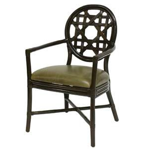
The Bristol Arm Chair and it's partner below, the Bristol Side Chair.

These chairs have pole rattan frames and features a woven plantation mahogany back pattern, leather bindings, and a dark coffee finish. Gorgeous!
This is the Auburn Lounge Chair. Isn't it interesting? Wonderful texture. A rattan pole is used to create the frame and hand bent crazy weave design ~ cool!. A two tone coffee and warm brown finish is added. This chair may not look all that comfortable, but it is. They feature an elasticized spring fabric deck which provides long lasting comfort.This hot little number is the Bundle Stick Side Table. This table is created from sticks that are found and bundled together. No two are alike. They can add so much interest to any room as they cannot be classified to one particular style. I love that versatility.
This is the Colonial Table. I love its form and shape ~ classic! It is constructed with a plantation gemelina wood base and anegre veneer top. It is finished in yummy espresso and warm brown hues. I will use these as side tables, night tables, an accent table.... Again, the possibilities are abundant.
This mid-century styled table is called the Pasadena Side Table. It is constructed from plantation mahogany with a mahogany veneer top and multiple brown tone finish. This reminds me of furniture we had in my home growing up so it has a nice association. That's what caught my attention.
How about this beauty? The Pasadena Motion Coffee Table. Yes, its related to the table above and yup, it moves. The bottom can be aligned with the top or moved to accommodate a furniture grouping or party guests. Fabulous!

They also have some wonderful new mirrors that I like. The one is the Blue Capiz Mirror. I love the mixture of material ~ steel wire is formed into a sun design with Capiz shell details and a beveled mirror. This is a new and interesting way to use these ever popular shells. Beautiful!


White Looking Glass Mirror ~ I have seen very similar designs using this approach but I never seem to tire of it. I see this used in a grouping. It is a 22" square so several can be placed together connecting the ovals as such.....


I could do a whole wall with them!

The next two come in black or white.
These are the Dahlia Mirrors. Plantation tung wood is painted and hand carved to reveal natural wood tone details. A plain mirror sits in the center. I love the delicate wisps at the ends.


These are the Marabella Mirrors. Hand carved tung wood is painted and carved to reveal the natural wood tone carving. A plain mirror rests in the center. These are wonderful because you can hang them in either direction dependant on your needs.

And last, but not least, some fun wall art. First the Metal Dragonfly.....

and the lovely Metal Windblown Tree.

I like to mix materials with my wall decor. If I have have paintings or photographs as wall adornments, I try to add pieces such as the ones above to add diversity.

So tell me ~ do you like these new pieces? Where would you place them?

BTW ~ These pieces are available though The Beautiful Home Store and, as always, a portion of the purchase price is donated to charity.

Monday's Method is here for interior design advice. If you have a question, leave me a comment. If you have a specific interior design question to your home, drop me an email with a couple of photos ~ that will help me give better suggestions ~ paula@paulagracedesigns.com.

Don't forget to visit tomorrow for Timeless Tuesday!


I'm linking with Mary's Mosaic Monday at the Little Red House. Check her out for amazing photography!

Friday, February 12, 2010

Fun Friday ~ Sweet Awakenings

Wallace E. Cunningham and Guy West published in Architectural Digest

Imagine waking up from your dream world to this ~ a surreal experience for sure.

Steven F. Haas, Architect; Lisa Tillinghast and Robert Nassar, Interior Design; Renny Reynolds, Landscape Design published in Architectural Digest

For Fun Friday, I thought I'd share my infatuation with waking up to a glorious view. These fantastic bedrooms allow the inhabitants to take in the world, breath it in, and be mindful of the beauty found in our natural surroundings.

Richard Meier, Architect; Rose Tarlow, Interior Design published in Architectural Digest

Can you hear the ocean?

Home of Demi Moore and Ashton Kutcher published in Architectural Digest

Can you hear the birds?

Guy Dreier, Architect and Interior Design published in Architectural Digest

Ok, I have to say it ~ this bedroom just puts me in the mood.

Enjoy your weekend!

Wednesday, February 10, 2010

Thursday's Room ~ The Art of Conversation

Andy Skurman

Today I am not going to focus on one specific well-designed room. I'm going to focus more on an art ~ the art of conversation at a lovely dinner party. This is where radial balance makes such a statement. I have written about radial balance before. There is no better place to realize it than in one's dining room. Take a look.....

Andy Skurman

Everyone is able to see each other equally well...

Craig Wright published in Architectural Digest

There is a feeling of togetherness...

Andy Skurman

Of belonging...

F. Pierpont Davis published in Architectural Digest

It is much cozier and welcoming with the round table.

I am craving to do a dining room with a big, beautiful round table. The tweens rooms I am doing right now are for clients that I will likely be doing their dining room shortly. It was supposed to be next on their list but the tweens spoke up and you know how that goes. So, the tweens first; then the dining room.

We already discussed the design a bit. She wants a big round table to seat her family for holidays. Alrighty ~ I can do that. I already found the table I would like to use...The Sheraton by Hickory Chair. I love that it is large but without great mass. I want to surround it with upholstered chairs for extreme comfort, which will add more mass and nicely balance the table.

That's my 'room' for today ~ designed with radial balance ~ rooms primed for the art of conversation.

What would we be talking about at dinner?

Wednesday ~ Hump Day

I don't formally post on Wednesday. This gives you a chance to peruse Monday's Method and Timeless Tuesday Link Party.

Here are a few older posts for you to enjoy!

Eye Catching
Bold Wallcovering
Fall High Point Market ~ Part I
Gossip Girl
Silver, Silver.....

Have a wonderful day!

Monday, February 8, 2010

Timeless Tuesday ~ Two


Beth Slifer

Recall in my definition of Timeless Tuesday, I spoke about trends that one hopes to become a timeless classic. I'm going to speak about one of those today. Although it hasn't been a 'trend' to all those in the furnishing industry, we hear it spoken about a lot these days ~ with good reason.

I'm talking about Green, Eco-Friendly, and Sustainable design and product. These terms are highly used interchangeably but the preferred phrase is Eco-Friendly since the attempt here is to support a healthy Ecology defined as the branch of biology dealing with the relations and interactions between organisms and their environment, including other organisms. That's us folks ~ an organism that relates and interacts with our environment. We haven't been very kind or smart in this area and now we are suffering the consequences for it.

Jim Logan published in Elle Decor

I think there is a lot of confusion about what is eco-friendly design and product when it comes to furnishings. Some companies say they are 'Green' when they really are 'green-washed' meaning they have done some minor adjustments to their product line but still contribute quite a bit to the demise of our environment. Saying your 'green' is trendy these days that's why it is important to know what purchasing an eco-freindly product actually means. If it is important to you, don't take retailers word for it when they say they are 'green.' They may not even know themselves what that means. So ask questions. If they cannot answer them with a straight answer, it likely means 'green' is part of their marketing slogan and not integrated into their products' manufacturing as we would like to think. Here are the specifics about what a true eco-friendly product is per the Sustainable Furnishings Council:

1) Casegoods (tables, chests, cabinets, etc.) ~
a) made from certified wood ~ stamp of approval from the Forest Stewardship Council (FSC)
b) made from rapid renewals (e.g. bamboo)
c) commercial harvest ~ plantation grown wood vs. taken randomly, or worse, stripped, from nature
d) made from recycled content
e) low VOCs (volatile organic compound) in glue and finish

2) Upholstery (sofas, chaise, lounge chair, ottoman, etc.) ~
a) frames and exposed wood made from certified wood
b) made from recycled content
c) bio hybrid cushioning
d) eco-friendly leather
e) organic textiles

3) Accessories ~
a) made from rapid renewals
b) made from recycled content

4) Bedding ~
a) bio hybrid cushioning
b) organic textiles

All it takes is a little research and some direct questions if being eco-friendly is something you value. Can your home be 100% eco-friendly? It would be very difficult to have it be that way but every little bit helps. I've written on eco-friendly products before. Give it a read it you would like specific companies that produce eco-friendly furnishings.

Jim Logan

Also, understand the the emissions footprint the product you purchase are making. What that means is that buying imports, even if they are eco-friendly, had to be transported a long way to get to you. Emissions are an important factor in global warming. Buying products made as close as possible to your home decreases the footprint significantly. If an import is the only product available, hopefully it is a eco-friendly one in it's material and manufacturing process.

Eco-friendly, I hope it becomes a timeless classic!

It's your turn ~

To join Timeless Tuesday:

1) Add your permalink below ~ not your blog's address in general but the specific post you want people to visit. To obtain the actual post link, click on the title of your post once you have published it and copy and paste the URL into Mister Linky.

2) Leave your name and say a couple of words to describe your post (e.g. "Coco Chanel suits" or "Classic interior design for children" or "Delicious meals in a snap."

3) Copy and paste the Timeless Tuesday logo button (on my right sidebar) to your blog's sidebar and your Timeless Tuesday posts. This is a sure way for your readers to know you have joined in the party.

4) Link back to the host blog, that's me ~ Paula Grace Designs Blogspot Timeless Tuesday ~ so all the bloggers that joined the party will receive many interested visitors.

It's that easy! Thanks for joining! Have fun perusing all the timeless classics.

Sunday, February 7, 2010

Monday's Method ~ Off White Dilemma

Lovely, aren't they? These designs are from the master herself of off~white, Barbara Barry.

Glinda asked me the question below in a comment ~

"I read your Monday's Method post tonight and since I am one frayed nerve away from a nervous breakdown, I was hoping you would be able to help. I am trying to find an off-white paint that has NO yellow in it but is creamy enough to be warm...I just can't seem to find the right one. I plan on using it in our entire house."

I answered her pretty quickly because I was concern about Glinda being "one frayed nerve away from a nervous breakdown." Oh dear! However, I thought I would expand here and show some detail because I think picking paint is one of the most difficult things to so IF the color is not based on the design as a whole. I have written this before but I never select paint color until I am certain about what fabrics or art will be in the room. Why? Because the room will be much more coordinated if the paint color is based on what will actually fill the room plus it is a heck of a lot easier to do it that way. Picking a paint color out of thin air is very difficult. Then you are left trying to find furnishings that coordinate with your paint color. The thing is ~ paint color is infinite ~ everything else that goes in the room is not (unless you have things custom made).

In Glinda's case, she simply wants to find an off-white that is on the warm side but without yellow in its formula. I actually told Glinda the wrong fan deck to use so I will correct myself here ~ take the Benjamin Moore Color Preview fan deck (not the Classic which is what I told Glinda ~ sorry Glinda) and find off-white colors that are the lightest tint of colors other than yellow. I found several that originated from greens. Even though they originated from green, a typically cool color, these still appear quite creamy and on the warm side. I also found some that were derived from neutrals. Can I say that they contain NO yellow? No. Green is derived from yellow but it also contains blue. Browns are made by mixing many hues on the color wheel so yellow may be a small variable. It will be tough to omit yellow altogether. Here are a few that do not appear yellow~ish...


2165-70, 2164-70, 2163-70

2162-70, 2161-70, 2148-70

2148-60, 2147-70, 2146-70

2145-70, 2144-70, 2143-70

And my all time favorite ~ I use this color for trim a lot...

2149-70 (aka White Chocolate)

Now that you have all these colors side by side, you can see that some are warmer than others.

This is actually a good exercise to do when trying to select an off white (or other neutral) paint color from thin air. After looking through the fan deck, use the website ~ My Perfect Color ~ to copy and paste colors side by side and see which are warmer or cooler, depending on your preference (if out of thin air, I would choose a cooler neutral as it will coordinate better with other colors). You may not pick your one color this way but it will narrow down the small samples to purchase. Choose only two or three colors to buy samples of. Too many samples may make it more confusing than it needs to be. Paint white boards with your sample choices and place them throughout the room (or home). View the boards over a couple days to see them in different lights to see how they perform as light ~ specifically the light in YOUR home ~ will make a big difference.

Benjamin Moore also offers a service on their website ~ Personal Color Viewer. This allows you to see paint colors in actual rooms. You may upload your own photos or choose from samples photos (I find the latter easier and sufficient). This will also give you a good idea but it does not replace the exercise above. It may help to narrow down your choices to two or three.

Please don't fret, this is a simple exercise that will help relieve your worried mind. It is also ok to use different off-white or neutral hues in different rooms if needed. The variation from room to room will likely be negligible to the eye. And lastly, please remember its just paint. Unless the color is completely off, once you fill the room with your belongings, the paint color won't be the prominent feature. Your focal point and supporting furnishings will.

There you go Glinda, I hope this helps!

If you do have a question about this or another topic, leave me a comment. If you would like advice about something specific to your space, send me a couple of pictures at paula@paulagracedesigns.com.

I'm linking with these lovely ladies ~ all fabulous parties worth a long leisurely visit.

Monday ~
Between Naps on the Porch Metamorphosis Monday
Little Red House Mosaic Monday
Cottage Instincts Make it for Monday

Tuesday ~
A Soft Place to Land DIY Tuesday

Thursday ~
The Shabby Chic Cottage Transformation Thursday

Saturday ~
Funky Junk Interiors Saturday Nite Special

See you tomorrow for Timeless Tuesday!
Blog Widget by LinkWithin