About Interiors FurnishingsWorking with You Attache Design Press PGD Blog Contact Us

Sunday, September 26, 2010

What are the Benefits of Working with an Interior Designer?

Home & Design Magazine, the elite luxury shelter magazine in the Washington, DC area, asked me to be a "Pro" for their Sourcebook 2011. This is one my favorite magazines so it was quite an honor.

Thank you Home & Design for considering my an expert and sharing my thoughts on "What are the Benefits of Working with a Interior Designer?" Here was my full answer (in the amount of words I was able to :-)

The benefits of working with a designer are many. First, designers are trained to develop the design concept encompassing both aesthetics and functionality; to cull it from the client’s heart & mind, interpreting their vision bringing it to life. Second, costly mistakes are avoided as palettes, furnishings, fabric, etc. are specified from an organized plan; not only a space plan but an overall plan that puts all the pieces of the puzzle together. Third is the service designers provide from concept to completion. Clients are able to relax and leave the labor to the design team.

This is a question that arises time and time again and that people really do ponder. It is not just about style. It is also about luxury, comfort, security, peace of mind, quality, understanding the principles and elements of fantastic design, service... the list can go on and on.

Tell me ~ what are some of the reasons you would use or recommend using an interior designer?

Friday, September 24, 2010

Robert Allen and Dwell Studio

I received news from Robert Allen. Their partnering with Dwell Studio. The fabrics they created look wonderful. Take a look at this video. You really can see how fabulous they seem because they are shown on furniture versus a flat picture of a sample.


I really like what I'm seeing. I think I'll go to the Robert Allen Showroom in DC to see how they feel.

What do you think? Do you like them?

Thursday, September 23, 2010

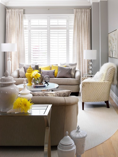
Gray or Nay?

Decor by Jennifer Inc contemporary family room

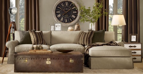
Designer Living/Family Rooms

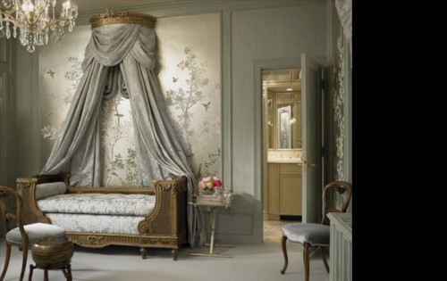
gibbonsfortman traditional bedroom

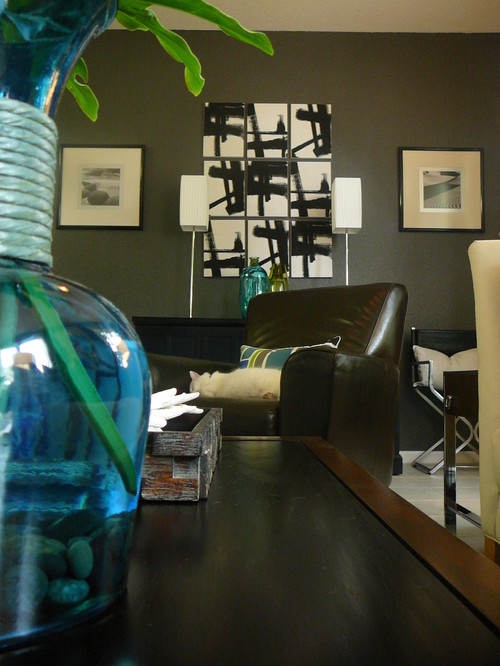
Great Room Re-Styled eclectic living room

I grew up with gray for a while in my home. I didn't really care for it. Looking back, I think it had more to do with the finish than the color. I'm careful using gray because of it. Eggshell or satin are paint finishes I cannot use with gray. Flat or matte for me. I found these gray rooms on Houzz that I like. I must say, I still steer towards light versus dark with this hue. A friend recently told me she painted her family room charcoal. I got a sinking feeling in the pit of my stomach when she said it. "I committed to it and I did it." She likes it so I am happy for her. Have I been there to see it yet? Nope.

What say you ~ gray or nay?

Wednesday, September 22, 2010

Husband Love

Some of you may know that yesterday was my birthday. It was an ok day. A couple things happened that gave me pause ~ like my printer, copier, scanner, Susie Bake Oven combo bit the dust. It didn't just have a cold, it died. I will need to get one today! Also, my daughter hurt her foot.

She damaged some cartilage while trying to balance on a ball. Seriously ~ I am not kidding. She likes her boot. I think once the novelty has worn off, she'll be begging to take it off.

But other than those two things, the day was fine. Lauren felt the need to tell people along the way that is was my birthday. We went through Starbuck's drive through and she said "Mommy tell them its your birthday and you'll get free stuff." "No, no," I said "I don't need free stuff." Of course Lauren yells from the back seat, "Its my mom's birthday" to the young man at the window. He graciously wishes me happy birthday and then ducks back inside. Sure enough he emerges with a free doughnut. I accept and enjoy something I would typically not eat. Lauren was so proud of herself. Plus ~ it was a gorgeous day ~ sunny and warm but not hot. And no humidity so my hair looked decent all day. A good hair day on my birthday??!! A free doughnut??!! What else can a woman as for? Well......
My husband came home with the lovely deep pink roses at the top. He also gave me a gift certificate for a spa day at my favorite place! The whole family went out to dinner but on a Tuesday night, we just went to one of our local favorites. We ran into my Project Love clients there. That was fun. Lauren, of course, told them it was my birthday. My client sent me an email last night telling me there was a little something on the hall table for me (I am going there today to check on things). How lovely! But that is not all ~ Friday, hubby and I are going out for dinner and a comedy show in DC. We love comedy. Laughing together until our sides split is one of our joys in life. Who are we seeing? Lewis Black.
A very funny comedian. He prides himself on his political satire and foul language. He always makes us laugh so it should be a fun night.

Yes, I am feeling the hubby love and loving him right back!

Tuesday, September 21, 2010

Hampton Showhouse Moments

I was visiting one of my favorite web places, Traditional Home. and began perusing the 2009 Hampton Showhouse. All of the rooms were lovely. My hat is off to all of those talented designers. It's all in the details ~ right?! Here are a few of the moments I really enjoyed...

Kenneth Alpert and Andrew Petronio
Love the Phillip Jeffries wallcovering in the coffer ceiling. Note the two directions the pattern is laid. Gives the detail more interest.

Brad Ford
How about swinging love seats? The gentle rock one will get seems like it would be so soothing. Not sure I'd let me 7 year old and her friends on them. This detail is just for mommy.

Jesse Carrier and Mara Miller
I love the textures and patterns of this space. So warm and cozy.

Brian Brady and Franco Biscardi
Here it is the freshness, the purity I love. The window treatment detail is a fresh look to the Greek Key. Love the orange pop!

Brian Brady and Franco Biscardi
The Odegard tables in the shower ~ luxury! I have always loved these tables and to see them in the shower is an unexpected great moment.

Jeff Lincoln
The palette is magnificent. I love this room is general. The mixture of patterns and shapes is the bomb for me.

Kate Singer
Palette here too. The lamp shade just strikes me as a mid point emphasis of a great rhythm of green around the room from this view.

Benjamin Bradley and David Thiergartner
Here I like the use of a decorative shelf as a towel holder. Practical and beautiful; the shelf adds depth and dimension to the neutral palette.

Kat Burki
This room gets two pictures. I adore the way the sunlight is seen in this room. I could be the perfect time of day to take the picture but I love the way the light radiates through the sheer drapes.

Kat Burki
The sheers are so feminine it makes me feel pretty.

Skye Kirby
This gentle palette and comfortable furnishings is so inviting, I just want to sit there with a glass of Chardonnay and talk about my day with friends.

Is there a room that speaks to you?

Monday, September 20, 2010

Monday's Method ~

Has this ever happen to you?


This is a common problem when changing counter tops. No they didn't measure or cut wrong. The fact is that walls are rarely straight. A little separation from the wall in places is normal. Why? Because the stone is cut straight but the wall usually ebbs and flows. That is nothing to worry about as the backsplash will cover those gaps. When it is at the end like this, especially with an ogee edge or other ornate edge, the gap cannot be this large. This gap was more that 1/4 inch. But won't the backsplash cover it? No. Here is an ogee edge.

The back splash stops where the curve begins. You can see that in the very first picture. So the gap will definitely be seen. You can 'fix' it like this...

The installer initially filled the gap with caulk. Once this is cleaned up, it may be ok but if you are taking the time and expense to change your counter tops, please do not fix it in this manner. Good stone cutters are craftmen. They can make a piece to fit perfectly in the gap and seal it with an epoxy that will not show.

There we go! The contractor first noticed the gap and the 'fix' and called me. Hmmm??!! When I saw it, I called my counter place. My rep was on maternity leave so I working with a replacement that clearly did not know my standards. After a short but clear discussion, they gap was properly fixed. I understand his position (BTW, be didn't say a peep, he just fixed it) ~ fixing a gap like this takes a bit of time. Cutting the sliver can be difficult and then a second trip out to the job site to install it = material and labor not accounted for in their price. I get it. No, they never charge to fix it correctly ~ that would be a bad business practice. But they may try to fix it in the least expensive manner. The moral of the story is check closely and if there is a gap too large to be covered by tile or cannot be covered, ask them to fix it to your satisfaction. Caveat ~ I do not use places that advertise a complete counter top package for $19.95 INSTALLED. I cannot vouch for things I do not believe. However any reputable company will want you to be happy and want to give you the very best. If they do not have these wants ~ run in the other direction and tell all your friends.

Sunday, September 19, 2010

Lauren's First Fundraiser

A while back, my daughter Lauren had an epiphany after the earthquake in Haiti. You may recall that post. Jim, Lauren and I transformed a portion of her play area to a studio so she could work on her jewelry. She wanted to raise money for the the victims of the Haiti earthquake.

This Saturday, Lauren held her first fundraiser. She entitled it Haiti, Kalie, and Me. Lauren raised money for Haiti and Kalie, a young girl in her school with cancer. We invited several of her girlfriends and I spoke to each Mom letting them know what Lauren's was working to accomplish. They all sent their daughters with a little bit of money in their pockets.

It was a lot of fun. The girls made jewelry to take home and each received a free bracelet Lauren had made for them. They ate pizza and cake, the usual kid party food :) Then Lauren opened her jewelry gallery. The girls enthusiastically perused and purchased 99% of Lauren's inventory. The guests really seemed to enjoy themselves and we all talked about what the money will do for Haiti and Kalie.

I think Lauren's first fundraiser was a huge success for a variety of reasons. She raised $50.83. That's my girl!

Thank you to all the guests and their Moms for helping Lauren realize her goal!!

Friday, September 17, 2010

Project Love ~ Rolling, Rolling...

I'm introducing you to a new part of the project ~ the kitchen. This was started after other areas of the home. Here are the before shots...

Not too shabby. However, the island was an awkward shape with places to sit only at opposing corners. Not very conducive to discussing the day for this lovely couple. Plus there wasn't much originality, nothing outwardly special about the room. There is a remedy for that!

First make a mess, then add here and there. Don't worry, the cabinets removed will be repurposed. The island and other woodwork seen are the work of the craftsmen at Creative Works. An island was designed and constructed such that husband and wife may actually sit next to each other ~ imagine that :) The island's glazed ivory finish contrasts with the perimeter cabinetry. The perimeter cabinets are in fantastic shape and are quite lovely ~ still... they'll eventually be enhanced even further. The perimeter base cabinets will have Silestone...

I love the functionality, ease, and look of Silestone! We'll add some tile...

A combination of natural stone, copper, and glass. We'll also add granite for the island and a grand cast stone hood...

So far so good?

Monday I'll show you a no-no and the cure that happens occasionally in kitchen projects. It will be the first Monday's Method I've done in a while. You remember Monday's Method don't you??!! You know where folks write in and get interior design advice. Peruse a couple of the posts and if you have an interior design question or dilemma, by all means leave me a comment or drop me an email with pictures if you have them. A very important aspect of interior design is solving problems.

Thursday, September 16, 2010

Congratulations Rue Magazine!

Phenomenal! The photography and writing are exceptional. Congratulations to Crystal and Anne. Brava!!

Wednesday, September 15, 2010

Lamp Impact

Glam Master Bedroom eclectic bedroom
eclectic bedroom design

Newlyweds home eclectic bedroom
eclectic bedroom design by los angeles interior designer Tracy Murdock Allied ASID

master bedroom contemporary bedroom
contemporary bedroom design by san francisco architect Mark English architects, AIA

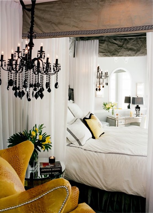
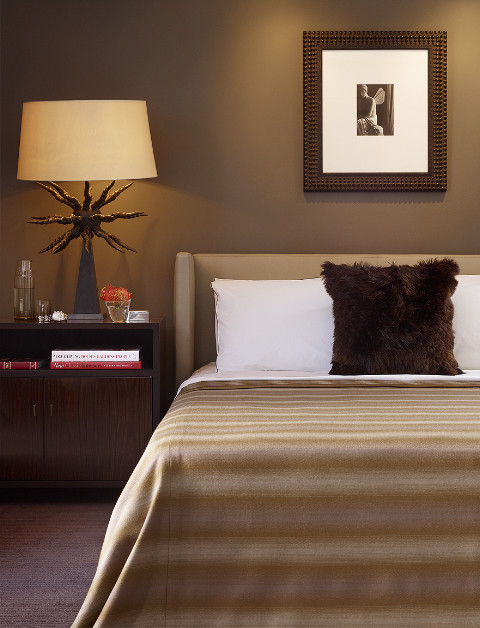
The lamps in these bedrooms make quite an impact. These designers new that they would. Jay Jeffers selected a portable lamp that literally glows, illuminating the elegant shape and form of the lamp's structure. Tracy Murdock adds drama and romance to her design with black crystal chandeliers. Mark English takes a monochromatic room and adds texture, of course, but also an edgy diversity that adds significant interest. Lamps in bedrooms are a detail that need attention and thoughtfulness but can often be overlooked. That is not the case in these examples. Follow their lead.

Photos compliments of Houzz

Tuesday, September 14, 2010

Nature's Simple Influence

This past weekend, my family and I hiked along the Potomac River. It was a gorgeous day ~ not too hot ~ sunny and crisp in the shade.

There's Jim and Lauren on a fallen tree. It got me to thinking about how nature has influenced so many designs.

Something as simple as a stick can provide inspiration and have impact. Above, my daughter uses one to aid her when she got tired.

So many lovely product designs have been influenced by or merely use the simplicity of a stick. From hardware to lighting to furniture and beyond ~ the stick has made important contributions. Here are just a smattering of examples compliments of Rocky Mountain Hardware, Palecek, Global Views, and Arteriors Home.

Designers often say they want to "bring the outdoors in." Today's selections in the Market let us do this easily. I love bringing in the accents above. They have a way of belonging no matter what the 'style' may be. Likely because they are so familiar, so at ease.

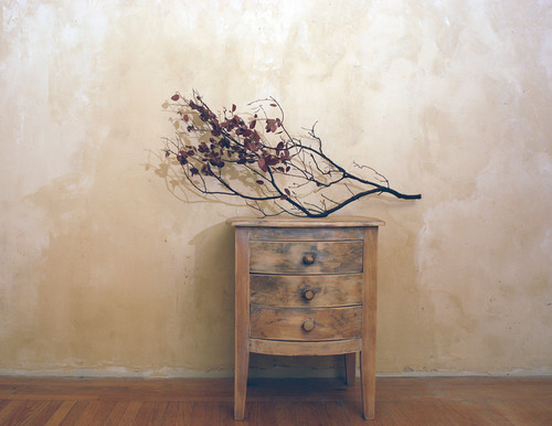
One doesn't even need to make a purchase to achieve the sophistication of the pieces above. Simply find some beautiful sticks of your very own and make a lovely arrangement to accent your home. Photos compliments of Houzz.

Barefoot Contessas Home Kitchen, Recreated  kitchen


Blog Widget by LinkWithin