Monday, May 31, 2010
Timeless Tuesday Number Seventeen
The water slide was set up in my backyard for three days. Lauren and her friends enjoyed it so much. We ate until we couldn't move and laughed until our sides hurt. We doubled the dose of sunscreen as we hung out almost exclusively outside.
I hope you had an enjoyable long weekend!
That is my timeless classic for today ~ welcoming summer and the glorious outdoor entertaining season!
Now it is your turn to share your posts about classics or trends you hope become timeless...
1) Add your permalink below ~ not your blog's address in general but the specific post you want people to visit. To obtain the actual post link, click on the title of your post once you have published it and copy and paste the URL into Mister Linky.
2) Leave your name and say a couple of words to describe your post (e.g. "Coco Chanel suits" or "Classic interior design for children" or "Delicious meals in a snap."
3) Copy and paste the Timeless Tuesday logo button (on my right sidebar) to your Timeless Tuesday posts. This is a sure way for your readers to know you have joined in the party.
4) Link back to the host blog, that's me ~ Paula Grace Designs Blogspot Timeless Tuesday ~ so all the bloggers that joined the party will receive many interested visitors.
Wednesday, May 26, 2010
Thursday's Room
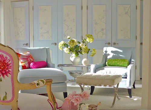
This is different type of room from what I am normally drawn to ~ at least palette wise. But this room captivates me and draws me in. I am completely smitten with it. Why? Let me tell you... You know I am a fan of Houzz where I found this lovely photo. I continually go back to Houzz to check my idea folder (I only have one) to see if I am still attracted to what I have placed in there. Some I still love, some I wonder why I even put them in. But this one still makes me smile every time. Why?! It is a happy room with a wonderfully sweet color palette and just enough pop to satisfy me. It also has lovely variety. At first, all I saw was the soft blue. I love blue ~ a big fan. Usually, it is not the powder blue types but I don't see this as powder blue. The wall has a smidge of red in it leaning it toward the lavender and the chair fabric has a touch of gray making it easy on the eye and giving it staying power. Then I noticed the wonderful pinks, green, and orange ~ some not so soft and a great contrast to the blues. A bold motif on the back of the chair serves almost like a wink inferring 'I'm not always a kitten'. The painted panels on the doors give my eye a great rest and interest to absorb. They also add a rhythm dancing across the room. After the colors, panels, and motif, I noticed that all the chairs are different offering unique seating ~ something for everyone. How considerate! All furniture has exposed legs ~ I love nice legs (on almost anything). Soft and sweet, sexy and sassy all at the same time. Hmmm... maybe that's why I can relate so well to this room ;)
Monday, May 24, 2010
Timeless Tuesday Number Sixteen
She has written many favorite songs of mine. I will leave you with a couple to enjoy as you contemplate which post you link to the party. Let me know if you have ever seen her in concert. I saw her once when she performed with her daughter. I loved that. Some day I hope my daughter is by my side like this. Not performing of course but designing. She does this now at the age of seven. Lauren, my daughter, is wonderful with colors. I've asked her to find a paint color that matches a fabric and she does it lickaty split. But I digress. Here are a couple songs that I love... enjoy!
Now it is your turn to share your posts about classics or trends you hope become timeless...
1) Add your permalink below ~ not your blog's address in general but the specific post you want people to visit. To obtain the actual post link, click on the title of your post once you have published it and copy and paste the URL into Mister Linky.
2) Leave your name and say a couple of words to describe your post (e.g. "Coco Chanel suits" or "Classic interior design for children" or "Delicious meals in a snap."
3) Copy and paste the Timeless Tuesday logo button (on my right sidebar) to your Timeless Tuesday posts. This is a sure way for your readers to know you have joined in the party.
4) Link back to the host blog, that's me ~ Paula Grace Designs Blogspot Timeless Tuesday ~ so all the bloggers that joined the party will receive many interested visitors.
Sunday, May 23, 2010
Monday's Method ~ Blue
My living room is at the top and here is my sun room. The steel blue is paired with neutrals. I have always loved blue so when I finally got around to perusing House Beautiful's story of blue since the 1930s, I found myself smiling a lot and enjoying almost every picture. Let me show you a few of my favorites...
February 1938; April 1940
Amazing ~ the 1938 design could be done today and still considered fresh. The blue with the chocolate brown ~ love it.
February 1950; June 1953
Isn't that the color in 1950 that is En Vogue this year? The 1953 design is priceless and if implemented today, I would still be drawn to it. I love the touch of red. Remember that touch.
January 1959; November 1965
The palette in 1959 is similar to my home now. There's that color again in 1965 ~ similar to 1953. I love those chairs. There is that touch of red again.
January 1969; September 1982
That is one lovely outdoor space. There it is again in 1982 - shades of turquoise.
December 1984; November 1993
The 1984 one is my favorite. That is a timeless room. In the 1993 room, the wood tones with the blue is striking.
August 2009.
Now we have more than a touch of red with the blue. We have a pairing. Note the back of the chairs. I love this color combination and apparently others have too over the decades.
It is interesting to me how colors, blue in this case, and color pairings come back. I think if a room is done well, it can be down right timeless and always seem 'just completed.' That means it didn't come back ~ it never went away. And that, my friends, is design done well.
If you have a design question, please leave me a comment. That is what Monday's Method is all about. If you have a particular concern with your space, send me a couple of pictures to paula@paulagracedesigns.com. Place Monday's Method in the subject line.
I'll see you tomorrow for Timeless Tuesday. I have a bit of a twist for tomorow's timeless classic.
Thursday, May 20, 2010
Fun Friday ~ Design Divas + One
Enjoy your weekend!
Wednesday, May 19, 2010
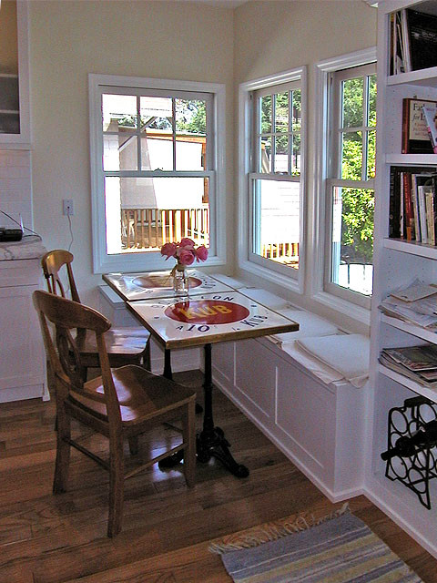
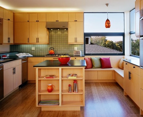
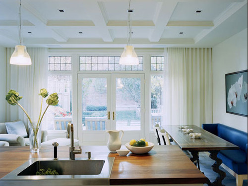
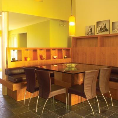
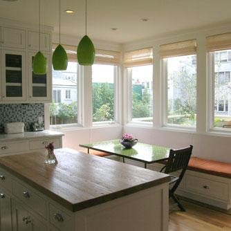
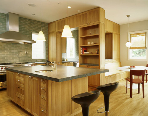
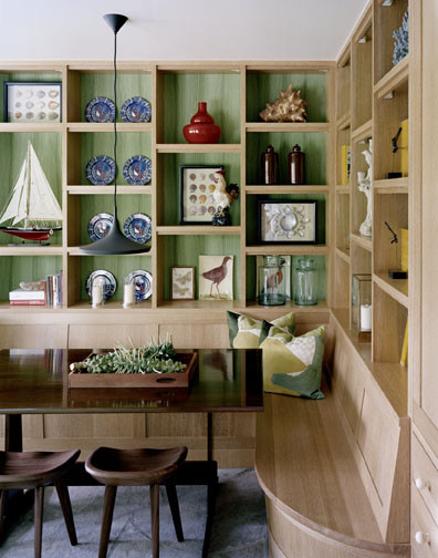
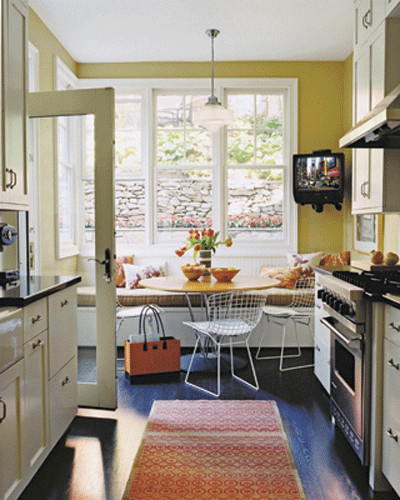
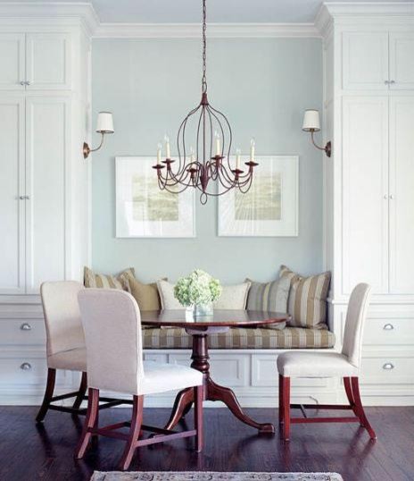
Thursday's Room(s) ~ The Banquette
I am working on two kitchens right now ~ among other things. In one of them, I am using a clever method of gleeming a comfortable dining space within the confines of the room AND adding extra storage. I need to seat five daily and more when family and friends visit. Enter the banquette. This smart detail has been around for centuries. Today, it is used effortlessly in kitchens, dining rooms... any room that would like a section for dining and the convenience of extra storage. Here are some examples I found on Houzz...
Monday, May 17, 2010
Timeless Tuesday Number Fifteen
Barbara Barry
Paula Grace
Jonathan Adler
Ron Marvin
Vicente Wolf
If the canvas is neutral, all else takes center stage ~ art, furnishings, lighting... The other wonderful thing is if you want to change out pieces, you can do so with ease.
Neutral wallcovering ~ specifically paint in this post ~ is my timeless classic for today.
Now it is your turn to share your posts about classics or trends you hope become timeless...
1) Add your permalink below ~ not your blog's address in general but the specific post you want people to visit. To obtain the actual post link, click on the title of your post once you have published it and copy and paste the URL into Mister Linky.
2) Leave your name and say a couple of words to describe your post (e.g. "Coco Chanel suits" or "Classic interior design for children" or "Delicious meals in a snap."
3) Copy and paste the Timeless Tuesday logo button (on my right sidebar) to your Timeless Tuesday posts. This is a sure way for your readers to know you have joined in the party.
4) Link back to the host blog, that's me ~ Paula Grace Designs Blogspot Timeless Tuesday ~ so all the bloggers that joined the party will receive many interested visitors.
Sunday, May 16, 2010
Monday's Method ~ What's New?
"Laura Kirar is the founder and creative director of Laura Kirar*TRU Design. Under her direction the teams in New York and Miami work in tandem to create elegant, innovative interiors and product for the home with timeless sensibility. Laura has shaped the design of an array of interesting projects - from high-end residences to award-winning commercial interiors of restaurants, showrooms and hotels.
A testament to Laura's unique design voice, she holds concurrent product licenses with all four of the Kohler Interiors Group companies: Ann Sacks, Baker Furniture, Kallista Company and McGuire Furniture. Her collections offer a full range of home products from tile and bath fixtures to seating, lighting and accessories. She has also collaborated with Boyd Lighting, Carnegie Fabrics, David Edward Company, Dennis Miller Associates, Tuohy Contract Furniture, Tufenkian Carpets and most recently Arteriors Home launching in the spring of 2010.
A designer with the soul of an artist, Laura completed her degree in sculpture and interior architecture at the prestigious School of the Art Institute of Chicago. Her passion for artistic exploration in numerous mediums has continued to infuse her work with originality and thoughtful attention to detail.
Over the last decade, Laura Kirar's designs have been profiled in many top publications including Architectural Digest, Elle DĆ©cor, House Beautiful, Interior Design, Met Home, Space, Self, Vogue Living, Women's Wear Daily, W, Wallpaper, The New York Times and Time."
Amazing! I have been a fan and admirer of her work since I started in this field. Here are a few of her creations from Baker...
When nobody writes in for advice on Monday's Method, I feature new items in the marketplace. The talented Ms. Kirar has now spun her creativity for Arteriors Home. She's designed lighting, accessories, and wall decor. It gives me great pleasure to showcase a smattering of her new products...
I love this vintage type pendant on the left. I think I'll specify it for a kitchen I am doing.
The wall decor above and below I adore. I can see a lovely grouping of them giving wonderful visual impact.
What are your thoughts? Any favorite pieces?
Of course, if you have design questions, leave me a comment. If you have needs specific to your space, send my a couple of pictures to paula@paulagracedesigns.com. Place Monday's Method in the subject line and I'll be sure to get it.