
Here is Paula Grace Designs, Inc. June Newsletter!
 Here are my smallest BeautifulX2 Curio Table in ivory in their temporary home. I think they are lovely drink tables. My friend, Pam, thought a grouping of these at varied heights would be fantastic. I couldn't agree more. They were designed to be as such either the same table at varied heights or different size tables grouped together. What did I place inside of them?
 Nothing yet. We're getting ready to move so I haven't placed the seashells in them my daughter collected on one of our vacations but I think the off white shells will look splendid on the blue background.
 Here is the distressed black one (size 22" diameter) in my client's home. The picture is awful as I forgot my camera so I snapped this with my Blackberry. They look fabulous in the room. A pair flank a floating sofa.
 You may have seen this vignette before in my master bedroom. I replaced the glass and crystal table (you see it off to the left) with the 22" table. I always thought the glass and crystal table was beautiful (still do) but it was just a bit too small ~ disproportionate to the chair and floor vase. Also, I think the bedroom is a very personal place. A place to have see beloved art and memories pertaining to one's relationship with their spouse (partner, lover.... you get the picture). I love this vignette. It is very meaningful and precious to me. The art is of a passionate embrace. Now ~ just below it is...
 a picture of me when pregnant with Lauren. Below that inside the table is Jim and mine wedding album. Cheesy?? Maybe but I love stuff like this. Placing precious thoughts and memories together. This vignette is my life with Jim.
 The media cabinet I designed for my private furnishing line was placed in its new home today. The piece is 11' tall so it took a bit of muscle to install it but I have to say ~ I love it. The doors function exactly the way I designed it due to specialty hinges.

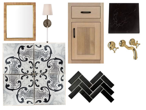
 Thank you Jason for selecting my hall to use as an example! Click here to view the story on Houzz.

 There is one of the counter stools ~ from the Kristin Drohan Collection.
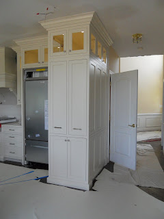
 Recall how the cabinets ended prior to the door? Well, no more. This area was made into a slightly separated display area. My client will display a cherished collection she will get from her father. Lovely!
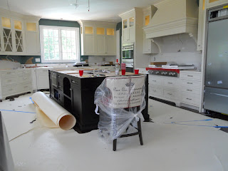
 Now that is an island that my client will be able to do all her baking on. The granite is not installed yet but there will be a 12" over hang that will increase counter space even further. Now for the bells and whistles. Are you ready??
 Large two tiered drawers under the Wolf cook top. Don't you love the knife block drawer? Remember this piece stored in the front hall?
 And here's what it does...
 Completely see through pull out pantry one may easily walk around. Nice! Here is a gadget every baker should have. Now you see it...
 Now you don't. Don't forget to place on outlet inside the cabinet or very close on the outside so there really is no muss, no fuss.
 Got utensils? Here's the place for them!
 Got dishes and bowls? Two drawers for them.
 Remember the half wall with the columns? It is now a full bank of cabinets and drawers (still under cover)...
 The pulls and knobs I specified for this job are perfect transitional designs...

 I can't wait to unveil it! Here's a fantastic detail... recall the cold air return? Those are a necessary nuisance. No problem ~ just conceal it in the cabinetry...
 No one will ever have to know.
Laura Britt Design (via)
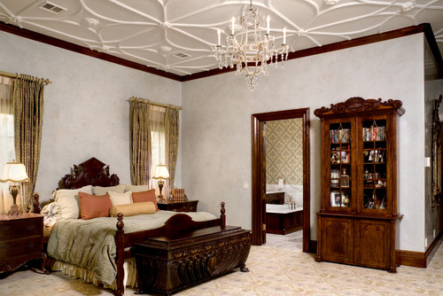
Beginning from the top, let's look at lighting on the ceiling. We mentioned the standard ceiling fixture that many of us have in our homes, especially in our bedrooms. From Mission to Modern, Classic to Contemporary, there are many styles to choose from besides builder grade globes. A step up from a ceiling fixture is a chandelier or pendant light. This can be a focal point for your room and add sparkle and glamour to the space. In combination with a central ceiling light or on its own, recessed lighting is a versatile lighting option. Say you want to highlight a painting or a wall of built-ins, create lighting zones for watching movies or entertaining, recessed lights can do it. Put them on zones and dimmers for maximum versatility. The above room is a superb example of using recessed lighting and a central light. But there is something missing -- task lighting.
workshop / apd (via)
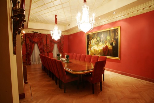
While recessed lighting and a chandelier can wash a room in light, you'll want to add lighting closer to the action. A table lamp on a side table or a floor lamp can provide light for reading or other tasks. Table lamps and floor lamps can create a more intimate feeling in the room when they are the sole source of light. Pairs of table lamps or as in this room, with an added floor lamp off to the side, create visual interest in the room as well.
House Beautiful (via)
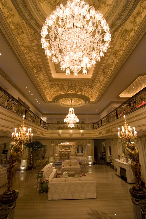
Not every room needs to have all five types of lighting, but large spaces can benefit from the variety of lighting options. Our fifth suggestion for living room lighting is the wall sconce. In pairs flanking the fireplace or a single one in a small space to provide task lighting, candle sconces create a warm, ambient light. Traditional wall sconces, like in this Southern living room, can also be focal points. I love Barbara Barry's style. Clean lined, elegant shapes. Her new line for McGuire is no different. Take a look...
 These pieces are from her Bowmont Collection.


 I love the stretcher, toe cap, and finial details! Isn't that the sweetest thing??!
 Here is the Media Cabinet. I have not named it yet. What do you think it should be called? This one is quite large as it was sized for a two story great room application. I love the softness of the arcs and the pizazz of the bronze - silver finish. The mirror will reflect the light and beauty of the rest of the room.
Home | About | Portfolio | Paula Grace Furnishings | Working with You | Attaché Design | Press | PGD Blog | Contact Us
©2006-20011 - Paula Grace Designs, Inc
| Privacy Policy
Website designed by Digital
Doorway Designs