About Interiors FurnishingsWorking with You Attache Design Press PGD Blog Contact Us

Monday, February 28, 2011

Paula Grace Furnishings ~ BeautifulX2 Curio Tables

My BeautifulX2 Tables are featured in the Spring Home and Design Magazine. I was looking in the marketplace for curio tables. These table were conceived when I didn't find what I was looking for ~ a more contemporary version of this classic table. I love displaying mementos and precious trinkets in my own home and in clients' homes but I don't like the dust that invades them. For example I have my wedding album on a table in our living room. The lovely black cover shows every speck of dust that lands on it. So I designed these elegant current tables for just such things. I'm placing them in a couple of my projects where mementos will be displayed in one and gorgeous fabric in another. I can't wait to show you the pictures after the installations. This is the second case good to my furnishings line. The first is a media cabinet being built as I type.

Here's the picture that appears in Home and Design ~
Here's a few good things to know about them ~

1. They are eco-friendly (maple wood from sustainable forests, finished in low VOC paint or stain, and are made in the USA).

2. They are available in four sizes 12" x 18", 15" x 22", 18" x 24", and 21" x 28". They also may be customized to any size (I am going to size it as a cocktail table for one of my clients).

3. And five standard finishes are available in matte or gloss ~ white, black, ivory, gray, and red. Custom colors and stains are also available if a finish sample is provided.


4. They have metal toe caps and stretchers (silver or gold finish).

5. In the center of the stretcher is a beautiful crystal finial.

6. The inside bottom may be upholstered in any fabric supplied plus the bottom comes out with ease for reupholstering.

7. These tables are so versatile. They can stand alone or in a grouping.

Here they are in the full rendering...

I think they are quite impactful in a grouping.

My furnishing line will be added to my website this week. I'll add to my collection as I design and fabricate pieces.

If you would like more information about my BeautifulX2 Curio Tables, please drop us an email at furnishings@paulagracedesigns.com.

Friday, February 25, 2011

Lauren's Room #1


Here is one of the fabrics Lauren, my eight year old, chose for her bedroom makeover. Sasha by JF Fabric in black and silver. This room is going to be fun and interesting!

Tuesday, February 22, 2011

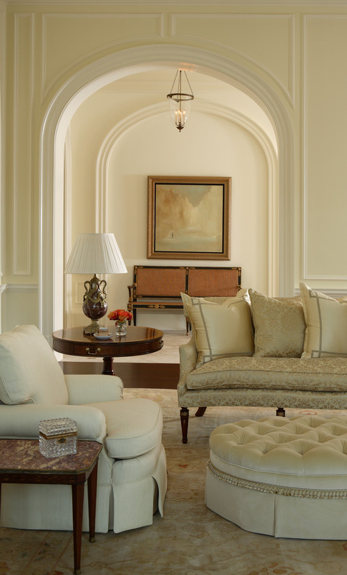
Grand and Serene

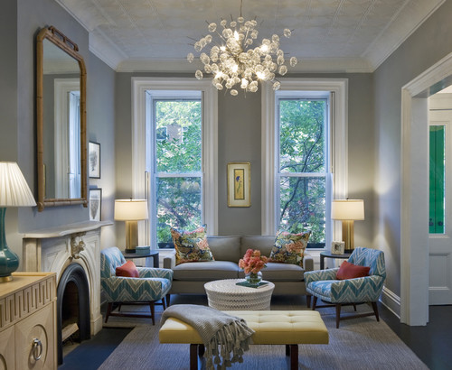
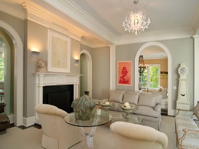
Buckhead traditional living room

I love the grandness, elegance, simplicity, and serenity of this architecture. The design group's use of neutral textures continues the love affair. Nicely done.

Photo compliments of Houzz

Sunday, February 20, 2011

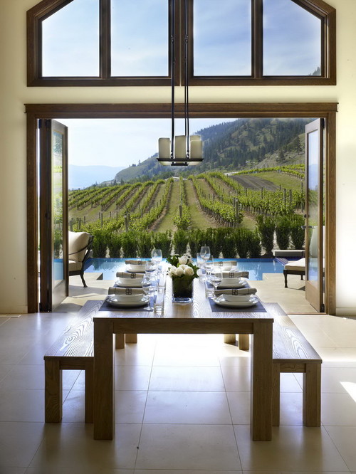
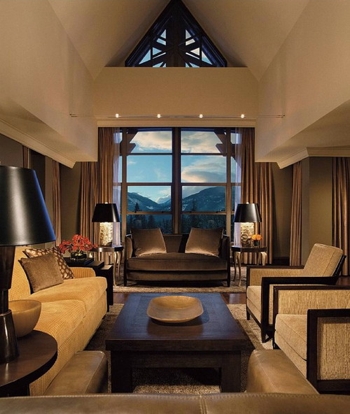
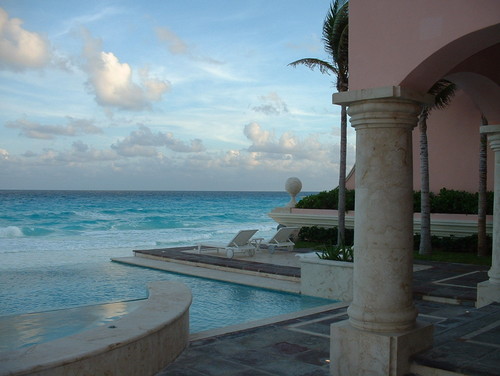
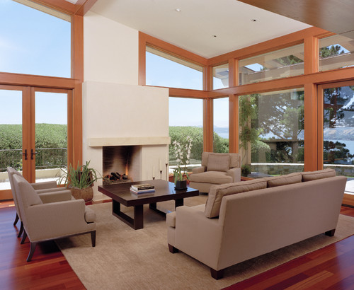
Rooms with a View

While at CHil Design Group contemporary dining room

While at CHil Design Group contemporary family room

South east view. With waves. tropical pool

Marin Residence contemporary living room

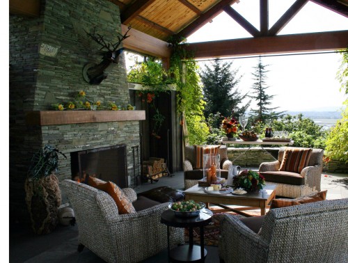
Dining Alfresco traditional porch

There is always something quite special about rooms that bring the outdoors in or are seamless with nature. We've had tastes of Spring so I'm getting myself ready to be one with nature ~ again. I wish I was a snowbird but I'm not. I do love many scenes in winter but I enjoy the feel of warm breezes. It won't be long now!

Photos compliments of Houzz.

Saturday, February 19, 2011

James Swan ~ This One's for You!

Some of you may 'Like' James Swan and " Things I Hate About Your Home. I know I do. It's all in good fun. I smile every time I look though the photos he puts together. Sometimes I think it is just an unfortunate situation. I have one of those on my hands right now. I joke about it with her all the time. I tell her that one day she'll find me in her home with a can of primer. "I know, I know," she says. But she is a loving wife. You see her husband painted this Rembrandt. A faux treatment called 'rolling.' I have seen rolling. This is not it. I call this Anxiety Attack...

Look left, look right, look up... its always there. I tell her I have to close my eyes when I am in this powder room because it makes me anxious and dizzy. But inevitably I have to open my eyes for fear of falling and cracking my head on the sink. Here's the thing... if I fall and crack my head and blood splatters on the walls and ceiling, could you even tell??!! I think not. I would lay there, helpless, TRAPPED.... my heart is pounding as I type... I'm starting to sweat.... UUGGGHHHHHHHHHHHH!!!!!!!!!!


Ok, I'm good. I realized I'm just sitting on my sofa looking at something that will change very soon ~ the primer is in the trunk ;-)

Thursday, February 17, 2011

Sculpting Sneak Peak

Some of you have asked for a peak at what I'm sculpting right now since reading the newsletter. I am working on two actually. This one I started tonight. It's nowhere near completion but you'll get the idea...

I need to fix the arm a bit... and give her another one... and a head. I'm not sure yet if I am going to give her a head. I haven't decided. That's what I love about art ~ the evolution.

Wednesday, February 16, 2011

Then and Now ~

If you have been following for a while you may remember a post on my daughter and I standing the same way. It always amazes me when I see myself in my daughter ~ even when she's having a melt down, I see myself (that's when I say "Oh dear!").

Here is Lauren's pose and then mine. We have the same body type ~ long and lean...


I guess that is a bit of then and now. I must have stood the same as Lauren does now.

Here is a REAL then and now... via Facebook, I was connected to old classmates from middle school. Yes, middle school. I was able to look at folks then and now. I had a few surprises but none as much as looking at myself...

That's me ~ top right picture in the middle. It's a bit difficult to see. I am sitting but you can still get a sense of what I look like. Here I am today...

The picture of me standing at Market and this one shows me that I haven't changed all that much from middle school. Even my hair is similar. Oh boy! This is either the longest rut or a saving grace. I'll let you decide ;-)

My Latest Newsletter


Here is my latest newsletter. You can sign up for my monthly newsletter almost any where on my website and on the right sidebar of my blog. Enjoy!

Monday, February 14, 2011

Elizabeth Lyons Glass Art

Elizabeth Lyons has unveiled her latest collections of glass jars (aka art). Take a look...

Zest2

Bottleglass

Warmth


Blues


Simply gorgeous!

Wednesday, February 9, 2011

Classic Vladimir Kagan

So many have been influenced by Mr. Kagan. You can see his influence in many contemporary designers. Just take a look at Amy Lau's design...

Miami Townhouse modern home office


Let's take a look at some of Vladimir's classics...
I do enjoy the shape and form of his creations. A well place piece of his or one influenced by him goes a long way.

Tuesday, February 8, 2011

Pops That Work For Me

Queens contemporary bedroom

My daughter would love this. That's her pink. My only question is where is the lighting?

Bergen Street Residence contemporary living room

I love the coral accent in this room. It develops a lovely rhythm across the room. The flowers are very well placed.

Corbett Venetian contemporary living room

I know, I know but I just can't take my eyes off this picture. The sofa with the chandelier just work for me. Would I have this in my home? No. But I'd really like to visit this home. I bet they are fun!

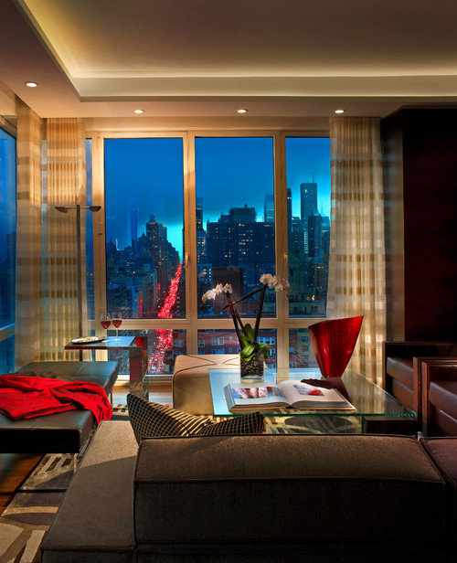
DENIER contemporary living room

The red is fantastic! The photographer was genius to incorporate the car lights.

willow decor mls greenwich home listing contemporary living room

And THAT is what art can bring to a monochromatic room.

I am working right now in a monochromatic master bedroom to bring in some color. I have just the thing for this bedroom. I'll share as I go.

I do love the pop. It just ignites the room. It doesn't have to make the room go up it flames if one doesn't want it to. A subtle pop that simmers and brings a gesture of heat will do.

Photos compliments of Houzz.

Friday, February 4, 2011

William Yeoward


I have to say I am truly smitten. I had the pleasure of attending the debut of William Yeoward furnishings in the United States the other day. It was a lovely event held in the Edward Ferrell & Lewis Mittman Showroom at the Washington Design Center. William did a "dry run" of his presentation on his new fabric line with Osborne & Little. He was going to NYC for the formal bash ~ we were his "guinea pigs" as he put it. I was happy to be one. First I'll say what I love about William; then I will tell you what I love about his creations.

William was the most gracious host I have ever seen. He was rearranging furniture to ensure people would be comfortable; he was taking the guests empty plates away; he wore jeans. I would live in jeans if I could. William was self-depreciating and humble. I have met people with half of his talent and success with egos the size of Minnesota; who wouldn't look at you when they spoke. I assure you I will not use their product lines in my designs. But William was down right endearing AND he is incredibly talented. His new fabric line was inspired by where he grew up ~ Cornwall, England. He treated us to pictures of Cornwall and how the fabrics relate. His brother was also in the pictures, which, of course, made it all the more personal.

William has many product lines. Sometimes when designer get too diversified, the magic can be lost. Not so here. Here has upholstery, case goods, pillows, accessories, and crystal. Now that is a man after my own heart. You know I have an affinity for glass and crystal and William did not disappoint. I also love embroidered pillows. William's are gorgeous and all done by hand.


His fabrics are lush and real. The cottons and linens he introduced were amazing. They are robust and beautiful.


I fell in love with his Pila Chair. Here's an important point ~ I sat in many of his chairs. They are comfortable! The Pila Chair in particular was very much so. Here is another point I love ~ you can dress his upholstery up or pare in down to accommodate any room in your home. Take a look...


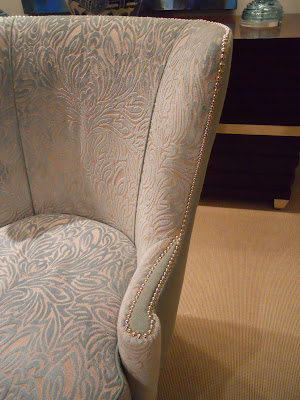
The Pila Chair on the left is currently displayed in the EF & LM showroom. That is a fabric for last year's collection (I love it!). This version is formal. Now look at the one on the right ~ this is casual done with his new earthy fabrics. Each equally lovely. Why? It's the shape of the chair. Graceful. The back wraps around you. Look at this detail picture...

I love the little touch of the solid fabric surrounded by the nail head. Beautiful!

William seems to often use two fabrics on his furniture. That is another detail that I enjoy. It makes the piece interesting and can provide a gentle pause to a highly patterned fabric.

William has wonderful books as well. Click on each to get them...


He is mindful and talented. I definitely will be using his lines.

He's just that good!

Blog Widget by LinkWithin