Thursday, December 31, 2009
Show House Reminisce
The bones of the room are magnificent. The built-in bookcases are lovely. The windows boast amazing views. The mantel was significantly damaged or I would have tried to selvage it as it was original to the home. I sadly had to remove it. In this show house, we were asked to incorporate the art work of the local artists whose work has been recognized by the Arts Council. Most of the designers, including myself, also paid homage to the Audubon Society. We also respected the incredible architecture of the home as it is breathtaking. The paint color options were selected by the Show House Committee as they wanted flow to be taken into account. They chose well ~ the first swatch in the Benjamin Moore Historical colors ~ buttery yellows and pale greens. I selected the lightest buttery yellow tint. Here are my after photos (double click on them for the full affect).....
This French inspired design began with the art of conversation with the primary focal point of the fireplace and the secondary focal point the art on the wall opposing the fireplace. The sofas were positioned to be able to see both and face each other for intimate interaction. The palette began with fabulous fabric on the ottoman from Beacon Hill. From the hues on the fabric, I selected the butterscotch area rug from Odegard. I color matched the rug hue for the paint to back the bookcases. Painting the bookcase backs added depth and richness. I also placed a mirror back in a portion of the lowest bookshelf to add a bar stocked with Port wine. Antique wine glasses and crystal and silver accessories completed it. I used traditional pieces from TCS upholstered in sumptuous fabrics from Robert Allen/Beacon Hill. The throw pillow fabric is also from Beacon Hill except the blue and gold striped one ~ that is a Highland Court silk that I adore. The casegoods are from Norwalk. The portable lamps are from Lenox and Waterford. The art work is stunning. The landscape paintings were done by Ed Cooper. The pastels were done by Libby Stevens. I simply hung them on decorative hooks with wire covered in fabric. Almost all of the items that were for sale in the room were sold. Wonderful as that is one of the ways money is raised in almost any show house. I remember it was a Fall Show House and particularly cool on some of the days. Many people came back to my room after they saw the entire house ~ they simply wanted to hang out in there. They told me how inviting and warm the room was and wanted to sip tea lounging on a sofa. That was the best compliment! If I had tea, I would have served it! It was a lovely event and I adored my room. I am itching now to do another show house. Hmmmm.... I should do something productive with that itch.
I am joining the Metamorphisis Monday party at Between Naps on the Porch and Blue Monday at Smiling Sally's. Hop on over to see what's happening there!
I just found out that Julia from the wonderful Hooked on Houses posted about my room in this show house on her blog as well! Wow, is that cosmic or what??!! Great minds..... Thanks Julia ~ you're the greatest!
Wednesday, December 30, 2009
Advice Column ~ Tranquil, Modern Bedroom
Here is her email....
My response.....Dear Paula Grace,
I enjoy your column and wonder if you can give me a tip on how to jump start my stalled master bedroom makeover. I want a peaceful, tranquil, more modern room that is bathed in light during the day and cozy at night.
Unlike the client you mentioned that wanted to get away from white, I am drawn to it. But now I have a lot of white and ivory including a beautiful new bed and new silk curtains. All three large windows have ivory solar panels which satisfied my desire for a clean and contemporary look (and lots of light) but the shades do not provide privacy at night or insulation when it is cold outside. Hence, the silk curtains. But I only have silk curtains on one large window leaving the two neighboring windows looking exceptionally bare.How would you suggest I even out the look of the windows and maybe begin to introduce color? I am attaching a photo so you can have a better idea of what the room looks like today.
Any advice you can give is much appreciated!
Sincerely,
Vikki P.
Dear Vikki,
Thank you for writing in. First of all, your bedroom is lovely. Stylish furniture; plenty of natural light and sumptuous silk drapes. You have the foundation of a magnificent room. I’m glad we had a chance to email regarding colors as it is important to add a color(s) that you enjoy. Green and brown are excellent choices ~ natures hues are always soothing. Since you would like peaceful, tranquil and more modern, I would add a soft green and a chocolate brown. The dark hue is neutral thus has staying power and will ground the design nicely ~ and a direct connection with the earth; the soft green is for the tranquility. I would not add any more color than that. Mix textures and use a combination of pattern. Use motifs you would see in nature plus a subtle plaid and stripe to compliment the curves. Here are some examples from Robert Allen / Beacon Hill.
RA: Statosky-Java, BH: Blanket Stitch-Citrine, BH: Fossil Dig-Citrine, BH: Wikipedia-Canary Green, BH: Summer Sonata-Peridot, BH: Woods Creek-Peridot, RA:Velvet Pipes-Terrain
For the specific window issue, I would suggest roman shades to be used in conjunction with your solar panels for the windows flanking your bed. Hang them at the same height as your drapes for a uniform line. The Beacon Hill: Woods Creek – Peridot would be an excellent choice. It is a soft pattern and incorporates the ivory hue connecting them with your ivory silk drapes. The shades may be lined and interlined for the privacy and coziness you seek. An important fact about fabric roman shades ~ they must be well-made or you may run into functional problems. They are notorious for being difficult to pull up straight and it sounds like you’ll be doing that to let in the natural light and have them down at night. If they are well made, you won’t have issues, if not ~ well….. Try The Shade Store. Robert Allen has a partnership with them so you may be able to use a fabric such as the Beacon Hill: Woods Creek – Peridot. If not, use the Robert Allen linen on The Shade Store site and add a band of the same fabric to the bottom of your silk drapes. You may use all of the other fabrics for throw pillows and upholstery noted as they relate nicely to the linen hue.
An alternative to the fabric roman shades is a roman woven shade. I have never run into problems with well-made wovens and since they have developed into sophisticated patterns, they could be easily used with the lush drapes. Select one that matches your ivory drapes and that has a close and consistent weave. An example from Horizons is below. This alone will not bring in color but it will bring in texture. If you would like color on the woven, simply have them banded in the green. If you decide to band them, add a band of the same fabric to the bottom of your existing drapes to further connect the window treatments.
Horizons: Holland Mesh-Timid White
Caveat ~ if you use Beacon Hill: Woods Creek – Peridot for roman shades, do not place a band of it on the drapes. There is a relationship with the drape’s ivory hue and the motif on the shade fabric. Adding a band on the drapes may be too much of a good thing.
On your bed, start with a clean lined ivory duvet. The Diva (love the name) from Wildcat Territory is a nice choice. Since you have a fabric headboard, the shams are optional. Place an assortment of throw pillows on your bed. Use the shade fabric as one pillow and then mix the patterns, textures, and pillow style. I like to ground the pillows with dark in the back row, then lighter in the front. I suggest one large bolster in the Robert Allen: Velvet Pipes - Terrain above as the back row. This will pop off your ivory bedding or headboard. Three 18” self-welt pillows (middle one being the window fabric) in front of the large bolster. One or two 16” self- welt pillow and two small bolsters in front of that. This may sound like a lot of pillows but here is where we have an opportunity to add lush fabrics, beautiful pattern, texture and color not mention an air of femininity given the master bedroom is for a lovely lady. Since the pillows are clean lined (no ornate trims), they will be contemporary yet lush. Add a faux fur throw to the mix and hello luxurious!
A bench at the end of the bed with in Robert Allen: Statosky – Java would be wonderful. This would connect the pillows at the head of the bed with the end of the bed. Nothing over powering ~ just a simple bench such as this one from Hickory Chair.
Hickory Chair: Farra Cocktail Ottoman
Ground the entire bed / bench area ~ the focal point of the room ~ with an area rug. The area rug that is shown in your picture is too small in scale ~ it is disproportionate to the bed. A 6’ x 9’ or 9’ round rug such as this one would be better. The rug should be placed such that it is underneath the end of your bed and the bench (see illustrations). I would recommend a chocolate rug with a tone on tone motif inspired by nature or a plain, soft, luscious rug as exampled below from Surya.
or
or
Surya: Natura NAT-7041 or Manhattan MAN-6663
Add some sparkle to the room by replacing your night stands lamps with something like these from Arteriors Home ~ clean and elegant.
Arterior Home:Clear Silveria Bottle NeckGlass Lamp 44471-371
Arteriors Home: Zola Melon Lamp, Hotel Silver 44438-146
If you have a seating area in your master, as many do, I suggest a chaise or chair with an ottoman to lounge in. The fabric ~ Beacon Hill: Fossil Dig – Citrine. It is soft with subtle color and wonderful pattern and texture. Since I don’t see this area, I cannot recommend a specific one ~ but you get the idea.
Note~ The specific furnishings named can be implemented literally or can be used as a catalyst to fill the room with similar choices.
I hope this helps!
Paula Grace ~
Wow, that was fun!
Tuesday, December 29, 2009
Bethesda Renovation
You know what they say about a house ~ location, location, location! Well, this home is the epitome of that expression. My clients thought about moving as they felt the house wasn't fulfilling their desires. Still, they raised a beautiful family and created a lot of memories there plus the real estate market was in peril. They purchased the home decades ago and were sure to reap great reward even in the market's state but then they had an idea. Instead of selling their home and purchasing their dream home, why not renovate and make their home filled with memories and dreams realized into their dream home. This is a win~win situation as they don't need to lose their location and fondness for their home and they will gain resale value (if and when they choose to leave). How wonderful!
I worked with a awesome construction company, Case. Kudos for all their fantastic work. Let's take a look at the before pictures.....
This is what was once their living room located at the front of the home.
This is a great before shot. You can see the former living room, dining room and kitchen door. The kitchen was located in the center of the home.
This was the view from the kitchen door and foyer area to the back of the home.
This is the back portion of their home formerly the eating area of the kitchen.
This is a shot facing the front of the kitchen. You can see all the wasted space quite well.
Here is their former television room on their lower level.
Clearly the layout needed some improvement, updating was essential, and even though they have plenty of windows, lighting was an issue after dusk. A little about the couple ~ all kids have grown so the main inhabitants were just the two of them, they have many lovely artifacts from around the world, their goal was to seat as many as possible in the living room as when the family visits they have a full house; they love books, they have thousands of books; the man of the house plays piano and wanted to incorporate a baby grand into his home, and they enjoy the color palette that you see represented in the after photos; he needed his study back ~ he gave it up as they had four children and needed the bedroom (I do not have photos of the study. He was not at home for the photo shoot and I did not feel comfortable organizing his study without him).
The main entrance for them and their guests is the front door. This vignette is located just as one walks in the home. A place to take your shoes off on the way in and check one's lipstick on the way out. Hardwood flooring was installed throughout the main floor.
This is the view from the foyer (and former kitchen door) now. The kitchen was moved to the side freeing up the wasted space and creating a wonderful flow within the home. The hardwoods also helped with flow from one room to the next.
The his and her wing chairs (clearly identified by what hangs above~ her favorite painting and one of his prize artifacts from his travels) is where the kitchen use to be. This reading room is flanked with bookshelves. The living room is now in the back of the home enjoying the lovely backyard view.
Recall the lighting issue ~ for general lighting, we installed several updated recessed lights in the new dining room, kitchen, and reading area. When it came to the new living room, recessed lighting was not an option ~ no problem! This gave us a opportunity to use fantastic track lighting that was able to be aimed all around the room. Portable table and floor lamps were used throughout for task lighting.
They wanted to seat as many as possible ~ ok then ~ a large small-scale sectional (I know that sounds like an oxy moron but the sectional can seat many without overwhelming the space) and two small scale tub chairs do the job nicely. The ottomans can also serve as extra seating. The tables and ottomans are easily movable to accommodate their needs. Each seating area is grounded with a lush area rug.
The dining room is now where their living room use to be. They have much more storage with the buffet and the demi-lune cabinet. Aren't the dining room chairs beautiful? My clients have had them for a long time ~ they constructed the chairs themselves! You see the pocket door opening to the kitchen as well. I love pocket doors; they are a wonderful alternative when space is an issue. On the left side of the picture, you can see their breakfast 'nook.'
The nook is a peninsula spanning almost half the kitchen and open to the reading and family rooms. It is a great congregation place and intimate meal area. Three small glass pendants illuminate this area nicely and add sparkle. There is even a place for cookbooks! The counter height stools swivel allowing them to turn towards the rooms behind to participate in the conversation.
Here is more of their new kitchen! Simple, clean line cabinets, stainless steel appliances, a window over the sink, and beautiful matte glass subway tiles in the wave pattern they sought (the wave is soothing for the clients, not for my installers. They followed my AutoCAD specs perfectly but I had to endure a few nasty looks during the process ~ all in good fun of course!).
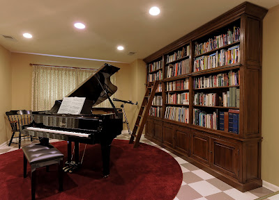
Here is part of their lower level. My clients did not want to change the flooring on this level. They had the flooring professionally cleaned and spiffed up ~ looks pretty good. Their television room was relocated to another portion of the lower level. We simply used all their existing furnishings for that and added new window treatments. The piano and library lives in the room seen when looking down the stairs to the lower level. This is his version of a man cave! What a delightful man.
They also had me do their guest bedroom. They wanted a room that could be beautiful all the time and very functional when visitors come. Enter a trundle day bed and lovely furnishings and window treatments.
Do you see a pattern in the home? Something that aids flow and gives a rhythm to the home? I used round red area rugs that are visible to each other ~ in the hall leading to the reading and living rooms, in the piano/library room, and in the guest room. The clients were unsure of this at first but they trusted me ~ that's what it is all about ~ and now they absolutely love them.
What a fabulous project this was. What truly remarkable people my clients are.
How wonderful!
Of course I am linking this metamorphosis with Between Naps on the Porch ~ Metamorphosis Monday! It fits right in.
Monday, December 28, 2009
CharityWorks' Green Designer Show House ~ Barry Dixon
I have one of those MP3 gadgets. I use it for transcriptions of the interviews I conduct. However, for this post, I have three audios you can download to hear Barry and my actual conversation. After you download the files, open them with Windows Media Player. You’ll hear Barry speak about all the green factors that are in the house, the resources, the camaraderie among the designers, and hear him working in the room with craftsmen as they arrive, speaking with his photographer, hear Barry talk about his own farm and the materials in the room that came directly from there, his design philosophy, and all about his magnificent room as we run around it, and his lines of furnishings ~ I was thrilled he provided so much detail. A quote I love is “tortured into place.” This is Barry’s thought about over-designing ~ aka matching so perfectly it abates the interest or sucking the 'living in' aspect right out of the space.
Paula Grace and Barry Dixon Interview ~ Part 1
Paula Grace and Barry Dixon Interview ~ Part 2
Paula Grace and Barry Dixon Interview ~ Part 3
I was treated to a sneak peek. Barry invited me to come the day he was having a in his room. That was fun to watch. I’m going to have to tell Bob, my photographer, that Barry treats his shoots like I do. Everything may be completed however, to the camera’s eye, things may need to be adjusted. It was great fun to watch Barry tweak and look through the lens to see if the shot was to his satisfaction.
In the midst of this, Barry and I sat down for a conversation about the house. I am not a reporter but I play one on my blog. The ‘problem’ is while sitting in Barry’s room, after a while when I was feeling more comfortable, it was difficult for me to focus on the interview. Why? Because the room literally started speaking to me. No, I wasn’t hearing voices. Not that kind of speaking to. You all know my love and sensitivity to music ~ harmony and rhythm play large roles in my designs. I was sitting there looking at Barry when out of the corners of my eyes, I kept seeing connections in the room that began a beautiful song in my head. I started sneaking peaks when Barry would look away for a moment to collect his thoughts and then it just took me over. I think in Barry’s mid-sentence I said, “This room has wonderful rhythm.” Barry’s eyes widened and he said, “Thank you!” He proceeded to get up and start showing me the connections in the room ~ some I had already seen, some I had not. It was exhilarating. There we were running around the room gleefully looking at all the elements. Honestly, it was like two kids in a candy store. And I thought, ‘I like this guy.’ Why? Because he made me feel welcomed to understand his design (versus keeping it a secret) and comfortable to be myself. In fact he mirrored what I was excited about. He’s a regular guy ~ albeit with incredible talent and clients by the score ~ but a regular guy just like I’m a regular gal that gets excited about such things as rhythm. He told me that some of his clients with kids play games for years connecting all the dots in his designs. How wonderful is that? How thoughtful! When you go to the show house and you are in Barry’s room, look for them. If you do not hear a symphony in your head ~ call me ~ I’ll take you through and play the music. If you are unable to go, I tried to capture much of what I was seeing in the photos, the way I was seeing it but it is difficult to recreate. I will try.
Barry was a gracious host. He’s a gracious man. He’s an intelligent man. He’s a kind man. I guess you’d say I’m a fan. Hmmmm…. I wonder if he has a fan page on Facebook. Sign me up!
Most of the furniture in the room are from Barry's own lines. The beautiful mirror that you see is a repurpose ~ an old factory window. The metal mullions of the mirror and the mechanism that connects the bolsters to the daybed are part of a larger metal/metallic rhythm in the room. Barry also connected his room to nature ~ bringing in the elements in the scenic backyard.
The beautiful chandeliers Barry brought home with him from New Zealand in his suitcase ~ they completely fold up. The fabric choice for the pillows mirror the water waves in the backyard pool.
There is also a theme of circles and geometric shapes in the room. You see it in the ottoman, the art behind the chair, the sculpture on the mantel, and in the chair's jewelry (rings on the arms) which doubles as a place to hang one's glasses. The nail head on the ottoman is part of the metal rhythm. The rug mirrors the texture of the grass outside.
Intimate seating areas in quite a large room.
The banquette and a metal screen behind it serve as a visual divider between the living area and kitchen. The chairs are another repurpose. Barry did not change anything on the the chairs ~ they are exactly as he obtained them. The worn leather and wood finish are harmonious as they engage with the hues in the room and add interest with their diverse period influence.
The artwork continues to bridge the outside with the inside as the pictorial themes connect to what is immediately seen through the windows. What a fabulous place to display the art!
I love theses chandeliers. They are wonderfully graphic.
The kitchen was done be SieMatic. Exquisite. The counters are literally a material that is made from trash and wears better than granite. The greenery is from Barry's farm ~ they trimmed the trees.
What an amazing space. I cannot wait to go back. I know I will see more connections. It's the room that keeps on giving.....
A funny tidbit ~ my camera battery died at the end. I had not yet taken a photo with Barry ~ UGH! ‘I can use my phone,’ I thought, ‘but who will take the picture?’ Guess who took the picture of Barry and me with my cell phone? The professional photographer shooting Barry’s room ~ how funny it that??
You may remember this dress from my picture with Barclay. It was the same day. What a day!
I so enjoyed my afternoon with Barry.
Click here to see the other lovely rooms in the Show House….