Today I have a very informative post by Yelena from House Painting Tutorials on the art of wall stripes in your designs. Take it away Yelena...
I love the versatility of wall stripes. The clean, tailored effect they create is so timeless, stripes can look equally appropriate in both period and contemporary decors... and every style in between.
And with paint, you have virtually unlimited possibilities and complete control over the final result (you decide how bold or subtle, formal or laid back, basic or sophisticated the stripes will be depending on the color combination, direction, size and pattern you choose).
For example, vertical wall stripes look traditional and classy (unless done in some funky color combo), and help draw the eye up toward the ceiling, creating the illusion of more height in the room.
The optimal size for vertical stripes is usually 6 to 8 inches; wider stripes will look less formal, while smaller ones can get too busy looking if painted on all 4 walls.
To create perfectly vertical stripes, you will need a plumb line (that you can even make yourself in a pinch - with a piece of string and a small weight).
Horizontal wall stripes look contemporary and casual, and have the effect of "pushing out" the walls, resulting in the illusion of a bigger room.
Horizontal stripes are best sized at about 12 inches or even wider, and require a carpenter's level to lay out.
Diagonal wall stripes are pretty uncommon and look somewhat exotic. They create an illusion of movement in the room: in fact, the effect is so powerful, this treatment is best limited to only one wall.
For laying out diagonal stripes on a wall, you will need a partner and a snap line.
Now as far as color combinations for your stripes, here are 3 approaches that always work great:
1) Pull a color combo from something already present in the room - it can be fabric (upholstery, pillows, etc), a painting or a wallpaper border (like Paula did in beautiful Lauren's room below).
This method is as easy as painting by numbers, but do tweak the value and intensity of the colors if needed, to prevent the walls from competing with the inspiration piece.
2) Using variations of the same paint color is another way to come up with a successful color combination for your wall stripes.
The easiest way to do that is to pick the colors from the same paint strip (neighboring shades will look very subtle, like shadows, when used together, so if you want more visible contrast, keep the colors at least 2 shades apart).
3) Stripes painted in the same color, but different sheens look utterly elegant and understated. Your walls will almost come to life as the stripes will fade away and reappear, depending on the lighting and the angle from which you view them.
To create the look, all you have to do is apply the base coat in your desired color, and then use clear polyurethane in a satin finish for striping the walls.
I could go on and on, but all good things must come to an end, they say :) But before I wrap up this post, I want to leave you with these 3 useful tips that might come in handy on your next wall striping project:
- Use only low-tack, blue painter's tape for taping off your stripes. This tape is specifically designed to be used for painting projects like this (unlike masking tape - which is almost guaranteed to rip off your base coat when you remove it).
- After taping off the stripes, use the back of a plastic spoon and press along the edges of the tape to minimize paint seepage. This step is especially important to do if you are re-using the tape (yes you can do that).
- When you want the sharpest, cleanest lines possible, here's the thing to do:
Tape off the stripes, then use a small brush to paint along the edges of the tape with the base coat color. Once that is dry, apply the accent stripe color as usual.
What this little trick will do is help you seal the edges and completely prevent the accent/stripe paint color from seeping under the tape.
Hope this was helpful, and if you need step-by-step instructions for painting stripes or other DIY painting projects, stop by at http://www.housepaintingtutorials.com/ and I'll lead you through the steps!
Thank you Yelena for that wonderful post and using Lauren's room as an example. I also used the "utterly elegant and understated" tone on tone in my dining room using ivory. I have always loved it. I'll end with a photo of that room as another example of this subtle technique.
Tuesday, May 31, 2011
Monday, May 30, 2011
Great Room on its Way to Beautiful Part II
YIKES!
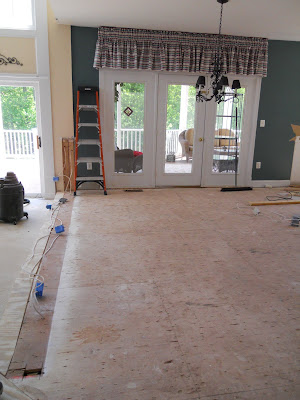
Calm down, that is not where we are now but I think it is important to see the process. Yes, there is just like my post about wearing curlers. To get to the state of gorgeous, first comes stages that are less pretty.
The half wall and columns are gone.
The closet is also gone and the trip hazard has been filled in.
Here's a better view of the resolved 'floor just ending.'
Now we move onto the first phase of installation.
The fantastic wide plank hard wood floors are installed. Next comes cabinetry...
Here's a portion of the custom media cabinet...
The family room served as the holding zone until the cabinets were completely installed.
Except for this large one in the front hall. What the heck is that?
Stay tuned...
Tomorrow I have a guest post by Yelena from House Painting Tutorials on wall stripes. I've used wall stripes many times ~ vertical and horizontal. Sometimes it adds just the right amount of pizazz or texture I'm looking for. Later in the week > more on the great room.
Labels:
family room,
great room,
kitchens
Thursday, May 26, 2011
Great Room Making Its Way to Beautiful
For me, it is always fun to follow a project along in its transformation. Here is a project I am currently working on that is coming along quite nicely. Today I'll show you some before pictures.
My client had the two tiered island which left little actual work space for her. She is an avid baker so counter space was very important. There also was not enough storage ~ a very common issue.
This was a closet that wasn't used very much. It stored items that were easily stored elsewhere. I knew I could put this premium space to better use.
Other issues ~ half wall with columns. Hmmm... half walls have their place (rarely if you ask me) and notice how the cabinetry ends prior to the door. More space to utilize.
This is a trip hazard and has adds no aesthetic or space value. An easy issue to fix.
The columns just closed in the kitchen. See the trip hazard on the right? The floor just ends.
Here is where the media cabinet was (and still is). They thought about placing the television over the mantel. I really use that option as a last resort. I know it is all the rage but disrespecting the lovely stonework would be a crime. The wall is awkward and we have the cold air return to contend with but not large issues to address.
Oh yeah ~ the powder room. This is just off the kitchen and in need of face lift and general updating just like the kitchen.
There you have it. See why they called me? Monday, I'll show you where is it now.
Labels:
family room,
great room,
kitchens,
projects
Wednesday, May 18, 2011
Friday, May 13, 2011
Slipper Chairs by Design Shuffle
Today's post is brought to you by Design Shuffle who speak with us about the ever popular slipper chair. Take it away Design Shuffle...
Slipper chairs are any armless chair that sits lower to the ground than a typical chair. They have been around for centuries but were revived during the mid-twentieth century by the modern style. Originally designed for the dressing room, to help ladies easily bend and put on their footwear, today they are now found from the living room to the bathroom.
Slipper chairs work well in small spaces as they take up less visual space than an armchair or club chair. Clean lines mean they fit well with most design styles depending on upholstery and legs—pair with a side table and table lamp or by itself.
Here's a list of eight top selling slipper chair styles.
Button tufted upholstery and a curved S-shape make this slipper chair more formal. Chairs inspired by English and American antiques are top traditional options.
This transitional slipper chair feels less formal than the one above with its straight legs and simple seat upholstery. Pair with a modern light fixture and round side table for a clean and sophisticated look.
Sleek leather and clean lines make this style slipper chair a good option for a modern or contemporary space.
Mid century chairs, like this one by Robsjohn Gibbings, or vintage inspired chairs continue to be top sellers.
We see a lot of slipper chairs with a curved back and splayed legs. These chairs also have a vintage feel to them.
Because slipper chairs are considered accent pieces in the room, bold colors and patterns can be used on them. Ikat patterns are very popular upholstery and fabric choice now.
This content is provided by Design Shuffle, where you can find top tier interior designs from around the world – from New York interior designers, Los Angeles interior designers, Washington DC interior designers, and more, check out the latest at Design Shuffle.
Slipper chairs are any armless chair that sits lower to the ground than a typical chair. They have been around for centuries but were revived during the mid-twentieth century by the modern style. Originally designed for the dressing room, to help ladies easily bend and put on their footwear, today they are now found from the living room to the bathroom.
Slipper chairs work well in small spaces as they take up less visual space than an armchair or club chair. Clean lines mean they fit well with most design styles depending on upholstery and legs—pair with a side table and table lamp or by itself.
Here's a list of eight top selling slipper chair styles.
Gstatic.com (via)
French Country slipper chairs inspired by French antiques continue to be a top choice. They can be more or less formal depending on finish and upholstery.
Style of Design (via)
Button tufted upholstery and a curved S-shape make this slipper chair more formal. Chairs inspired by English and American antiques are top traditional options.
Gstatic.com (via)
This transitional slipper chair feels less formal than the one above with its straight legs and simple seat upholstery. Pair with a modern light fixture and round side table for a clean and sophisticated look.
Southern Living (via)
Slipcover slipper chairs with casters are popular because the slipcovers can be switched out, while the casters mean the chair is easily moved around the room.
Amazon.com (via)
Sleek leather and clean lines make this style slipper chair a good option for a modern or contemporary space.
6 Three Rings (via)
Mid century chairs, like this one by Robsjohn Gibbings, or vintage inspired chairs continue to be top sellers.
7 Home Element (via)
We see a lot of slipper chairs with a curved back and splayed legs. These chairs also have a vintage feel to them.
House Beautiful (via)
Because slipper chairs are considered accent pieces in the room, bold colors and patterns can be used on them. Ikat patterns are very popular upholstery and fabric choice now.
This content is provided by Design Shuffle, where you can find top tier interior designs from around the world – from New York interior designers, Los Angeles interior designers, Washington DC interior designers, and more, check out the latest at Design Shuffle.
Labels:
Design Shuffle,
furniture,
slipper chairs
Wednesday, May 11, 2011
Never Forget the Ceiling...
I was looking at one of my favorite designers website ~ Jay Jeffers ~ for stair rail inspiration. I found it.
What I wasn't planning on was finding the brilliance with the ceiling treatments. I couldn't get enough of them. Let me show you...
Everything from soft and subtle to bold and striking.
Moral of the story ~ never forget the ceiling AND if you need more inspiration, check out the JDG.
What I wasn't planning on was finding the brilliance with the ceiling treatments. I couldn't get enough of them. Let me show you...
Everything from soft and subtle to bold and striking.
Moral of the story ~ never forget the ceiling AND if you need more inspiration, check out the JDG.
Labels:
beamed ceilings,
Jay Jeffers,
stairs
Monday, May 9, 2011
My kitchen, kitchens...
This great room (kitchen and family room)/butler pantry project is wrapping up. This is only a portion of the project as a whole. There are a few details to attend to but the major items are finished. I'm thrilled with results. In the next two weeks, their BeautifulX2 Curio Tables will arrive, art will be hung and accessories placed. I cannot wait for my professional photographer to take his shots to really show you its beauty. My Nikon can only show so much.
Here's one of my other great room/butler pantry projects...
YIKES!
Just remember the project at the top once looked like this...
That's a transformation they will never forget. Soon my other clients will be enjoying their new, beautiful, functional kitchen, family room and butler pantry. I love that part!
Subscribe to:
Posts (Atom)