The other day I posted about
Elizabeth Lyons. When I was reviewing photos that I have saved for inspiration I couldn't help but place her glass art in the rooms. You know when something is fresh in your mind and you think about how it would relate to what you're currently doing? It was like that. I found two rooms compliments of
Architectural Digest where the glass art above can easily be placed.


Some of the pieces would be a lovely addition to these rooms.
What about these chic ones?! Can you see them in this sophisticated space?!
I have to admit ~ my favorite colorways by Elizabeth in her latest and greatest are what I had on my mind when I was looking through pictures. It's funny how these things stick with you. I suppose that is how fabulous pieces usually get placed. The piece lays in the subconscious of the designer and a room can be designed just for it. That happens often to me after Market or after perusing one of my favorite hautes for antiques. And now it just happened with Elizabeth's work.
I wonder where they'll end up??!!

 The other day I posted about Elizabeth Lyons. When I was reviewing photos that I have saved for inspiration I couldn't help but place her glass art in the rooms. You know when something is fresh in your mind and you think about how it would relate to what you're currently doing? It was like that. I found two rooms compliments of Architectural Digest where the glass art above can easily be placed.
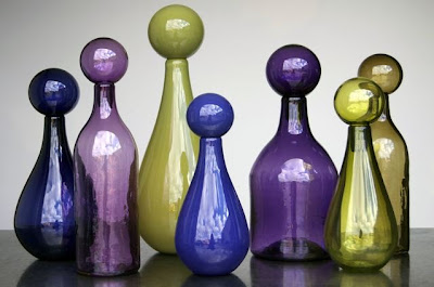
 Some of the pieces would be a lovely addition to these rooms. What about these chic ones?!
 Can you see them in this sophisticated space?!
 I have to admit ~ my favorite colorways by Elizabeth in her latest and greatest are what I had on my mind when I was looking through pictures. It's funny how these things stick with you. I suppose that is how fabulous pieces usually get placed. The piece lays in the subconscious of the designer and a room can be designed just for it. That happens often to me after Market or after perusing one of my favorite hautes for antiques. And now it just happened with Elizabeth's work. I wonder where they'll end up??!!


Very usual and beautiful, I am drawn to the gray and ochre ones...Thanks for sharing!
ReplyDeleteJanell
I really love those jewel tones in the first set.
ReplyDeleteI would absolutely put them close to a window where they would catch the light.