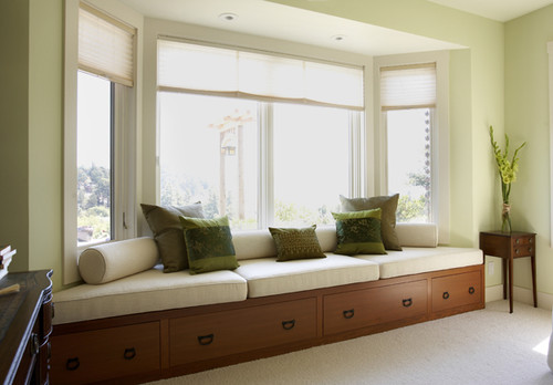
The first two are compliments of Point, Click, Home. The third is from Houzz. I love the soft green paint on the walls in the first and third and the two tone of the second.


Home | About | Portfolio | Paula Grace Furnishings | Working with You | Attaché Design | Press | PGD Blog | Contact Us
©2006-20011 - Paula Grace Designs, Inc
| Privacy Policy
Website designed by Digital
Doorway Designs


I agree with you on the pale green and the neutrals. Those tones feel really good right now. Thanks for stopping by to see us. -- Jane F.
ReplyDeleteAs you already know, red and green are two of my favorites!
ReplyDeleteLove the reds, perhaps because the wall color has a bit of coral in it and the ottoman orange undertones. I think red is pretty hard to decorate with if it is a strong cherry red...
ReplyDeleteThe greens are so serene.
Janell
Love the photos soft and beautiful!
ReplyDeleteLove Red, I'm picky about Green though. I like it Kelly or Apple Limey. Really don't like Sagey or Grayed Greens. I find them depressing.
ReplyDeleteThe green in the first photo is so soothing. The fuchsia enlivens it.
ReplyDeleteBefore we moved to our current home I always said that I wanted a home decorated in red, green and cream. I had that for over 5 years, now I'm looking for a change, but it is a great combination.
ReplyDeleteWhat a great post, Paula Grace.
ReplyDeleteThere is something about the very first image that draws my eye in. It's fantastic ( though, all of them are lovely ) Perhaps it is the scale of furniture and different periods, combined so well. This one is for the inspirational files! The colors are splendid!