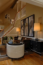
In today's Monday's Method, Lisa, who writes the lovely blog Destination Seaborn, writes in with a question about paint color and wood trim. The beautiful picture above is from Lisa's blog. Sigh ~ I wish I was there..... sorry for the digression :) Here we go...
Dear Paula Grace,
I'm having trouble deciding on a paint color that that will go with my wood trim.
About our room, it's currently a collection of leftover furniture and a play room. I plan on eventually scrapping everything except the piano. Here's a list of photo's that I've included in this message:
Sofa: this is the sofa we'd like to purchase for the LR...please ignore the pillows.
 Swatches:
1)Fabric that I would like to use in the room as accent pillows.
2)Tile that I would like to use around the fireplace
3)Paint swatch Pittsburgh Paint Delicate White 518-1. Supposed to be a "pure white".
4)Drop cloth to use as affordable curtains?
 We're thinking about changing the white plantation blinds to wood blinds to blend in with the trim?
 I favor light colored interiors with dark wood (i.e. British Colonial Style). I'm realistic that I live in central Ohio and have two pre-schoolers:)
Thank you,
Lisa
Here are pictures of the room before they did some work (BTW ~ what a cutie)...

 After a bit of work ~ refinished floors, border removed....
 Wonderful job on the floors Lisa! The woodwork is in excellent condition!
A couple things before we move on to the paint. The first thing I notice is the ceiling line. This room has wonderful bones; it needs a bit of finishing work...
 Crown molding. The room has such lovely molding everywhere except there. It does not need to match the rest of the woodwork in color, just in style. It can be inexpensive molding painted. This will be the creme de la creme in finishing architectural touches.
I agree with you that the white blinds need to be changed out. You mentioned wood blinds to match the trim. You are on the right track. My preference would be to use woven wood shades. They are a bit more of a current look and you could also match them to your trim.
 In another email you also mentioned loving natural fabrics and here mentioned considering using a drop cloth for inexpensive drapes. I think that is fine. You also may be able to find inexpensive linen fabric online that may suit your needs. If you do stationary panels for aesthetics versus function (the wovens are the functional piece here) then you won't need much fabric to complete the job. I found this linen at Amazon for $12.98 a yard.
 Moving on to paint. I really like the selection you have made thus far with your tile, fabrics, and sofa. It is wonderful that you have selected these before your paint color. Paint color is best chosen when it directly relates to what is or will be in the room. Many try to select their paint colors prior to fabric or art selection. Then people are trying to find things that 'match' the paint. Paint colors are infinate ~ the perfect color can be created for one's palette. Fabric and art are not. Yes, there is a lot to choose from but selecting at least fabrics first will be make it easier to coordinate the paint color ~ and may in fact inform the entire palette.
 With that said, I think the paint color 'pure white' in your picture is too white. My concern it that the contrast with the wood trim will be too great and it may make some of your fabric colors look dingy ~ we don't want that! I am working from my monitor so the colors may vary. I think a cool color picking up on the blue-green in your swatches would be nice. I also think a white with some gray in it would be lovely. The cool hues will be balanced by your woodwork, and the golden hues in your sofa fabric and tile. Lets look at them all together... (here's my mosaic for Mosaic Monday)...


These are Benjamin Moore colors ~ Colony Green (694) and Gray Mist (962). You said you love light colors with dark wood. Both of these fit that description. You may also use Ben Moore's Natura line (this paint has zero VOCs and is practically odorless ~ good for you and your family and good for the environment). But please, please, please do not select your paint color from little swatches. Please email me your address and I will order several large swatches of these paint colors for you ~ if you'd like. Place them all around the room and observe them for several days at all hours so it may be seen in different lights. With this observation time, you'll be able to make a more informed choice as the appearance of paint color varies in different lights. Or simply buy a small sample and paint white boards and do the same exercise. The white boards or large swatches do away with painting samples right on the walls and then having to live with your 'samples' until fully painted. A caveat ~ I have seen folks place several sample colors right next to each other on the wall. This sets people up for indecisiveness as the colors contaminate each other. You want a pure sample ~ meaning try one color for a few days then change it out for another you are considering. This is where the large swatches or white boards really do their job. What ever paint color you choose for the walls, remember to mix 20% of it into ceiling white for the fifth wall in the room. This mixture will guarantee the ceiling relates to the wall color. I do this all the time unless I am painting the ceiling a different color than the walls.
Good luck Lisa! I hope this helps.
If you would like a Monday's Method of your own, just email your question with some pictures to me at paula@paulagracedesigns.com. Please place Monday's Method in the subject line.
Now I am hoping you can help me with a bit of housekeeping. I have two questions I'd like YOUR help with. I have seen Followers posted on many blogs and many that do not have them. I don't have a Followers section in my side bar. I see that Followers may sign in to the blog if needed. Is that the benefit? I want to be user friendly. Please let me know if you think I should have Followers in my side bar and let me know why.
Second is that I have been enjoying wonderful parties on many great blogs ~ for example Between Naps on the Porch Metamorphosis Monday, Little Red House Mosaic Monday, Smiling Sally Blue Monday..... I love to entertain and I pledged to do more in a comment I left last year. Well, here's my chance. I have been thinking of hosting a blog party on Tuesday. I would call it Timeless Tuesday. The theme would be timeless classics (rooms, furniture, clothes, recipes, etc.) or trends that you would like to see become timeless. What do you think? Would you join the party?
Now that you've completed the question on parties... check out these wonderful parties that I have joined ~ Between Naps on the Porch Metamorphosis Monday, Little Red House Mosaic Monday, Smiling Sally Blue Monday, Cottage Instincts Make it for Monday, A Soft Place to Land' DIY Tuesday, and Funky Junk Interiors Saturday Nite Special!
Enjoy!


 Kristin


 Here is the daybed that sparked the genesis of Kristin's furniture line. Stunning don't you think?!


 Posts
Posts