About Interiors FurnishingsWorking with You Attache Design Press PGD Blog Contact Us
Showing posts with label Living Etc.. Show all posts

Wednesday, March 31, 2010

Purple and Orange

Wednesday, we have purple and orange...

The first two are compliments of Point, Click, Home. The third is from Houzz. I have to say, the pictures from Houzz are always big. I love that. You can double click to see the other pictures larger if you'd like.


Amoroso Design contemporary living room


These two also from Point, Click, Home...


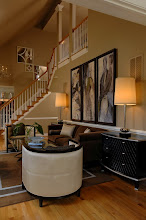
This one of from Living, Etc.

Thursday, December 17, 2009

Orange You Happy To See Me?

Orange was another popular color at the last High Point Market. I really like these stools. Here is the thing about orange and me ~ I really like it ~ in moderation. One of my clients wanted to paint her family room in an open concept house orange. It was actually a lovely color. I explained the need for flow in an open concept house and discussed using the hue throughout, since she loves it so much, but not putting it on the walls. She likes that idea. Phew!

Here is the fabric that is the jumping off point for the design.....

Robert Allen: Aquavite ~ Fire Opal (a Larry Laslo design)

I am loving how that design in coming along. I have done several designs with a color palette of orange, green, and neutrals. So much is out there now in variations of this palette that each design remains fresh and distinct.

Take a look at these two pictures. One I like very much; one I would grow tired of. Can you guess which is which and why?


Photos compliments of Living Etc.

Wednesday, December 16, 2009

Beam Me Up

I am digging these beamed ceilings. There is something so natural and warm about them. The ceiling in this room is particularly high so something needed to be done to make the space more human versus God-like. Wonderful solution! Here are more examples of what I consider well-done beamed ceilings....

In the above example, they painted the wood ceiling and beams white. Very clean and crisp. Yet a lot of interest and texture. They brought back in the natural with the use of the wicker shades. Brilliant!

Beamed ceilings can be very elegant when paired with more formal architectural elements. Love that picture.


Here again, the beamed ceiling is painted white likely to have it behave in a more expansive manner but the texture and pattern remain. Clean and crisp but paired with worn elements that bring back the warm and natural feel.

What do you think ~ beam me up or bury them?

Photos compliments of Living Etc.

Tuesday, December 15, 2009

Vision in Gray

When I was a teenager, my mom painted the walls in the living and dining rooms gray. It was something like this color ~ Stormy Gray from Benjamin Moore.....

It is actually a nice color but to a teenager, whose years are stormy anyway, I didn't need to be reminded daily. It was very tastefully done as my mom is a wonderful interior decorator. She paired the gray with lovely ivory upholstered furniture and wonderful art. Still, it was dark gray to me. I shied away from gray for years until recently. I designed a beautiful dining room, living room, and office (still a work in progress) with this color palette.....


Benjamin Moore: Cement Gray, Natural Wicker, White Chocolate, Wet Concrete

It is turning out swimmingly. The fabrics in the space marry the color palette. The cement gray was the hue I chose for the tray ceiling.

I am overcoming my avoidance of gray but I still have a bit of an aversion to putting it on walls. I am beginning to love it on furniture though in all shades and tints. The last High Point Market was alive with these hues so I was able to see them in all their splendor.

Take a look at the photo at the beginning of this post and the two below all compliments of Living, Etc.


The picture at the top has a very soft gray tint upholstery. The second one, a deep shade. The one just above is my favorite. A moderate gray boasting of elegance. I love that it is paired with warm gold pillows. Beautiful!

Its funny how certain times or events in one's life can leave an association ~ either positive or negative. In my gray case, on the negative side. I have learned two things from this gray recovery of mine ~ 1) gray is beautiful when used in a well designed room, 2) I will not be painting the walls gray when Lauren is an adolescent.

What are your thoughts on using gray? Do you have any color associations you'd like to share?

Blog Widget by LinkWithin