 Mimomoss Designs
And now for a long leisurely soak after a long hard week...
Ahhhhhh.................
Enjoy your weekend!
 This is Mike. He's my 'Chico' except much more grumpy...
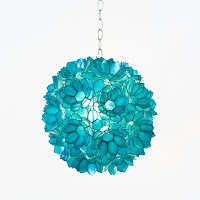
 Love them! The turquoise light will function as her night stand light. It has a remote so she does not have to get out of bed to turn it off.
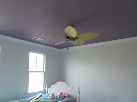
 The fan is up. I love the hand carved blades but I do not like the color. They are supposed to be a white wash. Well, they are about as yellow as they can be. The white will pop off the purple ceiling. No worries ~ I will have them painted white and perhaps add some detailing to them but I will wait until the room has more of its furnishings to determine. The art, fabrics, and wallpaper are very important elements that won't be fully appreciated until installed. I'll decide then on the blades.
 The jewelry armoire and desk are placed...
 as are a couple of the accessories.
 This is my daughter, Lauren, and I. She's my heart. Tonight we were having a conversation about a little girl in her school that has a rare form of cancer. The school is rallying around her and the family. It is both sad and inspirational at the same time. Sad for the little girl and her family ~ lovely to see the school as a whole providing emotional and financial support.
 Welcome to Timeless Tuesday #12! Today I celebrate one of my favorite designers ~ Barbara Barry.
 Her signature style has unsurpassed elegance in my book. Her product designs are flawless. Each one of her designs seems to be a timeless classic. Take a look at some of her rooms...


 Here is just a small sample of her products...


 Always lovely, always timeless ~ Barbara Barry.
 Welcome to Monday's Method! This is the day of the week I answer interior design questions. Today we have two for the price of one :) Sweet Sheila (wonderfully sweet ~ she's the type I'd hug upon meeting!) of the lovely blog, Note Songs, writes in with this question...

 Sheila, you have a lovely traditional style. The color palette of reds and greens is classic. Beautiful! I see how an an accent color may be a bit tricky. If you accent in a darker green, it may look a bit Christmasy all year round.

The two are a rich, highly saturated blue. The left is a Beacon Hill fabric ~ Arno in the colorway Berry Blue. This fabric has the red and the cream of the sofa. The right one is from Robert Allen ~ Aigrette in Navy ~ but also incorporates a nice green hue. Note that the patterns are an organized geometric yet traditional. This would be a nice contrast to the curvy motif on the sofa fabric.

These two are a medium tone blue. The left is from Robert Allen ~ Barnyard in Twilight. It incorporates the green and the cream plus the toile-like motif would marry well with your style. The right is Betty in Navy. This is a lovely, sweet fabric incorporating all three color in the room (red, green, and cream) plus adds the blue.
With the addition of a blue, the accessories that you spoke about adding may incorporate blues. This will enhance the harmony in the room. You already have fabulous unity with style and color. Adding blue would bring in a pinch of diversity for added interest. How wonderful!
This is a French Country design I did for a lovely family. The color palette is yellow, red, blue, gold, ivory, and a hint of green. The pillows incorporate most of the colors. The green comes in the form of topiaries and lamps. What do you think? Do you like the way the pillows marry all the colors and then there is a different hue ~ green ~ in the lamps? That just gives the room a bit more interest. By the way, the lumbar and chair pillows are reversible. See how the chair pillow has an ivory background and the lumbar ones on the sofa has a gold background? Each has the other fabric on their flip side. This is an easy way to get more bang for your buck. You may change out the room based on season or your mood by simply flipping the pillow over.

This is a very good question. One that many struggle with. The art needs to be in relation to the sofa ~ meaning that canvases need to be centered over the sofa. Also, they should not sit to far above the sofa either. Take a look again at the French Country design above. See how the art follows the line of the sofa back? The art is in relation to the sofa. Here are some other examples from my portfolio... Note the art centered over the sofa and practically sits right on the chair rail as these pieces are quite tall...
 Again, not too far off the back and centered on the long side of the L shaped sectional...

Centering it over the sofa may then leave the room feeling off balance. You may need to augment by adding a tall furnishing(s) to the side of the sofa that has more exposed wall to provide balance. This would be an asymmetrical balance done by the eye. In the last vignette ~ the floor lamp was placed first. There was a wall expanse to the left of the art so I added the large scale vase. The lamp backed by the ivory silk drapes is nicely balance by the large scale textured ivory floor vase.
There you go Jane! I hope that helps. Let me know how it turns out.
If you have interior design questions, don't hesitate to leave it in a comment. If you have questions about a specific room or space, email me a couple of pictures to paula@paulagracedesigns.com. Please note 'Monday Method Question' in the subject line.
I am linking with these fabulous blogs. Each deserves a nice, long visit...
Monday ~
Between Naps on the Porch Metamorphosis Monday
Little Red House Mosaic Monday
Tuesday ~
A Soft Place to Land DIY Tuesday
Thursday ~
The Shabby Chic Cottage Transformation Thursday
Saturday ~
Funky Junk Interiors Saturday Nite Special  See you tomorrow for the Timeless Tuesday link party!
 For Fun Friday, I thought a good time would be had by all taking a look at the variety of dressing rooms out there. So naturally I tapped Architectural Digest on the shoulder for elegant and over the top ones. I was not disappointed. Just take a look at the one at the top. The restoration architecture was done by Richard Manion and the interior design completed by Craig Wright. Wow ~ that is quite a decadent vanity. A well placed sun lamp and one would tan from head to toe.
 There are a few rooms that belong to the famous in this post. Can you guess whose dressing room this is?? Take a look at the colors. Who do they remind you of?? He also likes blue.... If you guessed Ralph Lauren, you are correct.
 Another famous person. This time a songbird. This lovely creation by designer Mario Buatta is the dressing room of Mariah Carey. I think it needs a chaise with a small drink table. It certainly has the space for it!
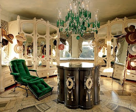
 Isn't this one magnificent?! The chandelier and lounge give it an extra special pop. I adore the piece in the middle. Love the floor. This is radial balance in all its glory! Samual Botera did a wonderful job designing this room.
 Oo la la for Jackie O. Yes this room belonged to First Lady Jacqueline Kennedy. She remodeled it as soon as she moved into the White House. Even though this room was done decades ago, it really is quite timeless.
 And now for the classic elegance of Barbara Barry. I love everything about this space ~ the palette, the furnishings, its gentleness ~ magnificent! Last but not least...
 Can you guess who this room belongs to?? Another songbird ~ this time a man. The designer is Monique Gibson.... Yup, Sir Elton John. He has a room just for all his artful glasses. I have seen shoe closets like this but I must say, this is my first glasses one. It just makes me smile :)
 For this Thursday's Room, I thought it would be fun to show you a project I am working on. The designs are done ~ they loved them. Furnishing and fabrics are either here or on their way. The work has begun! Remember the tweens rooms I wrote about? I wrote about it on Facebook and twitter for sure. I love doing kids' rooms (although, if I call a tween a kid, they may roll their eyes:) I'll show you a bit of each room's design. The reveal won't be for a bit as we are waiting on wallpaper and one piece of furniture (boo hoo). Both rooms will complete in June and I'll post before and after pictures.


 At least someone is enjoying the mess...


 You have a glimpse of the purple ceiling.