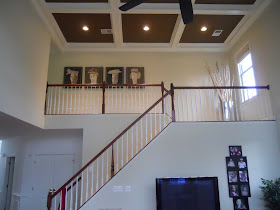
I originally ran this post in December 2009. I was reminiscing with friends the other day about a Holiday Party we had in our old home. Here's how the house looked for that. I look forward to hosting Holiday parties in my new home but these photos make me appreciate my old home and remember all the wonderful times we had there :)
Welcome to my holiday home tour! These pictures are of the dramatic and touches of Christmas all over my house (double click on the pictures to see them larger). Above is the family room ~ home to my daughter's tree. Her tree is decorated with all her baby ornaments, ones made by her own hands, pictures of her and her daddy, candy canes, light and, of course, hot pink sparkly ball ornaments. Our stocking hang by the fire with care.....
Here we are in the dining room with red and silver sparkle ornaments hung from the chandelier with very fine plastic thread. It looks as if the bulbs are floating. A simple arrangement of red beaded branches and pine cones serve as centerpiece. When the table is set, it is a blaze with black, red, silver, and ivory ~ I need to have a dinner party!
Let's move to the living room......
My color palette in the living room is red and gold. My living room's year long palette is browns and blues so during the holiday season, I like to warm it up! All ornaments on the tree are red and gold. The ribbon is twisted to see both sides as they too are red and gold. An angel in a red dress is joined with gold beaded reindeer for the cocktail table display.
What's that peaking out of my cabinet? Red glass bulbs of course! I love little touches.
It is a simple crystal bowl that lives in the cabinet all year long. During the holidays, it is married with simple red bulbs for a pop of holiday cheer.
Here is a shot of my living room normally. This angle is almost where the Christmas tree stands. You can see the stairs and the balcony. During the Holidays the stairs and balcony are lined with nutcrackers, lit garland and red bows with gold specks. Sparkle, sparkle!!
For safety, I tie each nutcracker to the balusters with neutral twine that goes unnoticed.
Let's peak into the conservatory, which is an extension really of the living room as the French doors are always open between the two rooms. The palette in here ~ blue and ivory.
I love this wreath! I actually bought it for the front door but it did not fit between the door and the storm door ~ oh dear!! No matter, I found a lovely home for it hanging contently in the window. The conservatory is at the rear of the house so all one sees from the street is a little twinkle of light from the back window. I wrapped the wire for hanging in ivory and gold ribbon and voila ~ a beautiful decoration that began with an oops!
And now the kitchen.....
Just a touch ~ blue and gold bulbs suspended from the chandelier float above a blue and gold pedestal platter filled with pine cones. Blue napkins with gold rings set a top striped blue and neutral place mats finished with beads on the sides. I chose blue and gold to add warmth.
Don't forget the powder room!
Just a touch will do for me!
Inexpensive blue and silver jewelry-like ornaments hung from the sconces with a bow tied from silver tinsel pipe cleaners.
How about upstairs? I like a touch of holiday decor in each room of the house. In the master bedroom, we have these bulbs on an accent table.....
We bought these bulbs on our honeymoon so it makes them extra special and wonderful to place in our personal space. When the candle is lit, the gold paint on each bulbs glistens.
What about Lauren's room???
Of course! It is decorated with a door wreath and red bows.... everywhere! Her own design!
I love Christmas with all the beauty the season has to offer ~ spending time with loved ones. This year, I am hosting Christmas for the first time. I cannot wait to have a house full, constant chaos and laughter. Lauren is so excited to have her Nana and cousins here. I wonder if she'll sleep at all of Christmas eve?! I know for sure that she won't let her older cousins sleep in on Christmas day. I cannot wait to see her face that morning. That will be the best beaming light of all!
I hope you enjoyed my Holiday Home Tour. I sure did. Let me know what your doing in your home this year. I'd love to see pictures! Email to me at paula@paulagracedesigns.com. I'd love to post them!
Naturally I am joining holiday parties at Julia's Hooked on Holiday House Tours and Southern Hospitality so hop over and join in!
I wonder if the parties above are still going on? Hmmmmm....?!
Have a very Merry Christmas and happy New year!
Saturday, December 24, 2011
Thursday, December 22, 2011
Monday, December 19, 2011
Gorgeous Ceiling
This ceiling is in the library of the Cosmos Club in Washington, DC. I went there the other day to meet Christian Herrmann, a stone artist from Pennsylvania. Christian belongs to the sister club in NY; he stays in this club when visiting DC. He gave me a tour.
I could have snapped pictures of the entire place as the architecture is beautiful but I thought that would be rude. However, when I saw this coffer ceiling, I had to take a few shots. I love the details. I have clients I'll have to show this too. They would appreciate it so much. I love the pattern of the beams... everything about it. It's not the simple square pattern seen so often. Inspiration is everywhere. EVERYWHERE!
Friday, December 16, 2011
Fa la la la....
The other day I decided that I would fill some silver vases I have with gold sticks and red shimmering berries for a bit of holiday cheer. I had the shimmering red berries but I needed the gold sticks. So off I went to my local crafts store. No gold stick that I liked. Next, my local home decor store. Yup, they had them. Nice and chunky just the way I wanted them. They wanted $12.99 for three short sticks. $12.99 plus tax! Blimey!
I needed many sticks for what I had in mind. I thought to myself, 'There's no way I am paying that.' So back I went to my crafts store. This time to buy a can of gold spray paint. Monday morning I went into the woods just behind my home. We had a good night below freezing so I thought now is the time for me to make my move. I gathered up some lovely fallen sticks and branches and went to work.
Here are my vases with my DIY gold sticks. I didn't want them to be perfect. I wanted a little bit of the wood to show through. I managed to get it just the way I wanted.
Here they are with my little men. I'm still waiting for the pedestals I ordered. The vases will be placed on top of them. They are arriving soon!
I love my little nutcrackers on my steps. I've done that for years and I smile every time they make their entrance.
Not to shabby for a novice craft DIYer. Nice and chunky... just the way I wanted them.
Fa la la la la la la..............
Wednesday, December 14, 2011
Shape and Rhythm Details
You've heard time and time again... Its all in the details. I agree. We've been looking at some before and during pictures of a project and then some of the details. Today's detail is about shape and rhythm ~ two elements I pay very close attention to when I design.
In the detail picture above are the table, chairs, and chandelier I selected for the kitchen. First, the chandelier and table base have contemporary lines and finished in chrome ~ a nice connection. To warm it up and mix materials and periods, I used reproduction 19th century Parisian brasserie wooden chairs. To connect the great divide in material and periods, I echoed a shape. Note the soft V-like shape of the chandelier arms and the back of the chair. The eye is drawn to the shape connection adding a lovely vertical rhythm. I love that.
Do you see it?
Monday, December 12, 2011
Sweet Details
This grand piece is in the family room portion of the great room I have been telling you about. I showed you a beautiful detail in my last post and now I will show you a sweet detail. As you can see this media cabinet that I designed follows the contour of the stairs and enables a great amount of storage and display. Let's take a closer look...
Here is the contents of the left cabinet next to the television. Do you recognize them? These are another Cyan Design find ~ the game pieces from Monopoly ~ a game that my client enjoyed playing with her family while growing up. She has many fond memories of those times.
I love the antique silver finish against the dark walnut wood. I also love that she smiles every time she looks at them. That is the best part of all!
Saturday, December 10, 2011
Friday, December 9, 2011
A Day Made of Glass
You know I have an obsession with glass... well, have you seen this? Pretty amazing. Tell me what you think!
Thursday, December 8, 2011
Beautiful Details
On Monday I showed you a wide angle shot of this project. Here is a detail shot. You may already know this about me but I love using glass... art glass, glass tile..... I am always mesmerized but the play between light and glass. This leads me to state for the record ~ lighting is critical for great design. You can see I used glass tile that captures the palette. These are illuminated by under cabinet lighting. In this design, I also have lit top cabinets along the entire perimeter of this kitchen. Of course, the shelves in these cabinets are a bit too high for daily functional use but functional use is not why they are there. I designed these cabinets to hold a two art glass series that I love from Cyan Design. They are not terribly expensive ~ GREAT! They are, however, very impactful.
When these glass pieces are illuminated, they are spectacular. The entire perimeter of the kitchen glows with champagne and soft green. Hmmm.... maybe I should take a picture of them in the evening (duh!). Next time :)
More details to come!
When these glass pieces are illuminated, they are spectacular. The entire perimeter of the kitchen glows with champagne and soft green. Hmmm.... maybe I should take a picture of them in the evening (duh!). Next time :)
More details to come!
Monday, December 5, 2011
Before and After Continued
Friday, December 2, 2011
Mini BUT Impactful Before and After
Do you remember this photo? I blogged about it before. My lovely client, the gentleman of the house, did this faux treatment himself. I tried not to wince but when the lady of the house winced rather loudly, I had to join in. He is a very skillful man. He can install practically anything. He was the project manager of this job AND he knew what he is doing. Fantastic attributes to have. Unfortunately faux painting is not on his long list of skills. The lady of the house asked me to "Please take care of this powder room as soon as possible." Ok!
There you go. All better. It is amazing to me how a simple coat of paint can calm. I changed out the lighting, mirror, vanity, area rug, and, of course, added art. Viola! Better yes?
Thursday, December 1, 2011
Thank You Hickory Chair!
Hickory Chair is one of my favorite furniture companies. They offer so much customization and diversity it's sensational!
I was featured on their blog yesterday. You can see for your self their lovely furniture in action.
Thank you Hickory Chair for being the best at what you do and for featuring my work!
I was featured on their blog yesterday. You can see for your self their lovely furniture in action.
Thank you Hickory Chair for being the best at what you do and for featuring my work!
Wednesday, November 30, 2011
Recipe for a Beautiful Bathroom Makeover
Today I have a guest writer! Richard Banks for BetterBathrooms.com has written a quick and easy path to a beautiful bathroom makeover for us. They also have a interesting blog that introduces new products to the marketplace as well as many DIY projects for your perusal ~ http://www.betterbathrooms.com/news/.
Take it away Richard...
For a luxurious and welcoming bathroom that allows you to indulge your need to be pampered as well as your more practical side, tiled surfaces in soft, neutral tones are both practical and adaptable, while wooden bathroom furniture will add warmth as well as style.
Decorating your walls in pale neutrals gives you scope to add rich accent colours and change them in accordance with the season or even just to suit your current mood. Tiled surfaces can be beautiful as well as practical and are always a favoured option in the damp environment of a bathroom – installing coordinating sets of tiles such as the Italian ‘Le Rable Craie’ collection helps to take much of the difficult decision-making out of decorating. This collection features wall and floor tiles in a pale matt beige together with contemporary design tiles which can be used to add a warm chocolate and mocha accented design to a feature wall.
Against this neutral backdrop, some freestanding bathroom furniture will create the ideal high end look. Choose solid wood pieces, or pieces with a real wood veneer, to bring the warmth of nature into your bathroom. Opt for a freestanding vanity unit with rich, dark wooden tones and either add other natural materials, such as a stone vessel basin, or stick to a classic white ceramic counter top basin for contrast. Additional walnut bathroom cabinets will complement your vanity unit and provide the ideal home for your accumulated bathroom clutter.
Ensure that there’s sufficient lighting in your bathroom: good ambient and task lighting will show your room off to its best advantage and allow it to function well as a practical space.
For a final touch of luxury, think about adding a freestanding bath. With modern materials and designs, freestanding baths have moved on from the traditional ‘roll top’ style, and you can choose from almost any shape and style you care to imagine. Wall mounted taps over both your bath and your wash basin will help to lend a contemporary, minimalist air to your beautiful new bathroom.
Thank you Richard! I love the last picture with the freestanding tub. I almost did one in my last home. Maybe this home will get one!
Until next time ~ happy decorating!
Saturday, November 19, 2011
Interiors of Washington, DC
I am very excited to announce that I've been invited to participate in an upcoming book publication. The picture above is of the Southeast regions version. It is a beautiful coffee table book showcasing wonderful interior designers. The Panache Company publishes regional books. They scour the country looking at designer's work and then inviting them to be a part of it. My book comes out this summer. You'll be able to purchase it on Amazon or at Barnes & Noble.
This past Friday, I had a photo shoot at one of my client's homes. It was an unusual shoot because the finished product is a 360 degrees view of several rooms in the home. This view will be available online in conjunction with the book. It is very cool! I'll share the link once it is up.
Of course, I'll be having a give~away of one of the books when it is available but I wanted to give you a sneak peak...
This beauty will appear in the Transitional section of the book. What do you think?
Tuesday, November 8, 2011
Thank you Shoshana and Houzz for Featuring my Work
Its funny... if you scroll down, you'll see where that vase now lives in my new home. I love that vase! Its from Palecek in case you would like to know :-)
Sunday, November 6, 2011
More is Up on My Walls ~ YAY!
Let's start at the beginning... the entry. I took this picture above standing in my foyer looking into the music room. Those are my favorite wedding pictures. Candid shots of Jim and I dancing and of us with our bridal party ~ laughing. I love that one. These are front and center on a column as you walk in the front door. The shot below is what you saw when you look up at the second floor hall from the foyer.
Before the art was installed.
Here is is with the artwork. You may notice a theme with almost all of the artwork in my home. Can you see the theme? There will be some exceptions.
Above is my art installer's ladder complete with tools. He just keeps moving it around to the area he's working rather than carry a tool chest. One never knows when the ladder will come in handy.
While were upstairs, let's peek into one of the guest rooms. Above is the room minus any wall adornment.
I used the mirrors I had in my dining room in my old house here. They will have a strong connection with the drapes which have a circular star-like motif on them. I cannot wait to get those up. The two together will bring a wonderful rhythm to the space. I love that!
Here is the back second floor hall that over looks the family room. This art has been waiting a while to be hung.
There you go.
This is the view from the family room. I have a gorgeous mirror planned for in between the floor vase and artwork...
Isn't she a beauty??! This is an amazing John Richard mirror 96" tall and 48" wide. I ordered it but it will not be in until the end of December :-( I did visit it when I was a Market though :-)
Below is the creme de la creme... ready??!
A blank wall! BUT...........
I commissioned an artist to paint a trip tyke for me. I am looking forward to seeing the drawings and seeing them come to life. Each will not be quite that wide. I think they need to be slightly thinner. I am leaving the tape up to remind me of what's to come. As soon as they arrive I will show you and tell you all about the wonderful artist. That will be a happy day!
Did you catch the theme to the artwork?