 Victoria Neale graced the dining room. Her room is next to Barry's and entitled "Dinner at Eight." The hues chosen in both rooms are lovely yellow-greens. The flow between the two is effortless.
 The hand woven panels and elegant chandelier are beautiful!
 The detailed mirror adds a splash of the ornate.
 I also loved the small bolsters that adorned the chairs.
 Gary Lovejoy provided the sophisticated library, "More Than Book Smarts.".
 With a neutral palette, the room presents an with a spacious, airy appeal. The clean lines lend an elegant style. I love the mantel ~ its juxtaposition with the defined lines of the other furnishings gives the room a relaxed intimacy.
 The sun casts its warmth and creates an amiable place to read and soothe away the days worries.
Raji Radhakrishnan's work is seen in the foyer and extends up the stairs to the second floor hall. Her space is entitled "Worldly and Eclectic."
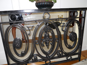
 The foyer is home to this amazing console made from an 18th century balcony.
Ernesto Santalla created "The Retreat." What a retreat it is! There are some rooms in the show house that I was smitten with. Barry's is one; Ernesto's is another.
 These are butterflies at the top of the stairs made from found beer cans.
 The shower is simply divine. It is a sky scrapper. Enough to house a a large pendant and a very, very tall person (or two).
 The commode room off to the side is quite sleek.
 Two story hung art was eye candy seen upon entering the space.
 Comfortable day bed for lounging or whatever comes to mind.....
 Comfortable tub for soaking.
 This room is made for lovers. Stunning in its overall design. Plenty of room for two in luxurious robes (or not ;-) I want this space.
As I climb the stairs to Skip Sroka wonderful office, "Fit for an Entrepreneur," a terrible thing happened. My camera ran out of juice. That will teach me to test out a new camera before going to an important story. Unfortunately, I was unable to shoot Miriam Dillon and Rebecca Foley space either. Their space includes the hall from the garage to the house, the mudroom, powder room, and laundry room. I can tell you though ~ all of these rooms are beautiful, full of surprises, interest, and a smidge of sparkle.
Tomorrow, we'll venture upstairs. For Fun Friday, we'll go to the lower level (another room I am smitten with lives there) and then to the backyard. BBQ anyone??


I love the dining room!
ReplyDeleteI love the first images with that amazing trellis pattern on the walls!
ReplyDeleteLove the Pear Green in the dining room and the trellis panels. I love that gorgeous foyer console. The "retreat" aka bathroom is pretty spectacular too.
ReplyDeleteI really like the bathroom pictures, as well as the sitting room with the glass table. Although I prefer darker and more dramatic decor, this is still very aesthetically appealing.
ReplyDeleteThis comment has been removed by a blog administrator.
ReplyDelete